INSIDE AXIS OF HARMONY · ARTICLE NINE
Looking Closer: What the Macro Studies Revealed
By Jabbi Delahaye · 10 October 2026

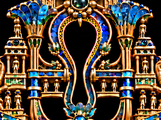
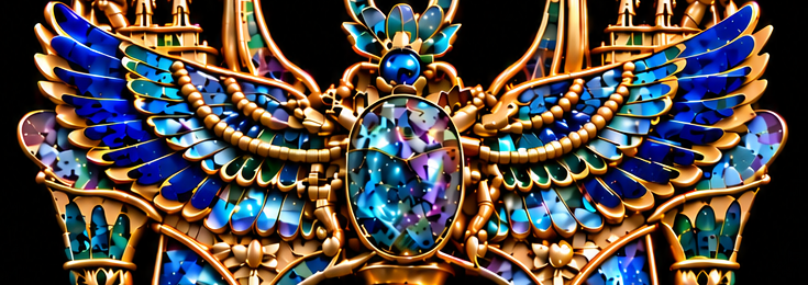

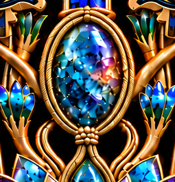
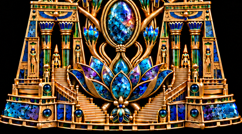
A gold connection beneath a gemstone can occupy very little of an image and still affect how the whole object reads. If its edges merge, the setting appears uncertain. If the connection becomes too heavy, it interrupts the line above it. Finding the right balance in those small places became a substantial part of developing Axis of Harmony.
The six macro studies bring that work into view. They follow the crown gemstone and horns, the ankh and crossbar, the scarab and wings, the paired eyes, the lower oval gemstone and binding, and the lotus with its surrounding gateways. Together, they offer another way into the artwork: through the places where one form meets another.
In this article, I want to explain what those studies helped me notice. The decisions involved separation, proportion, light and visual continuity. Some called for greater definition. Others called for less weight or less brightness. Each adjustment had to earn its place in the complete composition.
The crown: giving the gemstone room
The round fantasy gemstone at the crown sits between two curved gold forms. That arrangement makes it a natural focal point, but its prominence needed careful judgement. Enlarging the gemstone affected the frame around it. The curved forms also needed enough height and width to hold the new proportions comfortably.
Their relationship mattered more than either element considered alone. A stronger gemstone could make its surroundings appear cramped. A heavier gold frame could take attention away from the crystalline colour inside it. The close-up made these competing effects easier to consider.
The internal glow brought another question. I wanted light to feel contained within the gemstone, with darker crystalline areas preserving depth near its edges. Brightness needed to reveal the imagined material rather than wash its structure away. The final effect relies on variation: luminous passages, darker pockets and reflections held within a clear gold boundary.
At full view, that crown should belong to the composition below it. Its colour connects with the other fantasy gemstones, while the gold carries the eye towards the branching forms around the ankh.
The ankh: making an opening legible
The ankh study drew attention to how much work the surrounding edges were doing. The dark opening depends on a continuous contour. Gold ribs, blue channels and horizontal connections all contribute to that contour, and each change in their spacing affects its character.
The lower stem became a particular concern. Where it spread too broadly, its passage towards the scarab felt less resolved. Bringing that section into a slimmer, more upright form helped the central line remain clear. The lotus connection above the scarab then gave the transition a more deliberate meeting point.
The crossbar needed its own attention. Its ends had to meet the curved structure convincingly. More pronounced connecting collars made the join easier to understand, but their weight then became visible. Refining them further meant keeping the connection while reducing its bulk.
That sequence taught me something useful about detail. Solving one ambiguity can create a new imbalance. A stronger join may need a lighter profile. A clearer edge may need a quieter highlight. The close-up helps identify the local problem; the complete image shows the consequences of resolving it.
The wings: separating movement into layers
The spreading wings carry a substantial band of blue and teal across the artwork. Their layered forms introduce movement within the overall symmetry. At the centre, however, feather roots, small gold beads and supports occupy a crowded area around the elongated fantasy gemstone.
I wanted those components to remain individually readable. Gold rims help separate neighbouring layers, while narrow shadow intervals suggest their overlap. The attachment areas need enough definition for the extensions to feel connected to the central motif.
It would have been easy to make every feather border equally bright. That would change the balance of the wings, turning many small edges into competing points of attention. The useful refinement was to clarify their relationships while preserving the larger sweep.
The gemstone between the wings also needed to keep its own presence. Its shifting crystalline colours give the centre depth, while the setting establishes a boundary within the surrounding movement. In the macro view, I could consider the gemstone, border and attachments together. In the full image, I checked whether the wings still carried the eye outward and back.
The paired eyes: matching structure
The two eyes establish another strong horizontal relationship lower in the composition. Their rounded blue centres, dark contours and gold surrounds make them immediately recognisable. Because they form a pair, differences in their borders are particularly noticeable.
The refinements concentrated on contour detail, corners, setting sizes and the small connections around them. Matching the visual weight of the surrounds helped the eyes feel balanced across the central line. Their highlights still needed to describe rounded surfaces, with enough darkness to preserve depth.
Here, symmetry involves several judgements at once. The forms need corresponding positions and proportions. Their surrounding detail needs a comparable rhythm. The reflections can vary without disturbing that relationship.
I wanted the eyes to hold their place within the artwork rather than become a separate display of ornament. Fine engraved accents could enrich their surrounds, provided the original contours remained clear. The close-up gave those adjustments a scale at which they could be considered properly.
The oval setting: untangling the binding
The lower oval fantasy gemstone sits inside a cord-like gold enclosure. Beneath it, the binding gathers into the branching forms that lead towards the lotus. This junction needed particular care because several curves converge within a small area.
The binding could become visually heavy. Where its strands blended together, it looked more like a lump of gold than a deliberate connection. A finer tied base and clearer strand separation helped distinguish the enclosure from the gemstone's bezel.
The supporting stems also needed to remain understandable. Their curves should arrive at the setting with a coherent relationship to the surrounding forms. Small contact shadows and readable boundaries help convey that relationship in the image.
The gemstone itself presents a different kind of complexity. Its blue, teal and violet regions suggest an invented crystalline interior. Refining its depth meant preserving distinctions within those regions while giving the polished surface a consistent appearance. Greater brightness alone would not explain the material.
The lotus and gateways: keeping the small world clear
At the base, the lotus opens between paired architectural gateways and stairways. Gemstone petals overlap within fine gold rims. Nearby columns, figures and railings introduce a much smaller scale. The macro study brings these different forms into the same field of attention.
Petal separation was one of the most useful areas to refine. Clear overlaps and shadow lines helped individual petals retain their shape. Their gold borders needed enough definition to guide the eye through the layered opening without becoming overly thick.
The architecture required another kind of precision. Repeated steps needed consistent direction and depth. Railings needed continuous passages and legible joins. The tiny figures needed distinct silhouettes within their settings.
Some of these miniature details remain simplified under close enlargement. That is a limit I can acknowledge while still valuing the composition. The refinements improved their clarity; they do not turn the image into a verified plan for making a physical jewel.
Knowing when the refinement has done enough
Axis of Harmony is a digital artwork depicting imagined jewellery. Its macro studies reveal visual decisions about apparent materials and construction. They allow a viewer to examine the image closely, but cannot establish the physical properties of its gemstones or the practical strength of its connections.
That distinction helped me judge the work on its own terms. I wanted convincing relationships between surfaces, consistent proportions and a clear route through the detail. Further generative revisions also brought the possibility of changing an area that was already working.
Eventually, I chose to stop design edits and treat the refined version as the approved master. That decision left room for the next kind of judgement: preparing the intended print and examining a physical proof.
The six studies remain a record of what held my attention. They show how a crown, an opening, a wing attachment or a delicate binding can influence the experience of the whole. Their value lies in giving those decisions a visible scale, and inviting the viewer to follow them back into Axis of Harmony.
Studio source note
This article draws on the development and approved six macro studies of Axis of Harmony. It describes the artist's visual intentions and recorded refinement decisions. Historical meanings of individual Egyptian symbols are explored, with external references, in the earlier articles in this series.