INSIDE AXIS OF HARMONY · ARTICLE ONE
Axis of Harmony: Bringing Many Elements into One
By Jabbi Delahaye · 10 October 2026
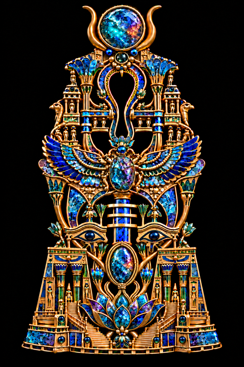
Axis of Harmony began with a simple question: how many elements can coexist before harmony slips into noise? I was trying to build a quiet centre that everything else could belong to. The ankh took shape through the spaces between the surrounding forms, giving the eye somewhere to settle within an intricate composition.
That relationship between detail and breathing space became central to the work. I wanted the image to reward two kinds of looking: the first encounter, when the whole composition makes its impression, and the slower discovery that happens when someone moves closer. A small connection, a shifted highlight or a change of colour should offer something further. The work needed to hold together at both distances.
Looking at it now, I see how much depends on the relationships between its parts. The crown, wings, paired eyes, gateways and lotus each have a presence. Their placement allows the eye to travel between them without losing the central line. This is where the title begins to make sense to me: an axis around which a richly populated world can find its balance.
Finding the centre
The composition rises vertically, from the broad architectural base and unfolding petals towards the circular stone at the top. Along that route, the eye encounters several changes of scale. A large wing spreads beside a tiny figure. A gemstone becomes a focal point within a setting, while nearby columns suggest an entire building. These differences give the image much of its character.
The open centre is particularly important. It gives the surrounding gold and colour a clear boundary, allowing their contours to become visible. With so much happening elsewhere, the dark space offers a pause. It also makes the central form feel connected to the background, which remains part of the composition rather than simply sitting behind it.
Symmetry provides an organising structure. The paired elements create a sense of steadiness, but there is still movement within them: curved wings, branching stems, rounded settings and stairs that lead the eye upwards. I wanted that order to support exploration. A viewer can recognise the overall arrangement quickly, then spend longer finding the smaller passages within it.
A world at the scale of jewellery
One of the qualities I wanted to preserve was the invitation to look closer. The architectural details make that invitation tangible. There are gateways, columns, platforms and stairways, with small figures occupying spaces that appear almost habitable. The image can be approached as an imagined jewel, yet it also suggests a place.
That change in how we look interests me. At first, a column may read as a decorative line. A closer look reveals its relationship to a platform, a figure or a passage beneath an arch. The detail begins to describe a setting. Looking becomes a way of moving through the work.
The smaller forms also influence the scale of everything around them. A tiny figure makes a nearby stone feel monumental. A staircase turns the lower section into an entrance. These relationships help the composition carry more than surface ornament. They give the viewer several possible routes through an object that remains unified when seen as a whole.
Symbols in relationship
The Egyptian-inspired imagery is central to the visual language of Axis of Harmony. The ankh, scarab, wings, eyes and lotus deserve careful individual attention, and the later articles will make space for that. Here, I want to begin with how they function together within my composition.
For me, the open central form gives the work continuity. The wings introduce an outward movement across its width. The paired eyes establish another point of attention lower down, while the lotus helps gather the composition at its base. These are artistic readings of the arrangement I have made.
I want to keep those readings distinct from historical explanations. Ancient Egyptian imagery comes from particular cultural and religious contexts, and a contemporary artwork cannot stand in for that knowledge. When I explore individual symbols later, their documented associations will need to sit alongside my interpretation, with the distinction made clear.
Within this work, their proximity creates further questions. How does a wing change the feeling of the architecture beside it? How do the eyes affect our encounter with the jewel? What happens when a flower carries some of the visual weight of a building? Those relationships allow the composition to remain open to looking and interpretation.
Imagining the materials
Axis of Harmony is a digital artwork depicting imagined jewellery. Its goldwork and gemstones belong to an image, and the freedom to invent their appearance is part of the practice. I can explore an intricate object through colour, light and form while remaining clear about what has been created.
The larger stones carry a mixture of blue, turquoise and violet, interrupted by smaller areas of warm colour. Their fragmented interiors suggest depth and changing light. I wanted these fantasy gemstones to invite attention in their own right, with enough variation to sustain a closer look.
Their colours also connect different parts of the composition. Blue travels through the wings, columns, settings and larger stones. Green appears in smaller accents and plant forms. Warm gold follows the edges and structural connections, helping the viewer distinguish one shape from another.
For the imagined materials to feel convincing, those relationships need discipline. A highlight should help describe a curve. A setting should appear to embrace its stone. A polished edge should remain legible beside an engraved or patterned surface. The appeal of the materials depends partly on whether we can understand how the object appears to fit together.
What refinement asks of the work
The process involved returning to the image and asking increasingly specific questions. Were the smaller details clear enough? Did the gold draw too much attention in one area? Did a connection feel coherent? Could the viewer follow a contour without being distracted by an awkward interruption?
Macro inspection was useful because it changed the scale of those decisions. Areas that looked convincing in the full composition could become less resolved when enlarged. Looking section by section helped identify where a setting, binding, petal or join needed further attention.
That scrutiny also required returning to the whole image. A detail can become sharper and still make the composition feel less balanced. The purpose of refinement was to help each part contribute more clearly to the overall work. It called for judgement about where extra definition would help and where restraint would serve the image better.
There is also a point at which a digital artwork has to be allowed to stand. Further changes are always possible. Deciding to stop means considering whether the current work expresses the intention strongly enough, while recognising that an imagined object remains different from a manufactured piece of jewellery.
From jewel to another form
The original design also opened a path into other visual forms. Its flattened adaptation allowed the pattern to occupy the whole image more fully. The jewelled egg introduced a different experience: an exterior carrying the design, with a freestanding miniature revealed inside.
That interior brought the question of breathing space into focus again. The miniature needed enough room around it for its shape and detail to remain visible. Making it slightly smaller gave the surrounding interior a role and allowed the reveal to feel more considered.
The egg also raised practical visual questions about doors, hinges, clearances and the base. Even as a mock-up, it needed to offer a readable account of how the object might open and hold together. Those questions extended the same concern that shaped the original jewel: how can intricacy remain understandable?
An invitation to look again
This first article establishes the whole before the series turns towards its individual elements. The ankh, eyes, scarab, lotus, fantasy stones and goldwork each offer a different way into Axis of Harmony. The macro studies will allow those discussions to stay close to the image.
What I hope carries across all of them is a willingness to look slowly. The composition offers an immediate impression, but its smaller structures ask for more time. A viewer might return to the same section and notice a figure, a connection or a passage of colour that escaped them before.
That is the experience I wanted to make possible: a work that holds together on first encounter and continues to open under closer attention. Every detail has a part in that invitation. The centre gives them somewhere to belong.