INSIDE AXIS OF HARMONY · ARTICLE EIGHT
Gold, Light and the Discipline of Detail
By Jabbi Delahaye · 10 October 2026
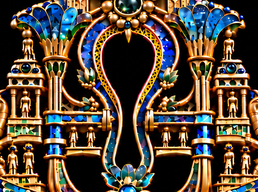

I can follow the gold through Axis of Harmony almost as a continuous route. It curves around an opening, divides a wing into layers, encloses a gemstone, then becomes a column or a stair. Its colour connects these forms, but its shape changes with each task.
That is what interests me about the goldwork. It has to do more than look precious. It gives the image edges, junctions and passages that the eye can understand. Where the fantasy gemstones invite me to look into a material, the gold helps me follow how the imagined object fits together.
The discipline of detail begins there. A small edge can explain a form. A highlight can reveal a curve. A crowded connection can make an otherwise clear arrangement difficult to read. Refinement means paying attention to those differences.
One material, several roles
The gold around the ankh's open centre has a particular responsibility. It gives the dark space a contour while connecting that contour to the surrounding colour and architecture. Along its inner edge, repeated small openings create another level of detail within the larger outline.
Elsewhere, the gold becomes broader and more substantial. The curved forms beside the crown gemstone have enough surface to carry long reflections. The stairways rely on repeated edges to describe their ascent. The columns establish uprights within the lower settings.
The wing layers need a finer division. Their gold borders separate neighbouring blues and teals, making the feather-like forms readable across a dense band of colour.
These differences let the gold belong to the whole work without becoming uniform. Its continuity comes through the shared material appearance. Its variety comes through what each area needs to accomplish.
What a highlight tells me
A highlight is useful when it explains something. On a rounded form, it can suggest a surface turning towards the light. On a narrow rim, it can keep an edge visible against a dark area. On a stair, it can help separate one level from the next.
In a rich composition, brightness is easy to notice. That makes it influential. A small reflective mark can pull attention towards a junction or away from the central line.
I want that influence to have a purpose. When I look closely at the gold, I ask what a bright passage is helping me see. Is the surface clearer? Does the edge still belong to the form? Can I follow the transition into the next component?
The darker gold passages matter too. They give the reflections something to emerge from and allow the metal to feel rounded or recessed. Without that variation, a gilded curve can become a flat yellow line.
The appearance of gold depends on relationships between light, colour and shadow. Those relationships give it a surface the eye can read.
Polish beside texture
The goldwork contains several kinds of apparent finish. Broad curved surfaces look smooth and reflective. Around the lower oval gemstone, closely repeated lines give the surround a textured rhythm. Smaller decorative passages introduce dots, narrow divisions and engraved-looking marks.
That variety changes the pace of looking. A smooth curve can be taken in quickly. A textured surround holds attention through repetition. A small pattern asks the viewer to move closer before its organisation becomes clear.
Putting those surfaces beside one another gives each more definition. The reflective curve feels smoother because a finer texture is nearby. The textured area becomes easier to appreciate because it has a quieter surface to sit beside.
I find that relationship more useful than making every area equally elaborate. The gold needs changes of pace if its details are going to remain distinct.
Learning from actual metalwork
The vocabulary of jewellery craft helps me look more precisely. In a GIA article on metalwork, Sharon Bohannon describes filigree as patterns formed from fine metal wires, granulation as small bead-like gold particles attached to a surface, and hand engraving as work carried out with specialised cutting tools. [1]
These are different ways of shaping and articulating material. Their effects cannot all be reduced to shine.
The Metropolitan Museum of Art also provides a demonstration of a granulation technique, featuring conservation preparator Jenna Wainwright Fennell. It was produced in connection with the exhibition Silla: Korea's Golden Kingdom. [2] The resource offers a point of access to a specific practice behind the appearance of finely detailed gold.
Axis of Harmony is a digital imagining. Its beaded forms, patterned rims and engraved-looking surfaces suggest craft, but they do not document soldering, cutting or working metal by hand. The comparison helps me understand how a surface can communicate care, while my own task is to make that communication coherent within an image.
The small connections
The junctions deserve particular attention. Below the oval gemstone, rounded gold details gather the setting into the branching forms. Around the wings, repeated small gold shapes help organise the relationship between the central motif and the layered extensions.
These areas are easy to pass over when looking at the full composition. They become much more consequential in a close-up. If several edges meet without a clear relationship, the image can feel uncertain at that point.
A connection needs enough information to make sense visually. One component appears to sit in front; another continues behind it. A narrow dark interval can help separate them. A reflection can clarify which surface belongs to which form.
Those modest distinctions help the larger fantasy hold together. I do not need every junction to become a focal point. I need it to support the movement through the image.
The value of an uninterrupted edge
An edge has a kind of promise. Once the eye begins following it, a sudden ambiguity can interrupt the reading of the form.
That matters around the gemstones. A setting gives an invented material its boundary, so its contour must stay legible through changes of colour and reflection. It matters around the lotus too, where several gold-edged petals overlap within a relatively small area.
The ankh's open centre offers another test. Its contour is visible against darkness, making changes in direction especially noticeable. The surrounding detail has to remain connected without obscuring that larger outline.
Close looking lets me attend to the local passage. Stepping back shows whether it still belongs to the shape I intended the viewer to recognise. Both views are needed.
Refinement as a decision
Working digitally gives me the opportunity to return to a detail and revise it. That opportunity is valuable when there is a clear reason for the change.
The question might concern separation: two neighbouring forms reading as one. It might concern emphasis: a reflection drawing more attention than the area needs. Or it might concern continuity: an edge becoming unclear where several components meet.
These questions give refinement a direction. They connect a local adjustment to the experience of looking at the work.
They also help me know when to leave an area alone. A detail can already be performing its role. Further elaboration may introduce another demand on the eye without improving the composition.
For me, the discipline lies in making that judgement. It requires attention to what the image needs at that particular place.
Symmetry and different surfaces
The overall symmetry gives the goldwork a framework, but the surfaces within that framework still need variety. The eye can recognise a relationship between two sides while encountering different reflections and small changes of texture.
That keeps the forms from feeling like a diagram. The columns, stairways and wing borders establish order, while their surface detail gives me reasons to keep looking.
The centre also needs room to remain visible. If every peripheral gold edge were equally emphatic, the work's hierarchy would become harder to read. Some passages need to carry attention; others need to sustain it quietly.
This is part of how I understand harmony in the piece. It depends on a distribution of attention across related forms.
Detail that belongs to the whole
The macro studies make these decisions visible. They bring a setting, an edge or a small junction forward so that its contribution can be examined.
The complete artwork remains the larger test. A beautifully articulated passage still has to fit the rhythm of the image. The gold must connect the fantasy gemstones and symbols without taking every encounter over.
I return to that continuous route through Axis of Harmony: around the opening, across the wings, through a setting and down towards the stairs. It is made from many small decisions, but the viewer should be able to follow it naturally.
That is what I want the detail to achieve. Enough clarity to hold the imagined object together, and enough variation to make another look worthwhile.
References
[1] Sharon Bohannon, “Metalwork Takes a Bow: Techniques that Enhance Gemstone Jewelry,” GIA, 9 November 2019. https://www.gia.edu/gia-news-research/metalwork-takes-bow-techniques-enhance-gemstone-jewelry
[2] The Metropolitan Museum of Art, “Gold Jewelry Techniques: Granulation,” 10 August 2018. https://www.metmuseum.org/perspectives/gold-jewelry-techniques-granulation