STUDIO PROCESS · ILLUSTRATED LONG-FORM ARTICLE
Painting Without Wet Paint
How I reconstructed drawing, ground, underpainting, colour, glazing, scumbling and surface inside a contemporary digital studio.
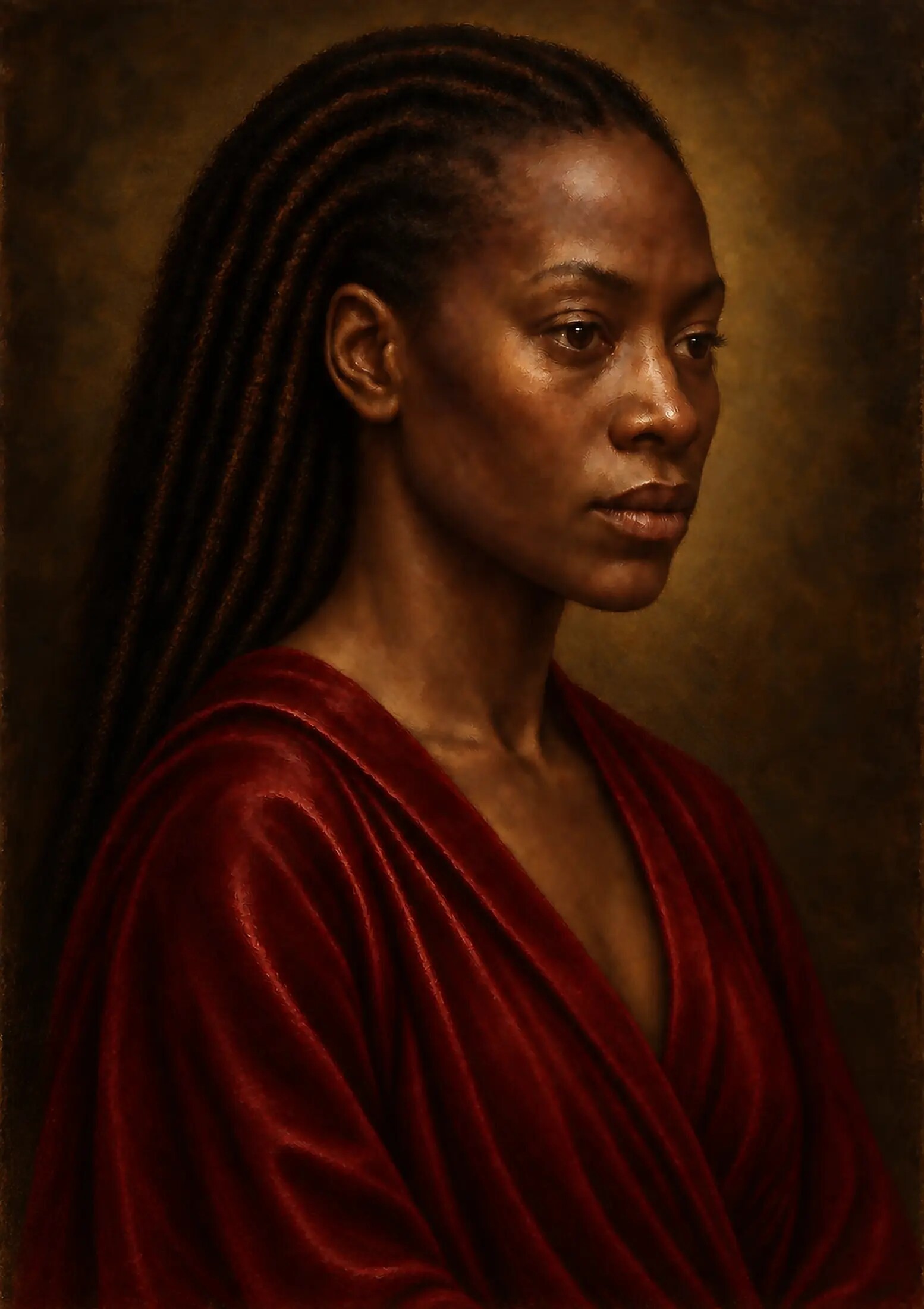
There is a moment in the making of an image when resemblance is no longer enough. A face may be anatomically correct. The lighting may be dramatic. The colour may be beautiful. From several feet away, the work may even appear painterly. Yet when the image is enlarged, something gives way. The skin becomes too smooth. Brush marks seem to float above the forms rather than describe them. A canvas texture repeats with mechanical regularity. The darkness has no depth. The eye catches the light, but the light appears to have no source and no history.
That was the problem I wanted to confront with this painting.
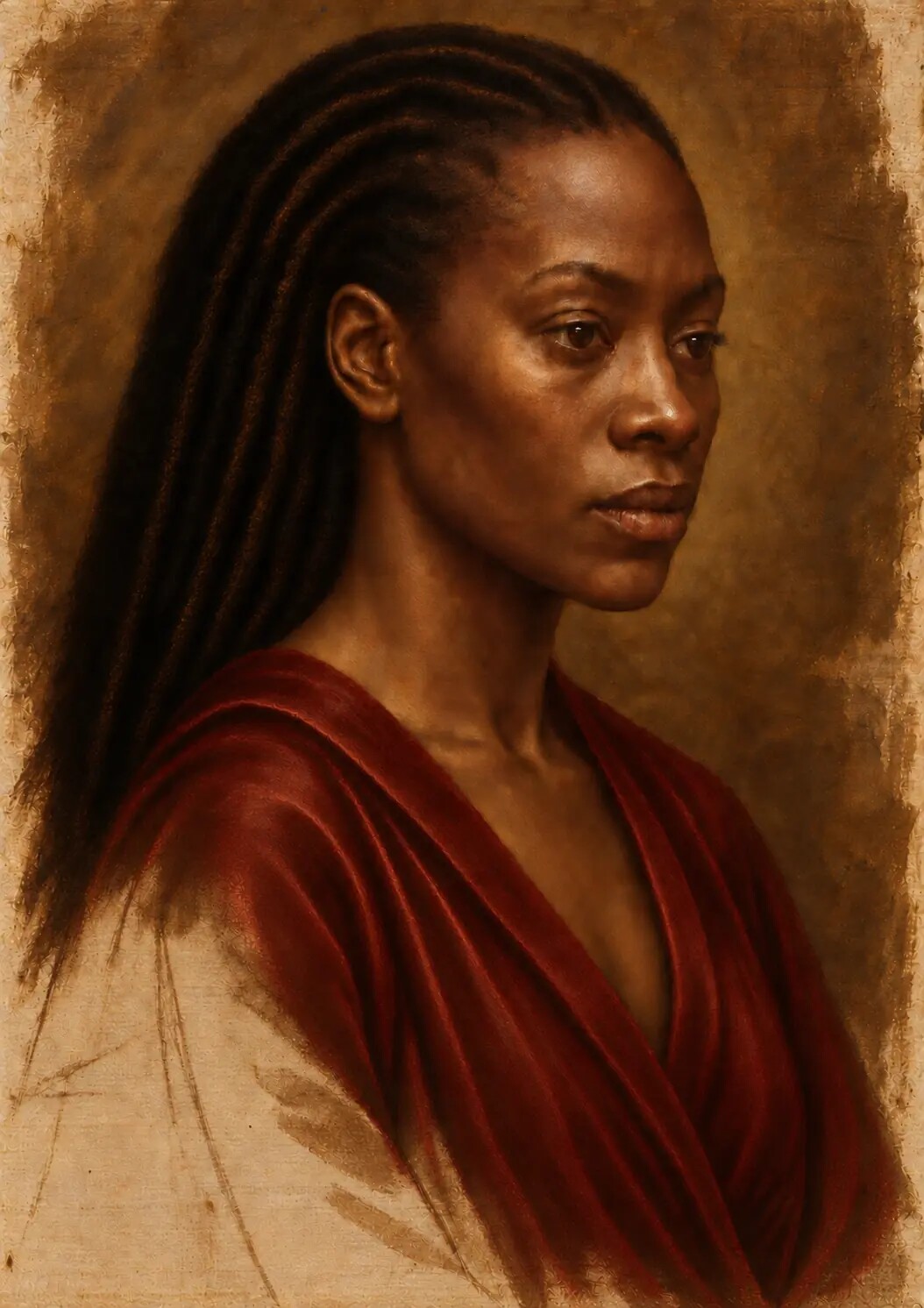
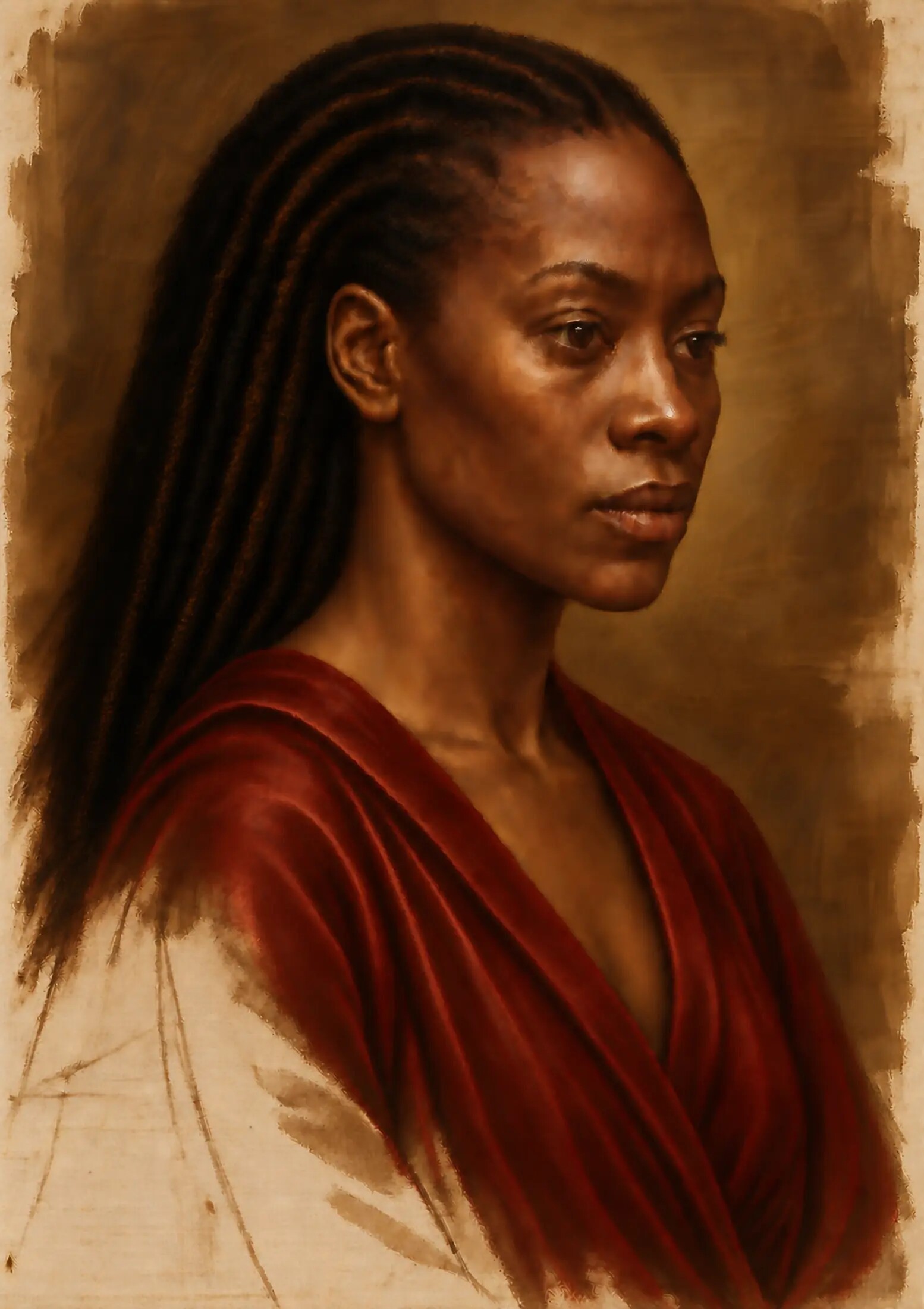
I was not interested in placing an oil-painting effect over a completed digital image. I wanted to know whether a digitally constructed work could carry the visual consequences of a painting process: whether it could suggest that the image had been built from a prepared support, a searching drawing, a tonal underpainting, restrained early colour, successive opaque and translucent passages, final adjustments and a unifying surface. In other words, could the finished image contain a believable memory of everything beneath it?
The process developed into a disciplined reconstruction of historical painting logic inside a contemporary digital studio. Artificial intelligence formed part of that studio, but it was not the author of the artistic intention and it did not remove the need for judgement. Each stage had to be directed, inspected, questioned and, when necessary, rebuilt. The work moved repeatedly between the complete composition and extreme close-ups of the eyes, mouth, skin, clothing and surface. It had to persuade at normal viewing distance and remain coherent when examined at a scale far beyond the way most paintings are ordinarily seen.
No wet oil pigment was applied to linen in the making of the digital master. That distinction matters. The work is not a physical Renaissance painting and should not be described as one. It is a digital painting that reconstructs selected visual behaviours associated with layered oil painting: the influence of a ground upon later colour, the relationship between drawing and paint, the difference between opaque light and transparent shadow, the soft bloom of scumbling, the depth of glazing, the broken relief of brushwork and the optical cohesion associated with a final varnished surface.
This article explains how that reconstruction was approached, why each stage mattered, what failed under close inspection and what the process taught me about the continuing intelligence of historical craft.
A Process Rather Than an Effect
An oil painting is not simply a picture with visible brushstrokes. Its appearance is the result of material events that happen in sequence. The support receives a ground. The ground affects the colour and absorbency of the layers above it. A drawing establishes proportion and placement. An underpainting organises value and volume. Thin and thick passages reflect light differently. Transparent colour modifies what lies beneath without completely hiding it. Opaque paint interrupts that depth. A scumble drags pale colour across a darker surface. A glaze deepens colour while allowing earlier modelling to remain visible. Varnish changes the way light meets the final surface.
The National Gallery describes a ground as the layer that prepares a support and notes that its colour and tone can affect the chromatic and tonal values of later paint. Its definition of glazing is equally important: a transparent or translucent paint film modifies the colour beneath it without obscuring it, while variations in thickness can produce tonal variation and an illusion of relief. These are not decorative effects added after the image is complete. They are relationships between layers.
My six-stage structure grew from those relationships. It is not a claim that Leonardo, Titian, van Eyck, Raphael or every workshop of the period used one universal procedure. Supports, binders, pigments and working sequences varied between regions, artists, dates and individual paintings. The studio framework brings several related practices into a coherent contemporary method:
1. The simulated linen, sizing and prepared ground
2. The pencil and charcoal underdrawing
3. The grisaille or verdaccio underpainting
4. The restrained dead-colour layer
5. The development of opaque paint, glazing and scumbling
6. The final detailing, unifying colour and simulated varnish
This sequence gave the work discipline. More importantly, it prevented the finished surface from becoming a collection of unrelated signs that merely announce “old painting”. Every texture needed a cause. Every highlight needed a surface capable of reflecting it. Every soft edge needed to belong to the turning of a form or the recession of space. The painting had to behave as though its visible surface had grown from decisions made earlier.
The Painting I Wanted to Make
The visual ambition was demanding. I wanted a work with the compositional gravity and controlled light associated with High Renaissance portraiture, together with the close material attention found in early Netherlandish and later Flemish painting. The face needed to feel alive without becoming photographically slick. The darkest areas needed to approach black while retaining atmosphere and internal variation. Colour had to appear jewel-like in selected passages, but never collapse into modern digital saturation. Fabric, hair, ornament and flesh had to occupy the same world while responding differently to light.
The painting also had to operate on two scales.
At normal viewing distance, the first experience should be the presence of the subject: the face, posture, light and emotional atmosphere. Texture should support that encounter quietly. The viewer should not first notice a canvas overlay, a cracked varnish effect or a collection of conspicuous brush marks.
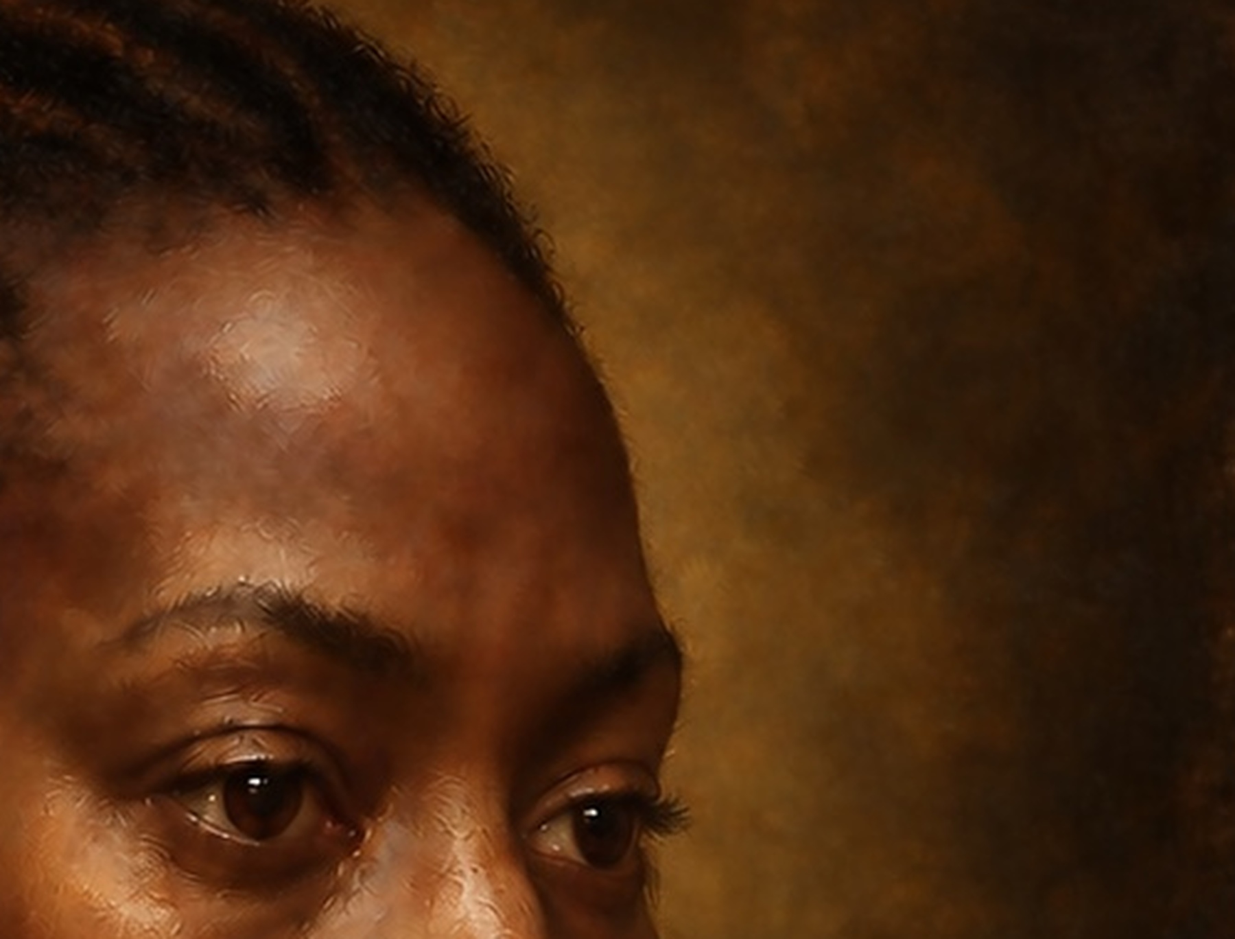
At close range, however, the image needed to reward examination. The skin required minute temperature shifts. The mouth needed volume, compression and moisture without a hard digital outline. The eye needed anatomical structure, a convincing wet surface and a reflection governed by the same light as the rest of the face. The jacket and secondary materials needed their own physical logic. The weave and ground had to appear intermittently, where thin paint or broken handling would plausibly allow them to influence the surface.
This double demand changed the way I judged progress. More detail did not necessarily make the painting more convincing. In several areas, credibility improved when detail was removed, softened, partially buried or made less regular. The question was never simply “Is this sharp enough?” It was “What should be visible here, at this distance, through this material, under this light?”
Looking at Old Paintings as Constructed Objects
Historical paintings are often encountered as flat reproductions. Museum websites and art books are invaluable, but a front-facing photograph can hide the physical decisions that made the image. Raking light, conservation imaging and macro photography reveal another object: a woven or wooden support; a prepared ground; incised, drawn or transferred lines; corrections; thin translucent films; ridges of paint; worn passages; later varnish; and changes that have occurred with age.
The National Gallery defines underdrawing as the preliminary outlining of a composition on a primed support. It guides the application of paint and may remain visible or reappear over time. Its account of pentimento is equally revealing. A pentimento is a change made during painting, commonly hidden by later paint but sometimes detected by infrared reflectography or X-radiography. Such changes matter because they record thought. They show that an image was developed rather than delivered whole.
That idea became central to my simulation. A physically credible painting should not look as if every decision arrived in perfect final form. The drawing may be adjusted. A contour may migrate slightly. A shadow boundary may be revised. A passage may be softened by later paint but remain faintly present. I did not want to manufacture false historical evidence or imitate the ageing of a particular masterpiece. I wanted the digital construction to acknowledge that painting involves discovery, correction and partial concealment.
The research therefore focused less on copying the surface of one artist and more on understanding a visual grammar. How does a pale ground contribute to luminosity? Why do some shadows feel deep rather than merely dark? How do painters move from large tonal masses to small accents? Where does brushwork describe anatomy, and where does it dissolve into atmosphere? How does a transparent red over a cooler base differ from an opaque pink placed directly on the surface? What happens when a highlight is physically thicker than the shadow beside it?
Those questions gave the digital process something more useful than a style label. They gave it structure.
The Artist and the Machine
AI-assisted image making is often described through the prompt, as though one sentence accounts for the resulting work. That description is inadequate for this process.
A prompt can indicate a direction, but it cannot replace sustained artistic judgement. It does not decide why one historical reference is relevant and another is not. It cannot determine the emotional temperature of a face without direction. It does not know which imperfection strengthens the work and which one exposes a technical failure. It cannot be trusted to preserve anatomy, material logic, lighting consistency or symbolic intention simply because those requirements have been named once.
My role was to establish and maintain the painting’s internal laws. I decided the visual ambition, the historical frame, the hierarchy of attention and the standard of finish. I assessed whether a surface appeared physically plausible. I rejected passages that were superficially impressive but inconsistent with the whole. I returned to the eyes and mouth at increasing magnification because tiny irregularities in those areas could alter the expression. I controlled when the work should become sharper and when it needed to become quieter.
The working cycle was iterative. I defined a problem, developed or regenerated a passage, inspected it, compared it with the intended material behaviour, and decided whether to retain, revise or replace it. Some corrections affected only a minute highlight. Others required the logic of an entire region to be rebuilt. A successful area then had to be integrated into the master so it did not appear pasted into a different painting.
This is where human control becomes visible. Authorship is present in the continuity of decisions. The machine can propose visual material, but the artist determines the purpose of the image, the standards by which it is judged and the point at which it becomes the work.
PROCESS STAGE
Stage One The Linen and Prepared Ground
I began beneath the image.
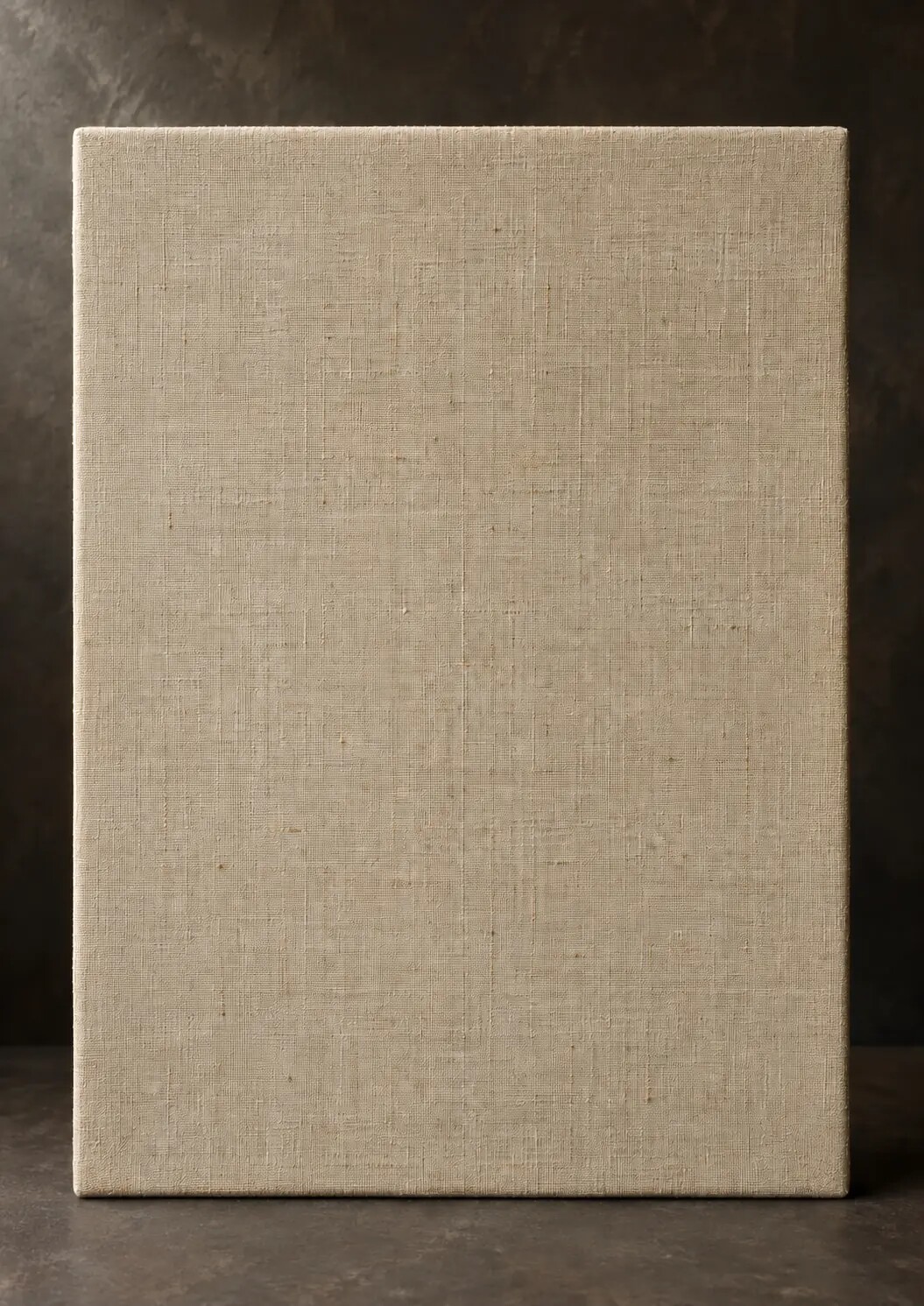
The first simulated stage was a blank, unprepared linen support. This may seem unnecessary in a digital workflow because the support could be hidden completely by later layers. Yet beginning with the imagined material changed the logic of everything that followed. It forced questions about scale, tooth, absorbency and reflection before the figure appeared.
Real linen is not a perfect grid. Its warp and weft vary slightly in tension and width. Threads catch light differently. The weave changes appearance when it is stretched, sized and covered. A repeated digital canvas texture usually fails because it remains equally visible across every colour, depth and paint thickness. It behaves like a transparent sheet placed over the finished image rather than a support beneath it.
The simulated linen therefore needed irregularity without noise. The weave had to be fine enough for the scale of the intended work. It could not compete with the face. It also needed to disappear selectively. In thin, quiet or worn-looking passages, the underlying tooth could influence the image. Beneath opaque modelling and thicker highlights, it had to be diminished or lost.
The next consideration was sizing. Historically, a size layer helped isolate a fabric support from direct contact with oil and changed its absorbency. No physical size exists in the digital master, but its imagined function mattered. It suggested that later colour should sit upon a prepared barrier rather than soak indiscriminately into raw cloth. The simulated surface became less fibrous, more stable and more responsive to the intended ground.
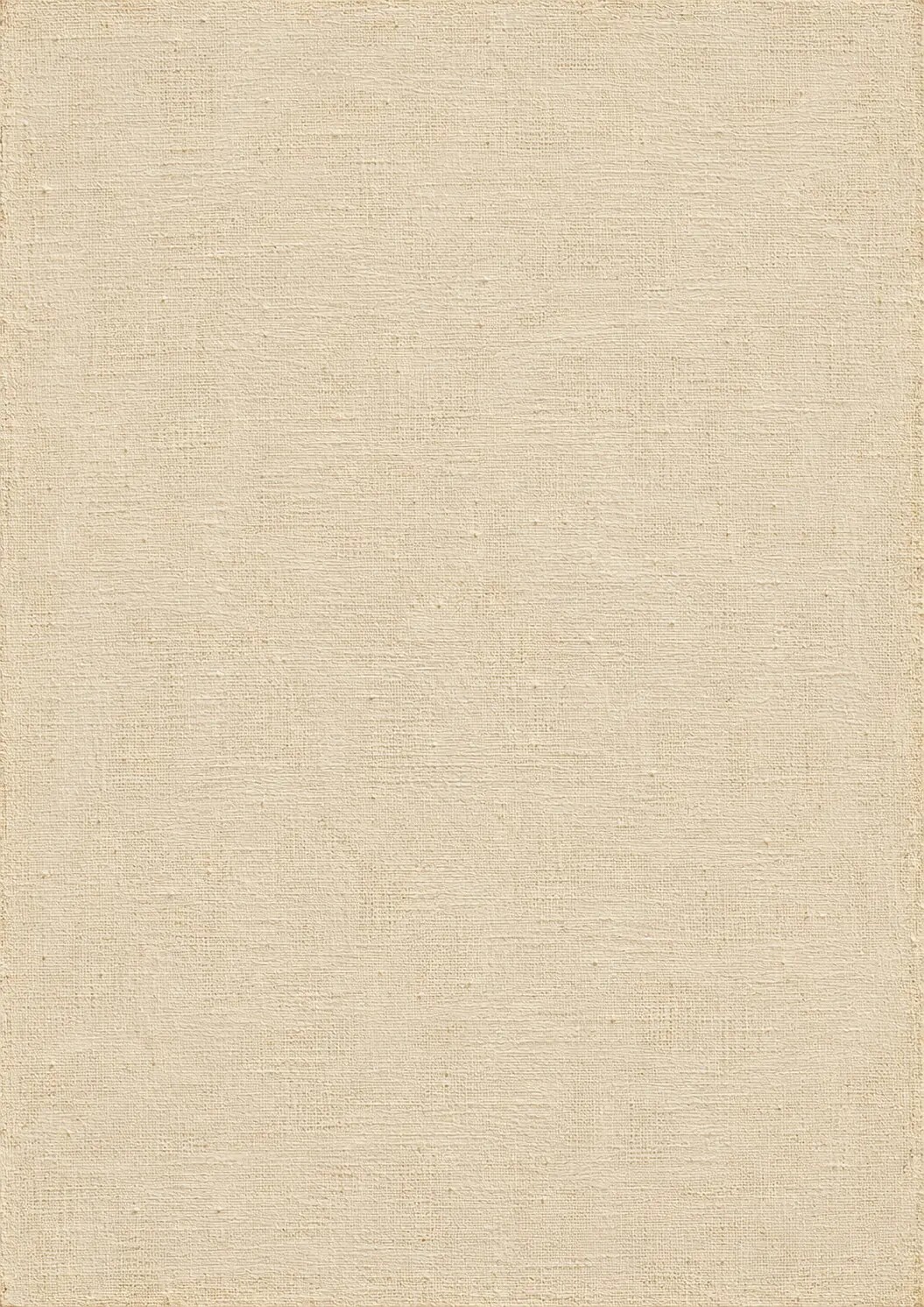
I then established a pale, subtly warm, gesso-like or chalky preparation. Historical terminology needs care here. Grounds differed according to support, place and period; the National Gallery notes that panel grounds were commonly gesso, while canvas supports were more often prepared with underlying paint layers. My digital stage was therefore not presented as a universal recipe. It was a visual foundation inspired by the reflective and absorbent role of traditional preparations.
The ground was not pure white. A completely neutral digital white can make later colour appear detached and synthetic. The slight warmth allowed cooler passages to retain life, while the pale value created a source of internal luminosity for subsequent transparent colour. Minute preparation marks, variations in tooth and gentle tonal unevenness gave the surface a history before the drawing began.
Most of this foundation would eventually be buried. That was the point. In a layered painting, invisible preparation can still govern the visible result.
PROCESS STAGE
Stage Two The Underdrawing
The second stage established the architecture of the image through drawing.
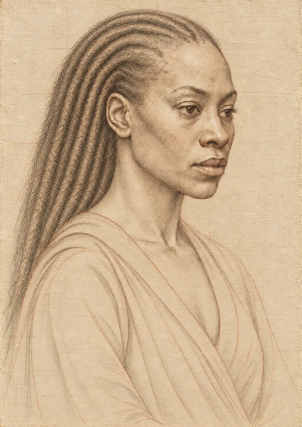
The drawing was not treated as a clean outline waiting to be filled. It needed to perform several jobs at once: place the subject within the field, stabilise proportion, clarify anatomical relationships, locate the major shadow boundaries and organise the movement of secondary forms. The head, features, clothing and surrounding shapes had to belong to one spatial construction before colour began to seduce the eye.
Pencil-like and charcoal-like behaviours were simulated because they contribute different kinds of information. A fine point can test a contour or locate a feature. A softer charcoal passage can mass a shadow, search around an edge or indicate movement. Pressure needed to vary. Some marks had to be decisive; others had to look provisional. Erasure could not produce sterile emptiness. It needed to leave a disturbed surface, a softened residue or a faint earlier position.
The face demanded particular restraint. A hard line around the lips would later make them appear cut out. An equally hard line around the eye would flatten the lids and destroy the sense of a sphere within a socket. The drawing therefore identified structure without enclosing every form. It allowed later modelling to complete what the line only proposed.
I also retained the possibility that some drawing might remain faintly visible beneath thin paint. The National Gallery notes that underdrawing can remain visible or reappear. In the simulation, a barely perceptible line could make a light passage feel thin, or suggest that the paint film had not completely erased the stage beneath it. Such traces had to be selective. If every contour remained equally present, the effect became illustrative rather than painterly.
The underdrawing established discipline, but it was not a cage. Later stages were allowed to correct it. That ability to change course was important because it prevented the process from becoming a theatrical demonstration in which every preliminary mark miraculously predicted the final image.
PROCESS STAGE
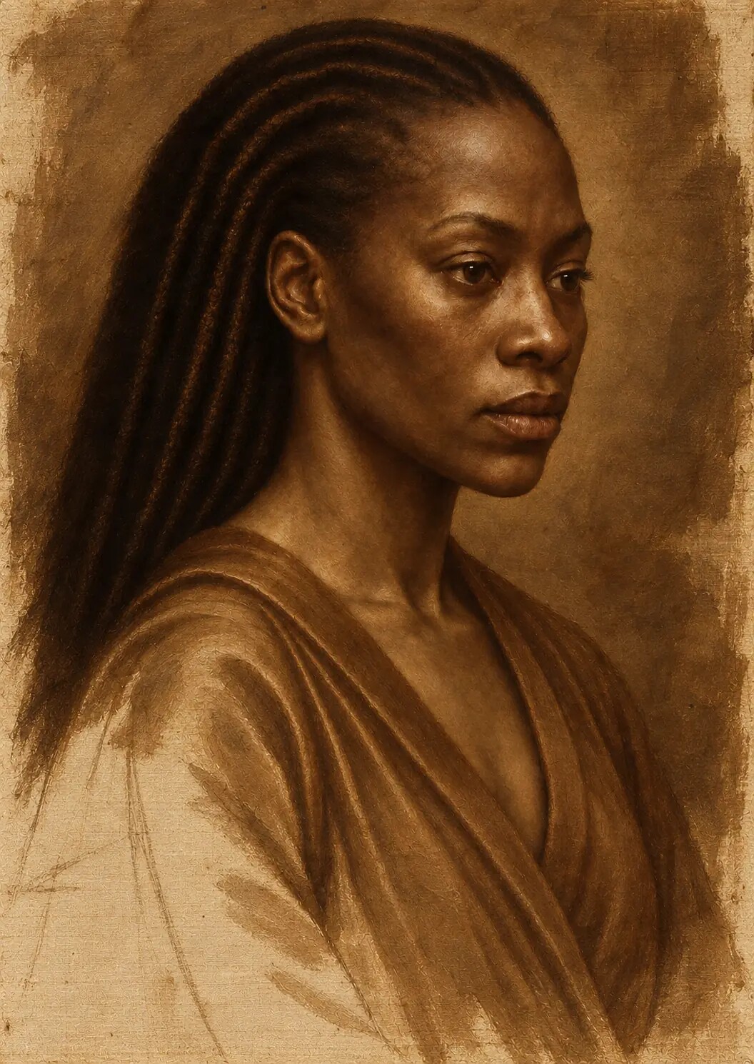
Stage Three The Grisaille and Verdaccio Underpainting
Once the drawing held, I moved into tonal construction.
A grisaille uses a restrained monochromatic range to establish form. Verdaccio refers to a greenish or cool grey underpainting historically associated with modelling flesh in some traditions. In this reconstruction, those ideas were used as related tools rather than rigid formulas. The main purpose was to solve light, volume and spatial hierarchy before full colour complicated the judgement.
This stage revealed whether the portrait actually worked. Colour can conceal structural weakness for a time. A compelling red, gold or blue may distract from a misplaced feature or an incoherent light source. Tonal underpainting removes that protection. The forehead, nose, cheeks, mouth and jaw must turn convincingly through light and shadow. The figure must separate from the background without appearing cut out. The deepest darks must support the composition rather than swallow it.
I organised the image into large value families first. The brightest light was reserved. Halftones described the gradual turning of flesh. Core shadows gave forms weight. Reflected light was kept subordinate so that it did not compete with the primary illumination. Small accents were delayed until the broad architecture could carry them.
Chiaroscuro was treated as composition, not as a dramatic filter. Darkness needed internal temperature and depth. A black region that contains no variation behaves like a hole in a digital file. A painted darkness can contain warm and cool undertones, softened forms, reflected colour and nearly lost edges. It can conceal while still remaining spatially active.
The cool or green-grey undertone beneath the flesh also served a later optical purpose. Warm skin colour placed above it could appear more complex because the warmth was not operating alone. Cooler undertones could remain near the jaw, temples, eye sockets and halftones, while warmer passages developed in the cheeks, lips and illuminated areas. This interaction gave the skin a sense of blood, bone, atmosphere and reflected light rather than a single sampled complexion.
At the end of this stage, the painting was not colourful, but it possessed a body. The light had direction. The face occupied space. The later colour would have something to illuminate.
PROCESS STAGE
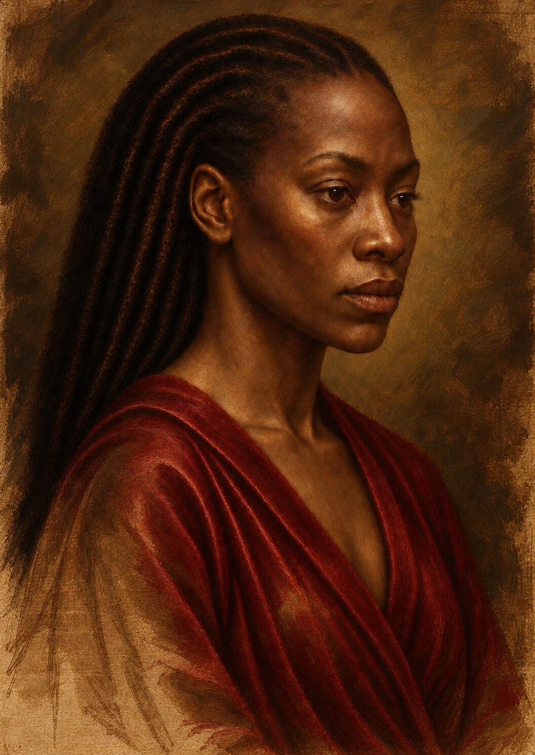
Stage Four The Dead Colour
The first colour pass was deliberately restrained.
This stage is sometimes misunderstood because it can appear less impressive than the underpainting or the final glazed image. Its value lies in preparation. Local colours are introduced, but they are kept quieter, lighter or less saturated than their eventual state. Flesh, hair, fabric, ornament and background begin to separate materially. The relationships between warm and cool areas become clearer. The painting acquires colour without spending all its intensity at once.
I treated the dead-colour layer as a negotiation between the tonal structure and the final palette. If it became too bright, later glazing would produce excessive saturation. If it became too dark, the transparent upper layers would lose light. If it covered the underpainting too completely, the earlier modelling would cease to contribute. The stage therefore required opacity in some passages and deliberate thinness in others.
The skin began with muted warm and cool mixtures rather than a single flesh colour. The background remained deep but was prevented from becoming uniform black. Fabric received its local hue and general fold structure, but its most luminous or reflective qualities were held back. Precious details were placed without their final sparks. The image looked present, yet unfinished.
That unfinished quality was valuable. It preserved room for the later layers to perform real work. The final depth would emerge through accumulation, not through an early attempt to make every region spectacular.
Reconstructing Pigment Behaviour
A colour value on a screen is not the same thing as a pigment suspended in oil. The distinction became one of the most demanding parts of the process.
Traditional pigments vary in opacity, particle size, tinting strength, refractive behaviour and interaction with a binder. A transparent red lake over a pale ground can produce a different sensation from an opaque mixture designed to match the same average red. One allows light to enter the layer, interact with what lies beneath and return to the eye. The other reflects more directly from the surface. Even in a digital simulation, that difference must be represented structurally rather than treated as a change of hue alone.
I worked with visual equivalents rather than false material claims. Lead-white-like passages were conceived as warm, dense and opaque. Ochres and earth colours supplied grounded warmth. Umber-like shadows created depth without the deadness of neutral black. Lake-like reds enriched the lips and selected flesh passages through transparency. Ultramarine and lapis-inspired blues were treated as precious colour events rather than indiscriminate saturation. Gold, silver, pearl and gemstone references required sharply controlled reflections and a clear understanding of the surrounding light.
Black presented a special problem. Digital black is easy to produce and easy to misuse. Historical dark passages often contain layered colour, visible undertones and differences of sheen. In the simulation, the deepest values were built from subtly varied chromatic darks. Some absorbed light; others returned a trace of warmth, coolness or reflected colour. The aim was not to make black less black, but to prevent it from becoming empty.
Granulation and particle behaviour also had to be suggested without turning the surface into noise. Minute irregularities could break a transition or catch light, but they needed to respect scale. A pigment-like texture enlarged beyond plausibility would make the face appear made of stone or sand. The most effective material detail was often the detail that could be felt before it was consciously noticed.
Building Flesh Through Temperature and Form
Flesh is one of the quickest places for a digital painting to reveal its weakness. Smooth tonal gradients can look polished, but skin is not a plastic shell. It is an optically complicated surface stretched over bone, muscle and soft tissue, animated by blood, moisture, hair, pores, reflected colour and changing thickness.
I began with the larger anatomical planes. The forehead turns differently from the cheek. The bridge and wings of the nose catch and lose light at different rates. The mouth sits around the dental arch; it is not a symbol placed on the front of the face. The chin projects and turns. The jaw recedes towards the ear. If those relationships are wrong, no amount of pore detail can rescue the result.
Colour followed structure. Warmer passages were introduced where circulation, thin skin or direct light supported them. Cooler notes remained in selected halftones and receding planes. The areas around the eyes, mouth and nose required greater chromatic sensitivity than broad sections of the forehead or cheek. A small cool transition could make a warm highlight appear more luminous without increasing its brightness.
Surface detail came late and remained subordinate. Pores, faint lines and minute irregularities were varied in scale, orientation and visibility. They softened or disappeared as the form turned away from the focal light. Repetition was removed. Sharpening was concentrated around selected features rather than applied uniformly across the face.
The most difficult judgement concerned finish. A completely smooth passage looked synthetic. An over-textured passage looked diseased, stone-like or mechanically processed. Convincing skin occupied a narrow territory between them. It needed variation, but variation organised by anatomy, light and attention.
The Eye as a Test of the Whole Painting
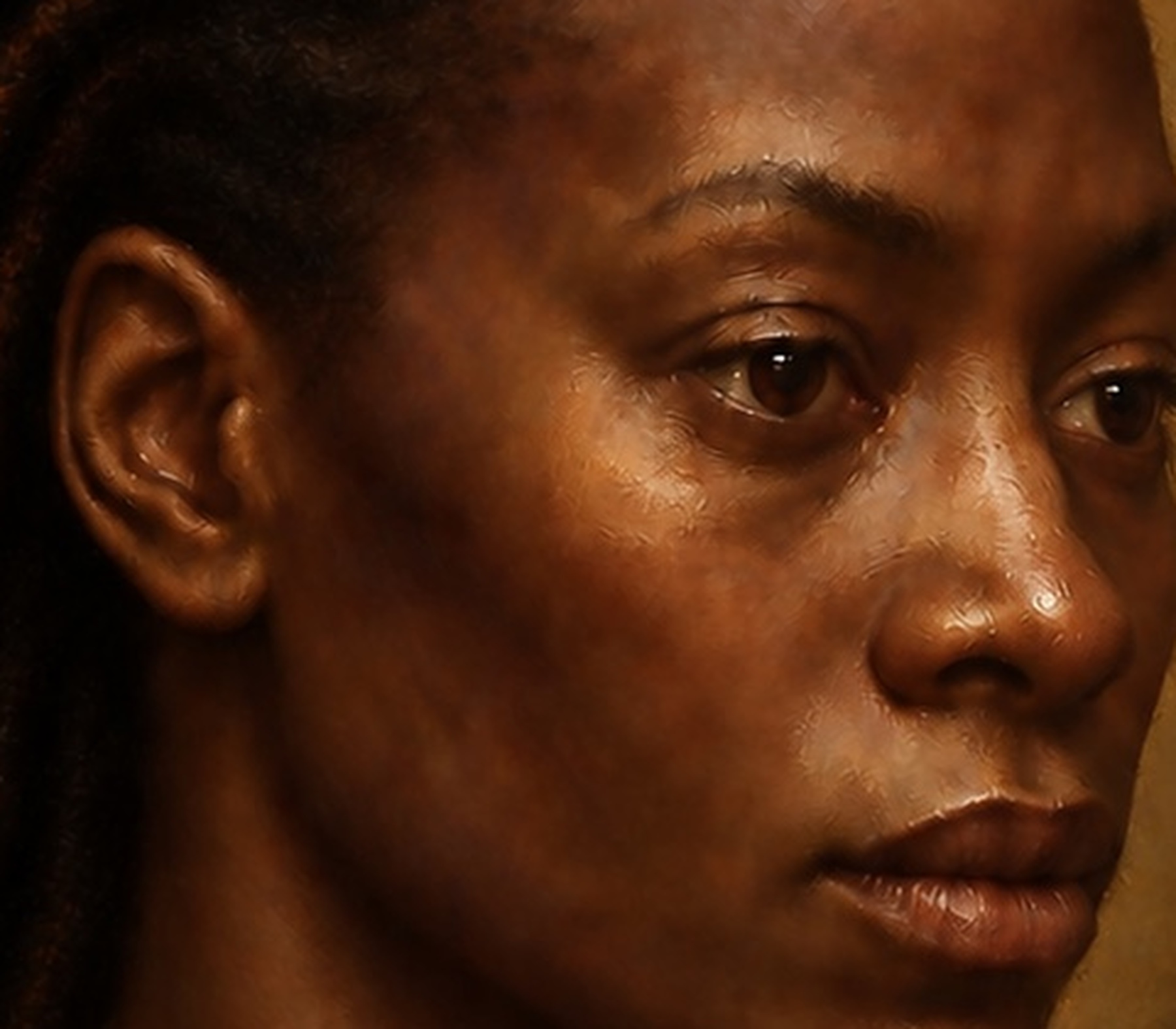
The eye became a concentrated test of every principle in the work.
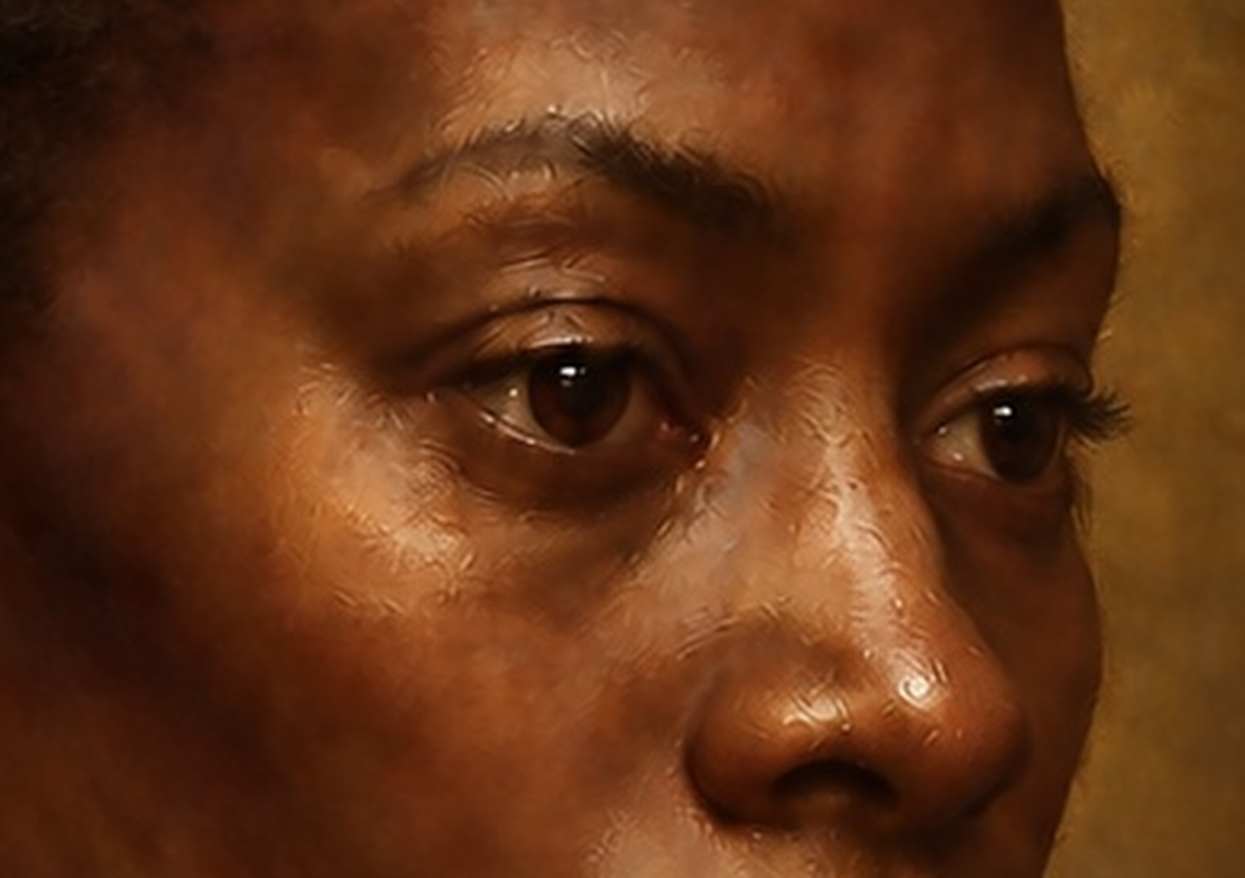
An eye is not a white almond containing a coloured circle. It is a moist sphere held within a socket, partially covered by lids of different thicknesses. The upper lid usually casts a subtle shadow. The visible white changes value and colour as it turns. The iris has depth. The corneal surface catches a reflection, but the reflection must agree with the painting’s illumination. The tear line receives light differently from the surrounding skin.
At first inspection, an eye may appear convincing because humans respond strongly to gaze. Under magnification, however, small failures become severe. Eyelashes may emerge as identical spikes. The highlight may be too white or too large. The iris may appear printed onto the surface. The lower lid may lack thickness. The sclera may be brighter than the skin highlight and detach from the head.
I examined the eye repeatedly at macro and micro scale. The work involved reducing as well as adding. Some lashes needed to merge into groups. The white of the eye needed chromatic variation and shadow. The iris required a darker perimeter, internal modulation and partial concealment by the upper lid without becoming diagrammatic. The brightest reflection had to remain small enough to suggest moisture without turning into a graphic dot.
Edge control was decisive. The focal eye could support a few sharp accents, but not every boundary could be equally crisp. The lids soften as they turn. The socket moves into shadow. The eyebrow breaks into the surrounding flesh. These transitions allowed the eye to belong to the head.
The psychological expression changed with adjustments so small they would be almost invisible elsewhere. A fractionally altered lid, highlight or mouth corner could shift the subject from calm to startled, distant to present. This is why the close-up process was not merely technical. It protected the emotional centre of the painting.
The Mouth and the Problem of Overdefinition
The mouth required the same intensity of examination.
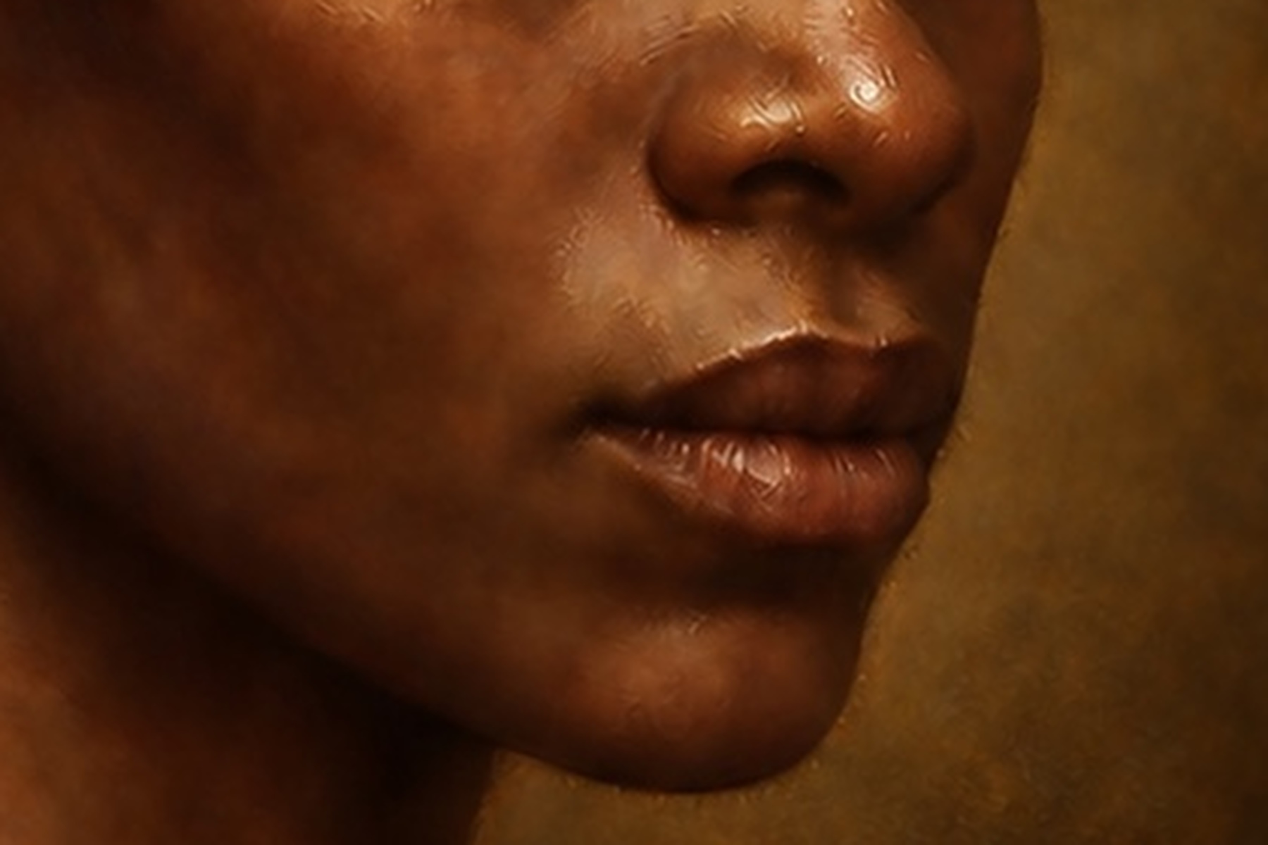
Digital systems often overstate lips. They draw a continuous dark boundary, produce a uniform red surface and place a glossy highlight on top. The result can be attractive at thumbnail scale and unconvincing when enlarged. Real lips are integrated into the muscles and planes around them. Their edges vary. The line between them changes in depth and softness. The corners recede. Colour passes gradually into the surrounding skin.
I treated the mouth as volume before texture. Its position had to agree with the turn of the head and the projection of the muzzle area. The meeting of the lips carried the deepest accent, but that accent could not remain equally dark across the entire width. The upper and lower lips reflected light differently. Warmer and cooler reds were layered rather than flattened into one hue.
Moisture was suggested through restrained highlights and subtle changes of transparency. Tiny vertical structures helped the surface feel organic, but they were softened where the lips turned away. The surrounding skin remained essential. Without the faint transitions above the upper lip, beside the corners and across the chin, the mouth would appear attached rather than grown from the face.
Successive close-ups exposed marks that felt too regular, edges that were too hard and highlights that were too metallic. Each correction moved the mouth away from a polished digital emblem and towards a living part of the portrait. The final micro-inspection did not seek limitless sharpness. It sought continuity between anatomy, colour, moisture and expression.
Hair Cloth and Precious Surfaces
The secondary materials could not be allowed to become secondary in their logic. Hair, clothing, metal and ornament needed distinct responses to the same light.
Hair was constructed as mass before strand. Large dark shapes established volume and direction. Midtones described changes of plane. Only selected strands caught the strongest light. When too many individual hairs were sharpened, the surface resembled wire or engraving. When the masses were preserved and detail emerged selectively, the hair retained weight and softness.
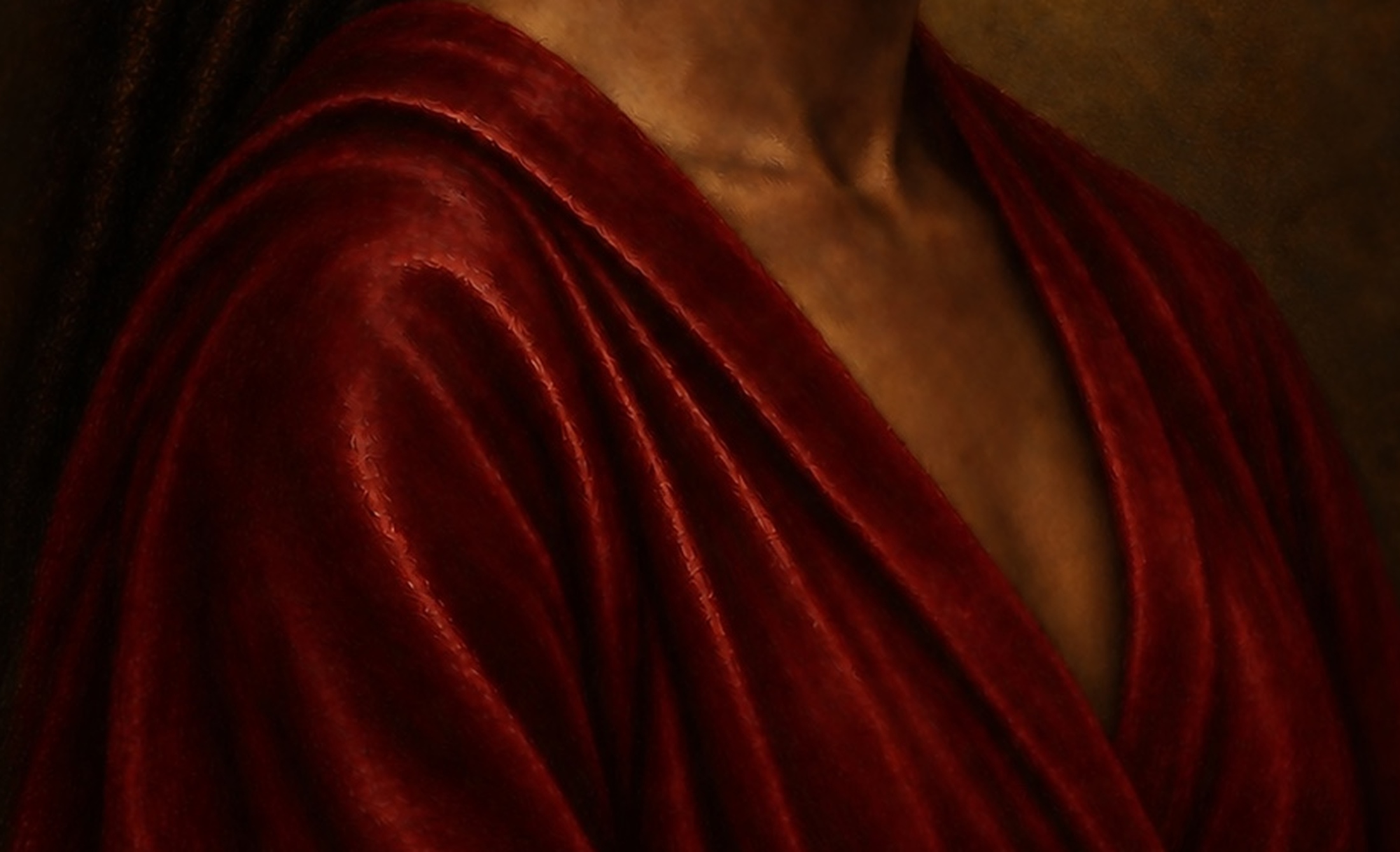
The jacket and clothing required an understanding of tension. Folds originate from support, compression, gravity and movement. Decorative brush marks could not substitute for that structure. Broad passages established weight and direction. Smaller highlights followed ridges or changes in surface angle. Absorbent fabric needed broad, restrained reflections; smoother or satin-like material required narrower, more directional highlights. Texture followed the folds rather than lying across them.
Precious surfaces demanded economy. Gold or polished metal can carry strong contrast within a tiny area, reflecting both the light source and surrounding colours. Pearls produce a softer, more enveloping response. Gemstones may contain internal colour and sharp external reflections. If every ornament received the brightest possible accent, the face would lose authority. I therefore used the strongest material events to support the path of attention.
These distinctions helped the entire painting feel governed by one environment. The same light touched each object, but each object answered in its own way.
PROCESS STAGE
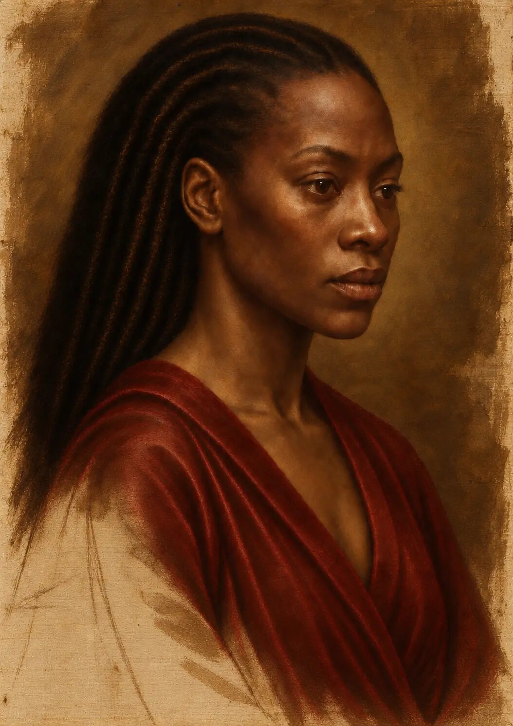
Stage Five Glazing and Scumbling
The fifth stage created much of the painting’s optical depth.
The National Gallery describes a glaze as a transparent or translucent film that modifies a colour beneath it without obscuring it. It also distinguishes a scumble as a thin, lighter layer over a darker colour. That distinction became extremely useful in the digital reconstruction.
Glazing allowed shadows and colour to deepen while preserving earlier modelling. A warm transparent passage could enrich flesh without covering the cool structure beneath it. A dark chromatic glaze could increase the depth of a background without replacing it with flat black. Reds, blues and jewel tones could gain intensity gradually. Variations in the apparent thickness of the glaze helped create tonal movement and the suggestion of relief.
The simulation needed more than reduced opacity. A uniform transparent layer looks like tinted glass. Oil glaze has viscosity, accumulation, brush boundaries and a relationship with the absorbency and texture below. In the digital painting, glazed colour was therefore allowed to gather selectively, thin across raised-looking areas and remain uneven at a microscopic scale. Those differences were restrained enough to preserve the image, but present enough to avoid a sterile filter.
Scumbling worked in the opposite optical direction. Pale, semi-opaque colour moved across darker passages, catching the imagined texture beneath it. It softened transitions, created atmospheric bloom and returned broken light to flesh, fabric and background. A scumble was not simply a brighter version of the underlying area. Its broken opacity suggested that light was sitting nearer the surface.
The alternation between transparency and opacity became more important than either technique alone. Transparent shadow beside opaque light created depth. A smooth glaze beside a broken scumble created surface variety. Thin passages allowed the ground and underpainting to participate; thicker accents asserted the upper surface. This orchestration is one reason layered oil paintings can feel internally illuminated. The light appears to meet different depths within the image.
Brushwork as Structural Evidence
Brushwork needed to appear as the record of decisions, not as decoration.
The direction of a stroke can describe a form. Curved marks can turn around a cheek or forehead. A firmer edge can clarify the bridge of a nose. Broken diagonal movement can articulate a fold. A broad, soft passage can allow the background to recede. A fine mark can catch a hair, eyelid or piece of ornament. The value of the stroke lies in what it explains.
Random painterly filters fail because they distribute signs of painting without understanding the objects beneath them. A stroke may cross from skin into background without changing behaviour. A canvas ridge may remain equally strong beneath thin and thick paint. A palette-knife effect may appear on a delicate eyelid. The surface says “paint”, but the form says nothing.
I used a hierarchy of simulated handling. Broad marks supported early blocking. More directional strokes modelled anatomy and cloth. Soft blended passages controlled transitions. Dry-brush-like and broken marks introduced surface vibration. Fine brushwork resolved the eyes, mouth, hair and ornament. Loaded highlights were limited to places where a thicker physical accent would plausibly catch light.
Earlier marks were sometimes allowed to remain partially visible. Others were buried by later work. This created a surface with temporal depth. The viewer may not identify the sequence consciously, but the image feels less instantaneous because different decisions occupy different apparent levels.
Simulated Thickness and Relief
The National Gallery defines impasto as paint built up heavily enough for brush or palette-knife marks to remain evident. Such paint reflects light noticeably, which is why painters have often used it in highlights and jewellery. A digital image cannot reproduce the changing physical reflection of genuine relief on its own. It can, however, describe the visual conditions associated with thickness.
In the simulation, shadows generally remained thinner. Their surfaces were quieter and more transparent. Flesh lights became more opaque. The brightest accents suggested a slight build-up of material, with small ridges and changes of sheen. Ornament could support sharper relief. The background remained comparatively subdued.
The distribution mattered more than the amount. If the same heavy texture covered the entire image, nothing would appear thick. Relief becomes legible through contrast with thinner passages. It also belongs to a hierarchy: a glint on the eye, a light on the lower lip, an edge of jewellery or a selected fold may carry more apparent body than an adjacent shadow.
This visual impasto must be distinguished from physical depth in the final print. A conventional giclée or C-type print remains largely flat. Its image can represent ridges, but those ridges will not cast new shadows as the viewer moves. Raised-texture and UV processes could translate selected depth into material relief in future editions, but that would be a further interpretive stage rather than proof that the original digital master contained physical paint.
PROCESS STAGE
Stage Six Final Detail and Unification
The final stage was not a general instruction to add more detail. It was a process of deciding what the painting could now afford to reveal.
I returned to anatomy, proportion and the large tonal masses before committing to the smallest accents. Colour temperature was adjusted across the face. Some shadows were deepened; others required reflected light to prevent them from closing. Details that had become isolated were softened into their surroundings. Lost drawing was recovered where structure had weakened. Excessive sharpness was reduced.
The focal hierarchy determined the finish. The eyes and mouth could sustain close attention, but the rest of the image needed degrees of completion. A viewer should be guided through the work rather than confronted by every thread, pore and reflection at equal intensity. Selected edges were sharpened. Others were allowed to dissolve. Quiet regions gave the detailed passages room to breathe.
Unifying colour was then used to bring separate areas into the same atmosphere. A subtle warm or cool influence could connect flesh, clothing and background without making them identical. Dark accents were checked across the whole composition. Highlights were compared, not judged in isolation. The brightest note had to remain the brightest for a reason.
At this stage, I repeatedly moved away from the image. A macro correction can improve a lip while damaging the face. A beautiful eye can become too prominent. A textured jacket can begin to compete with the subject. The painting had to survive the return from detail to totality.
The Simulated Varnished Surface
Traditional varnish changes both the protection and appearance of a painting. The National Gallery explains that varnish creates a more uniform surface for reflected light and can impart gloss, while also noting that varnishes may darken or discolour over time.
The digital master required an optical equivalent, not a literal coating. The final surface needed to deepen selected darks, restore the apparent saturation of glazed passages and bring the different paint behaviours into a coherent viewing field. At the same time, it could not create a uniform plastic sheen.
Gloss was therefore varied. Moist eyes and lips, polished ornament and denser-looking glaze could return sharper reflections. Skin retained a subtler response. Broken or scumbled areas remained comparatively diffuse. The final surface connected the painting while preserving material differences.
I avoided exaggerated yellowing and indiscriminate cracking. Age can produce visual complexity, but false ageing is a shortcut that often weakens a contemporary work. A heavily distressed overlay does not make an image historically intelligent. It merely makes it look processed. The aim was to evoke a mature painted surface while preserving the luminosity and colour of a newly completed work.
Testing the Painting at Five Scales
The painting was assessed at five practical scales: the complete composition, normal viewing distance, a portrait crop, macro detail and micro detail.
Each scale asked a different question.
The complete composition tested balance, hierarchy and emotional presence. Normal viewing distance tested whether the subject arrived before the technique. The portrait crop revealed anatomy, modelling and edge control. Macro views exposed brushwork, material transitions and repeated patterns. Micro views tested the smallest structures of the eye, lips and surface.
This method challenged the common assumption that enlargement is mainly a search for more detail. At extreme scale, the most important task is often subtraction. A repeated pore must be broken. A false eyelash must be removed. A highlight must be made less perfect. A sharp boundary must be softened. A texture that looked convincing at one scale may reveal itself as an overlay at another.
I used several questions consistently:
- Does this mark describe the form or merely decorate it?
- Does the texture belong to the material beneath it?
- Is the scale of the weave or brushwork plausible?
- Does the highlight agree with the established light source?
- Is the darkness spatially active or digitally empty?
- Has the image become uniformly sharp?
- Do small irregularities look organic or repeated?
- Does the focal hierarchy survive magnification?
- When I return to the complete image, has the correction strengthened the painting?
The close-up studies of the eye and mouth became documents of this process. They showed that credibility is cumulative. No single pore, lash, crack or stroke proves that an image is painted. The sense of material truth emerges when thousands of small relationships agree.
Removing the Signs of Digital Artificiality
Digital artificiality does not have one appearance. It often emerges through inconsistency.
Skin may be highly detailed but anatomically vague. Brushwork may be expressive but unrelated to volume. A reflection may be attractive but impossible under the established light. The weave may be accurate in isolation but far too large for the size of the portrait. Cracks may cross the eye, skin, cloth and background with identical width and contrast. Shadows may contain no colour. Every edge may be equally finished.
I treated these signs as categories of failure rather than isolated blemishes.
Uniform smoothness required variation organised by form. Repeated detail required interruption and changes of scale. False reflections required a return to the light source and surface angle. Overdefined features required softer boundaries and stronger integration with surrounding flesh. Decorative texture required rebuilding so that marks followed anatomy, cloth or atmosphere. Empty black required layered chromatic darkness. Excessive sharpness required a deliberate hierarchy of edges.
This distinction helped prevent endless cosmetic correction. If several defects shared one cause, the cause had to be addressed. Adding more texture to artificial skin would not solve the problem if the anatomy beneath it remained weak. Sharpening an eye would not make it convincing if the lids did not wrap around the sphere. A more elaborate canvas effect would not help if it ignored paint thickness.
The painting improved whenever the correction returned to structure.
Ageing Without Counterfeit History
The visual language of Old Master painting is inseparable from time. Many paintings now appear through aged varnish, abrasion, increased transparency, craquelure, restoration and changes in pigment. Yet those effects do not necessarily represent the artist’s original intention.
That raised an ethical and aesthetic question. How much age should a contemporary digital painting simulate?
My answer was restraint. Slight surface variation, gentle tonal settling and occasional evidence of layered revision could help the work feel materially complex. A faint line might suggest buried drawing. A small irregularity could interrupt perfect smoothness. The apparent varnish could unify the surface without producing a heavy amber cast.
What I avoided was the indiscriminate manufacture of antiquity. Random cracks spread across every material would make the work look like a reproduction filter. Excessive yellowing would reduce the carefully built colour. Artificial damage would claim a history the object has not lived.
The painting belongs to the present. Its relationship with the Renaissance is methodological and imaginative, not archaeological. It uses historical intelligence to create a contemporary object. It does not need to pretend that it has survived five hundred years.
From the Screen to the Fine Art Print
The digital master is only one state of the work. A physical edition introduces a new support, new colour behaviour and a new relationship with light. Printing is therefore part of the artistic interpretation.
Before proofing, the master file must be examined for resolution, tonal range, colour transitions and artefacts. Highlights and shadows need enough information to survive translation. Deep blacks that remain differentiated on an illuminated display may merge when printed. Subtle skin transitions may shift according to the paper white, surface texture and viewing light. Sharpening appropriate for a screen may become brittle in print.
Critical crops are essential. The eye, lips, skin, jacket and darkest passages should be printed at intended scale. These proofs reveal whether the simulated weave is too strong, whether micro-detail survives, whether the black contains separation and whether colour has moved away from the master.
Giclée printing offers a strong route when the paper is intended to participate visibly in the work. A warm or textured fine-art sheet can support painterly character and soften the boundary between printed image and physical surface. Cotton rag, German Etching-style papers, bamboo papers and other tactile stocks each interpret the digital painting differently. Their whites, fibres and coatings alter colour, contrast and apparent depth.
C-type printing offers another interpretation. Its smoother surface can support highly resolved facial modelling, cinematic light, saturated colour and deep blacks. Pearl, semi-gloss or photographic surfaces can strengthen the contemporary dimension of the work, creating a deliberate tension between Renaissance-inspired composition and modern optical finish.
Neither route is neutral. The correct choice depends on what the edition should emphasise. A textured paper may bring the image towards drawing and traditional printmaking. A smooth or pearl surface may heighten luminosity and polish. A baryta-like finish may hold rich darks while retaining a fine-art presence. Proofing allows those decisions to be made in relation to the actual painting rather than through general assumptions about which paper is “best”.
The digital origin should be translated, not disguised. The final print can possess physical beauty, archival quality and painterly depth without claiming that ink is oil pigment. Its integrity comes from the care with which one medium has been carried into another.
What the Digital Studio Can and Cannot Reproduce
Digital reconstruction has real strengths. It permits non-destructive comparison, extreme magnification, local correction, controlled variations of colour temperature and multiple print interpretations. It allows the artist to study the consequences of rare, unstable or hazardous historical materials without physically using them. It can combine the precision of high-resolution image making with the visual depth of layered painting logic.
It also has clear limits.
A screen emits light; a painting and print reflect it. Actual oil films possess depth, refractive properties and surface variation that change as the viewer moves. Physical impasto casts changing shadows. Pigment particles remain suspended in a binder. Drying, sinking, yellowing and cracking happen through chemistry and time. The resistance of a brush against a surface affects the mark. The smell, weight and duration of wet painting belong to the physical practice.
The digital master does not reproduce those events materially. It represents some of their visible consequences from a chosen viewpoint. Even a raised-texture print would be a new physical interpretation, not a conversion of pixels into historical paint.
Acknowledging these limits does not diminish the work. It locates its achievement accurately. The project asks how deeply one medium can learn from another while remaining honest about the difference.
Is It Still a Painting
The word “painting” can refer to a material object, a visual language, a method of constructing an image or a field of artistic practice. This work sits inside that complexity.
It is not an oil painting in the literal material sense because no oil paint forms the digital master. It is a digital painting built through the study and simulation of oil-paint processes. Its composition, tonal structure, colour, edges, brushwork and surfaces were developed through painterly decisions. Its six stages borrow their discipline from historical workshop practice. Its final form remains native to contemporary digital production and fine-art printing.
For me, precise language strengthens rather than weakens the work. There is no need to disguise the medium. The artistic challenge lies in showing what sustained direction, historical study and close judgement can produce within it.
The question then shifts. Instead of asking whether a digital image can pass as a physically painted antique, we can ask what painting knowledge becomes possible when the digital studio takes historical craft seriously. We can ask how drawing, glazing, scumbling, tonal organisation and material differentiation can inform new work. We can ask what happens when the artist can move between the whole image and microscopic inspection without surrendering either scale.
Those questions are more interesting than imitation. They open a field of practice.
Authorship Beyond the Prompt
The finished work did not emerge from a single instruction. It developed through a chain of choices: the conception of the image, the historical research, the selection and rejection of references, the ordering of stages, the control of composition, the correction of anatomy, the testing of light, the simulation of materials, the inspection of details, the integration of revised passages, the preparation of the master file and the interpretation of that file in print.
AI contributed to the generation and reconstruction of visual material within that chain. It offered speed, variation and a capacity to test complex combinations. It also introduced errors, inconsistencies and seductive surfaces that could not be accepted without scrutiny.
The artist’s responsibility did not disappear when the tool became powerful. It increased. Greater generative capability creates more possible images, but possibility is not intention. A system may produce an impressive face that belongs to the wrong emotional world. It may create convincing cloth under an impossible light. It may solve one detail while disturbing identity or proportion elsewhere. Every proposal must therefore be judged in relation to the work, not merely admired for its local effect.
Authorship resides in this continuity of responsibility. I determined what the painting was trying to become. I established the standards it had to meet. I decided which changes served the subject and which changes only displayed the tool. I gave final approval.
This does not reproduce the exact labour of a fifteenth- or sixteenth-century workshop, nor should it claim to. It is a contemporary form of studio labour: visual, intellectual, iterative and technically mediated. Its craft lies in the quality of control.
What the Old Methods Changed in the New Work
The six-stage reconstruction changed more than the surface appearance of the painting. It changed the order of thought.
Beginning with a support made texture relational rather than decorative. Drawing before colour made proportion and anatomy accountable. Tonal underpainting made light structural. Dead colour created restraint. Glazing and scumbling made opacity and transparency active choices. Final detailing became a matter of hierarchy rather than accumulation. Simulated varnish became an exercise in surface cohesion rather than an ageing effect.
The historical method also introduced patience into a medium associated with speed. Each stage imposed a different standard. A passage that succeeded as drawing might fail as volume. A successful underpainting might be weakened by colour. A beautiful glaze might destroy a focal edge. A convincing macro detail might damage the composition when returned to full scale.
This constant movement between states produced a more deliberate image. It prevented the tool from setting the pace of the artwork. The painting proceeded according to the needs of the painting.
The most important lesson was that Old Master depth is not one thing. It does not come from dark backgrounds alone, nor from cracked varnish, warm colour, dramatic lighting or visible strokes. It comes from relationships: between support and ground, line and mass, transparency and opacity, sharpness and softness, finish and restraint, surface and depth. When those relationships are understood, historical technique becomes a living resource rather than a costume.
A Contemporary Renaissance Practice
The Renaissance is often treated as a closed historical period, admired through masterpieces that appear complete and inevitable. Yet its continuing relevance lies partly in its appetite for enquiry. Art, anatomy, optics, material experiment, symbolism and technical invention met inside the same culture of making.
A contemporary Renaissance practice cannot repeat that world. It can, however, recover the seriousness with which visual problems were investigated. New tools can be used to accelerate production, but they can also be used to slow down perception: to inspect how a shadow turns, how a colour changes through layers, how a face holds attention and how a material declares itself through light.
That is the territory this painting occupies. Historical knowledge gives the process discipline. Digital methods provide a new field of control. AI expands the range of material that can be tested. Fine-art printing returns the image to a physical encounter. The artist holds these elements together through judgement.
The result is neither an untouched machine output nor a counterfeit Old Master. It is a contemporary digital painting formed through an extended conversation with the craft of oil painting.
The Image Beneath the Image
When the painting is complete, most of its making is no longer directly visible. The linen is largely buried. The ground survives as light travelling through later colour. The drawing remains only in fragments or in the certainty of a contour. The cool underpainting lives beneath the warmth of the flesh. Dead colour supports saturation that arrived later. Glazes deepen the shadows. Scumbles return light to the surface. Fine marks gather around the eyes and mouth. The final optical layer draws the parts into one field.
That hidden accumulation gives the image its authority.
The purpose of the simulation was never to add a convincing texture at the end. It was to build a history into the surface. Each visible passage had to feel connected to something beneath it. Each refinement had to survive both intimate inspection and the return to the whole.
The finished painting therefore carries two kinds of time. It refers to the long history of Renaissance and early oil-paint practice, and it records the contemporary time spent testing, rejecting, correcting and looking again. Technology made the reconstruction possible, but attention gave it coherence.
What remains is an image that openly belongs to the digital age while carrying the visual memory of linen, drawing, earth colour, translucent glaze, broken light and the searching hand of the painter. That is where the work finds its meaning: not in pretending that the past has been recovered unchanged, but in allowing historical craft to become active inside a new form of artistic practice.
TECHNICAL REFERENCES
Historical language, contemporary practice
This article describes a digital and AI-assisted painting process directed and approved by Jabbi Delahaye. It simulates selected visual behaviours associated with historical oil painting; it does not claim that physical oil pigment was applied in creating the digital master.