ARTICLE SIX · OPTICAL LAYERING
Between Surface and Depth
How glazing, scumbling and alternating opacity created the optical depth of simulated oil paint.
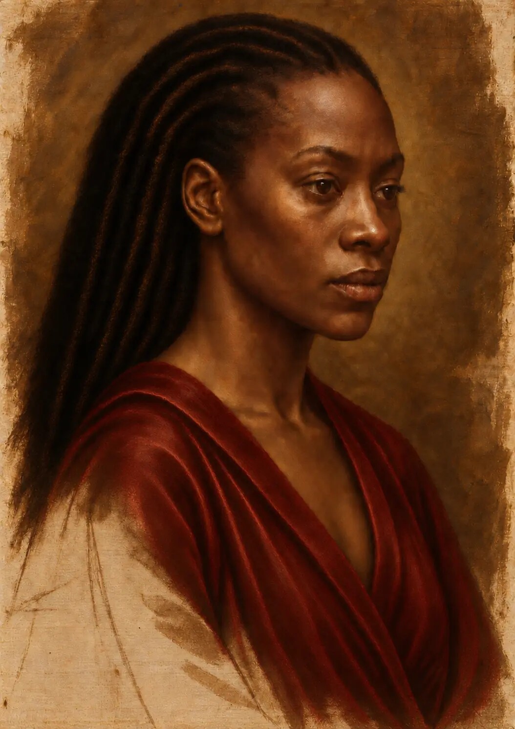
After drawing, tonal underpainting and dead colour had established the portrait, the next task was to decide where colour should appear to sit—and where the eye should seem to travel through it.
In this sixth article accompanying Painting Without Wet Paint, I examine glazing, scumbling, alternating opacity, microscopic refinement and the translation of simulated oil-paint depth into a physical fine-art print.
The painting had already acquired its structure.
The prepared ground had established a material beginning. The underdrawing had located the figure and preserved the evidence of searching. Grisaille and verdaccio had organised the light. Dead colour had given flesh, fabric, hair, ornament and surrounding darkness their first chromatic identities.
Yet the portrait still felt comparatively direct.
Colour sat upon the image, but it did not yet seem to extend through it. The face possessed volume, the garment carried weight and the main contrasts were secure, but the optical sensation associated with layered oil painting—the feeling that light had entered one film, encountered another and returned altered—had not been fully established.
This was the task of glazing and scumbling.
They were not decorative effects added after the important work was complete. They changed the relationship between surface and depth. A glaze could deepen colour while allowing earlier modelling to remain active. A scumble could return pale, broken light to a darker passage without covering it completely. Alternating transparent, translucent and opaque layers could make the viewer's eye stop at one area, travel through another and hesitate between the two.
In the physical tradition, these effects belong to paint films, pigments, binders and the behaviour of light inside matter. In the digital studio, none of that material action existed literally. It had to be reconstructed as a visual logic.
The question was no longer simply what colour a passage should be.
The question became: where should the colour seem to live?
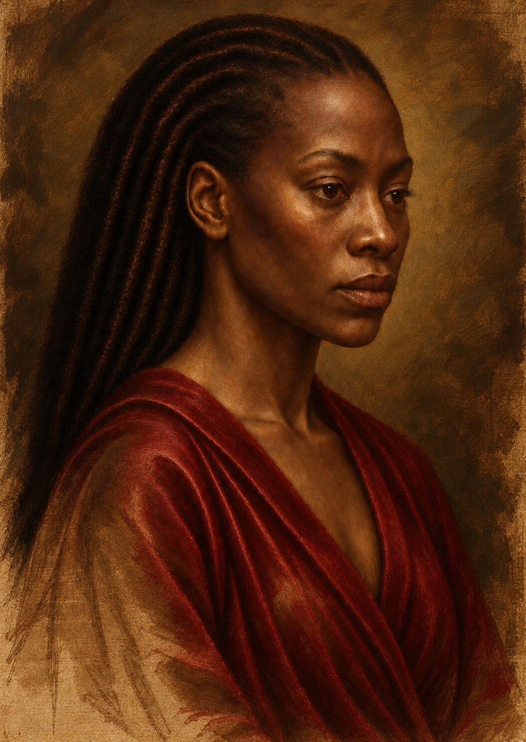
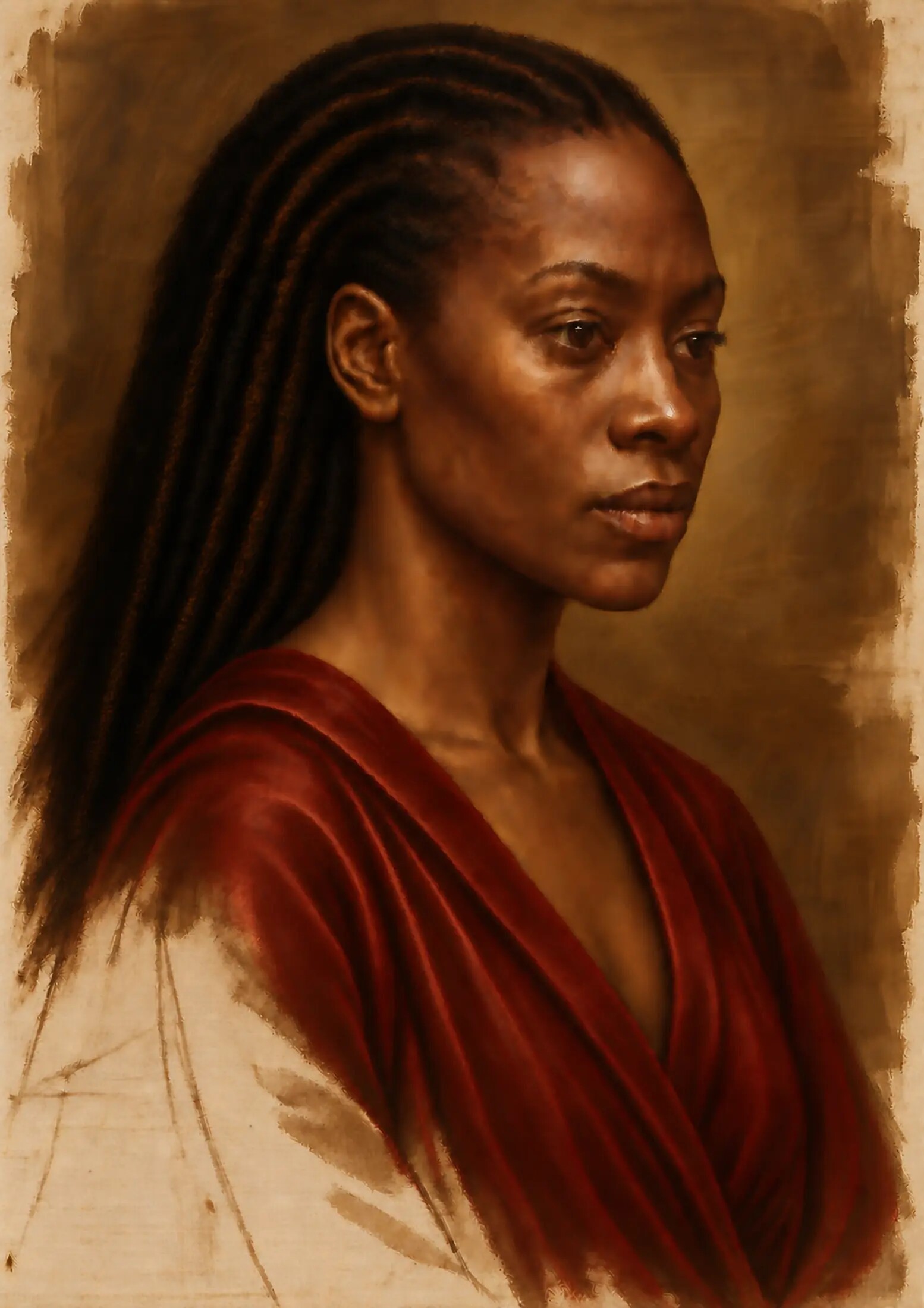
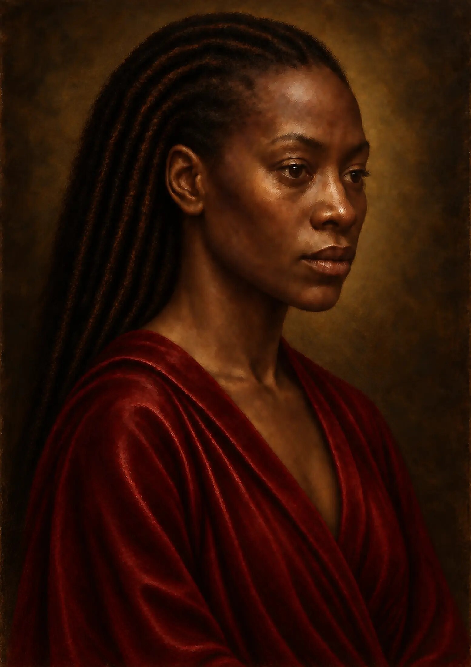
A painting can hold more than one depth
We often speak of a painting's depth as though it were one thing.
There is perspectival depth: the apparent distance between foreground and background. There is volumetric depth: the sense that a cheek turns, a shoulder projects or a fold recedes. There is atmospheric depth: the gradual loss of clarity and contrast that allows space to breathe.
Layered oil painting introduces another kind.
Optical depth occurs when the visible colour appears to result from more than one physical or perceptual level. Light does not seem merely to bounce from a single coloured surface. It appears to enter a translucent film, meet a lighter or differently coloured layer beneath it and return through the upper film changed.
The effect is not measurable by hue alone.
An opaque mixture can be adjusted until its average colour resembles a glazed passage. Yet the two can still feel different. The opaque mixture tends to declare itself at the surface. The glazed passage can appear more internally illuminated because the lower layer continues to participate in what the viewer sees.
This distinction was central to the portrait.
The painting needed areas of firm surface—opaque light, decisive accents, material highlights—but it also needed passages in which colour seemed to accumulate through depth. The face could not be uniformly dense. The crimson garment could not be solved by one saturated red. The surrounding black could not become a flat digital absence.
Different passages required different optical distances.
What a glaze does
A glaze is generally a transparent or translucent layer applied over another colour. The lower colour remains visible but is modified by the film above it. Varying the glaze changes colour, tone and the illusion of relief without necessarily destroying the modelling already established.
In physical oil painting, the result depends upon the pigment, its concentration, the medium, the thickness and evenness of the film, the absorbency and colour of the layer beneath it, and the condition of the surface. A transparent red over a pale underlayer behaves differently from the same red over a dark one. A warm brown over a cool preparation does not simply replace the coolness; the two act together.
The digital reconstruction treated glazing as cumulative modification rather than transparent colour placed indiscriminately across the whole image.
Each glaze had to answer three questions:
- What useful information already exists beneath this passage?
- What should the new layer deepen, warm, cool or unify?
- How much of the underlayer must remain visible for the effect to retain depth?
If the glaze became too strong, it behaved like a filter. The portrait looked tinted rather than painted. If it was too uniform, separate materials lost their identities. If it darkened every area equally, form collapsed. If it intensified colour without regard to light, saturation replaced structure.
A successful glaze did less than its name might suggest.
It altered the image while preserving the reasons the earlier layers were there.
Glazing is not a transparent wash over everything
Digital tools make global effects dangerously easy.
A colour layer can be spread across the whole image in seconds. A blend mode can create immediate richness. Contrast can be intensified and shadows can be pushed towards a cinematic unity. The first impression may be persuasive.
But a painting is not improved simply because every colour has been pulled towards the same atmosphere.
The portrait contained flesh, cloth, hair, metal, pearl-like and jewel-like detail. Each responded differently to colour and light. A single global glaze risked making the skin too red, the whites of the eyes too warm, the gold too dull and the black background too chromatic. It could also reinforce digital smoothness by applying the same mathematical relationship everywhere.
The work therefore required local glazing.
Some warm films were restricted to the cheeks, lips and selected illuminated flesh. Cooler, quieter colour entered the turning planes, temples and shadowed side of the face. Red was accumulated in the garment according to the direction and depth of its folds. Brown-black and blue-black were balanced in the background so that it remained dark without becoming empty.
The glaze followed anatomy, material and light.
It did not merely follow the edge of an object.
Dark skin is not one dark colour
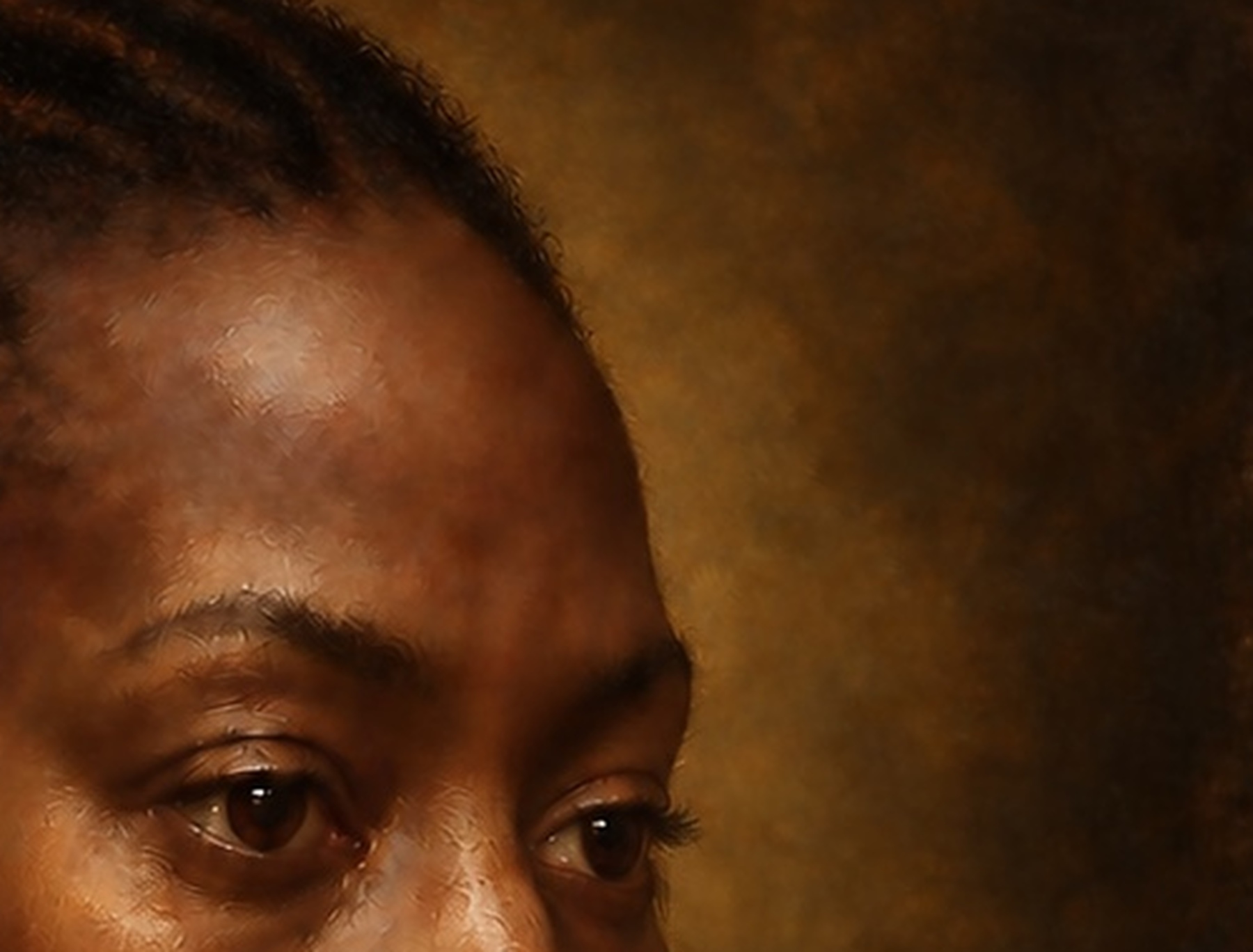
The face was the most demanding area because darker skin can be damaged by the very techniques intended to make it luminous.
One failure is over-lightening. Highlights are expanded or filled with pale colour until the skin loses its tonal identity. Light becomes bleaching rather than illumination.
Another failure is uniform darkness. The complexion is compressed into a narrow brown range, and the subtle changes in temperature, reflectivity, blood flow and underlying structure disappear.
Glazing offered a way to deepen the skin without simply lowering its value.
Warm transparent colour could gather across the cheek, forehead and blood-rich areas. Cooler violet, olive and blue-black tendencies could remain active in the halftones and shadows. Earth colour connected the face to the prepared ground. Minute shifts around the eyes, mouth and jaw kept the complexion responsive to anatomy rather than turning it into a polished shell.
The aim was not to make the skin glow as a special effect.
It was to show that dark skin already contains complex relationships with light.
Some light is reflected directly. Some appears softened by the surface. Some is shaped by oil, moisture and texture. Some arrives from neighbouring fabric or atmosphere. Some forms a sharp highlight; much of it moves through gradual changes that cannot be reduced to a bright edge.
The glazes intensified this complexity while protecting the underlying tonal architecture.
Darkness retained colour. Light retained belonging.
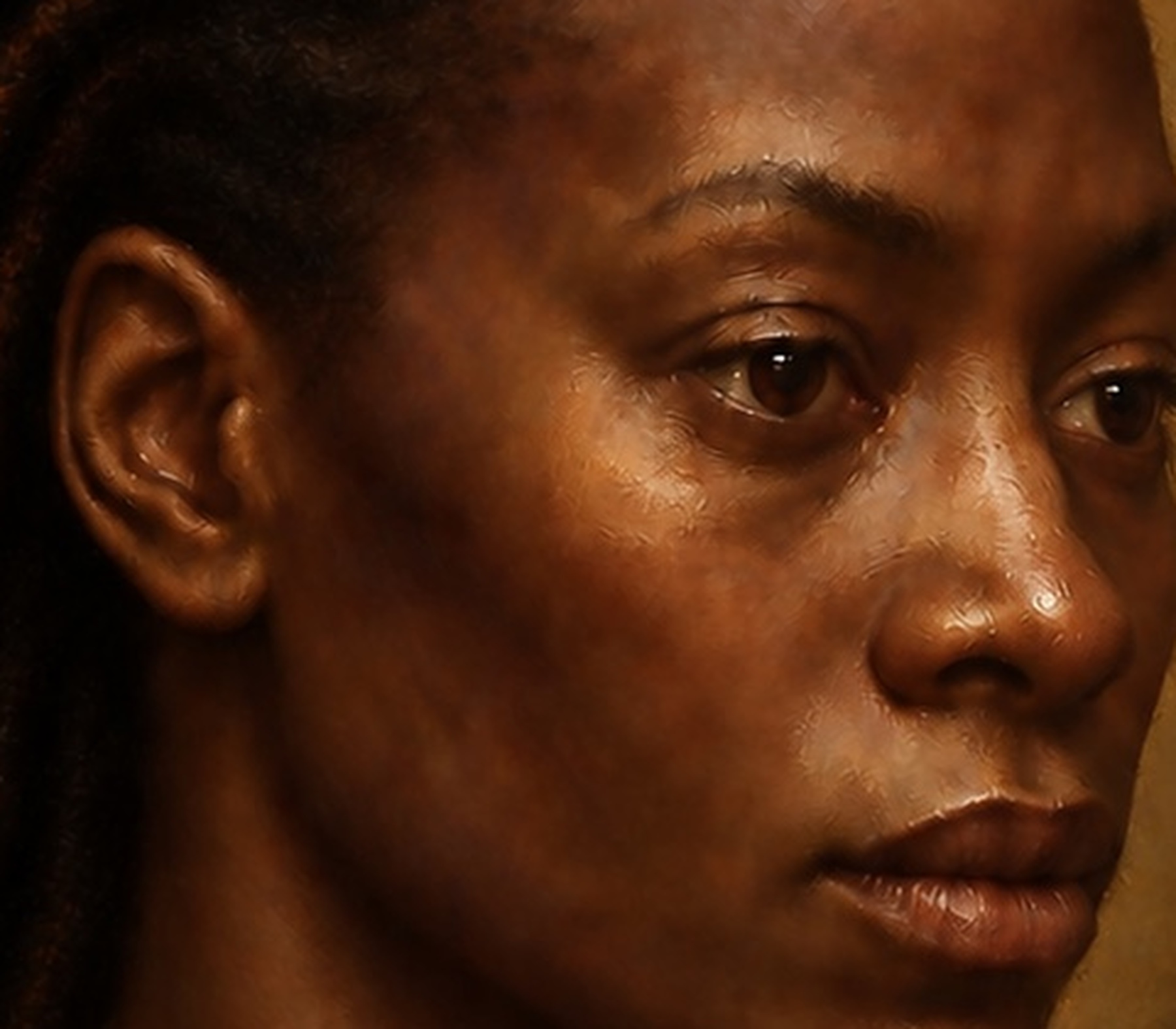
Scumbling brings light back across the surface
If glazing carries the eye down through colour, scumbling can bring it back towards the surface.
A scumble is a thinly applied layer lighter than the colour beneath it. Unlike a glaze, its translucency may arise largely from the thin, broken application of a comparatively opaque mixture. The lower layer remains visible through gaps and variations in the upper film.
The effect can resemble light catching the uppermost points of a textured surface.
In the portrait, scumbling was simulated selectively across the forehead, cheek, lower face, garment and smaller ornamental passages. It softened transitions that had become too abrupt. It cooled selected areas without replacing the warmth beneath them. It suggested the bloom of light across flesh and the broken response of fabric to illumination.
This was not digital fog.
Blur would have removed information indiscriminately. A pale overlay would have lifted values without explaining why. Scumbling had to remain attached to form and imagined surface.
Across the cheek, it followed the broad plane receiving light. Around the mouth, it was restrained so that the lips retained their moisture and projection. Across the garment, it broke according to the folds rather than settling as a uniform haze. Near the brightest accents, it prepared a softer field from which a small opaque highlight could emerge.
The scumble did not make the image uniformly lighter.
It made light appear to encounter the surface.
Alternating opacity creates rhythm
Glazing and scumbling became most convincing when they were not treated as two final effects performed once each.
The portrait developed through alternation.
A transparent layer deepened colour. A lighter broken layer recovered atmosphere. An opaque correction restored a plane that had become weak. Another glaze rejoined the correction to its surroundings. A small highlight stopped the eye at the surface. A softer film beside it allowed the eye to travel inward again.
This sequence created rhythm between covering and revealing.
Opacity was used where the painting needed physical authority: the lit ridge of a form, the body of the garment, the sharp turn of an ornament, the small wet light on an eye or lip. Transparency was used where colour needed to accumulate without erasing structure. Translucency mediated between the two.
The surface became varied because the viewer was not asked to look through every passage in the same way.
This is one reason a convincing painted illusion cannot be produced by adding texture at the end. Texture alone describes irregularity. Optical layering describes a history of decisions.
The image needed to appear as though some marks had been covered, some preserved and some allowed to return through later films.
The eyes must belong to the paint
The eye is a natural focal point, and digital imagery often exaggerates it.
Sharp lashes, bright catchlights, glass-like pupils and high local contrast can create immediate attention. Yet if every part of the eye is equally defined, it no longer belongs to the softer, layered world of the portrait. It can appear inserted after the painting was complete.
Glazing helped the eyes settle into the face.
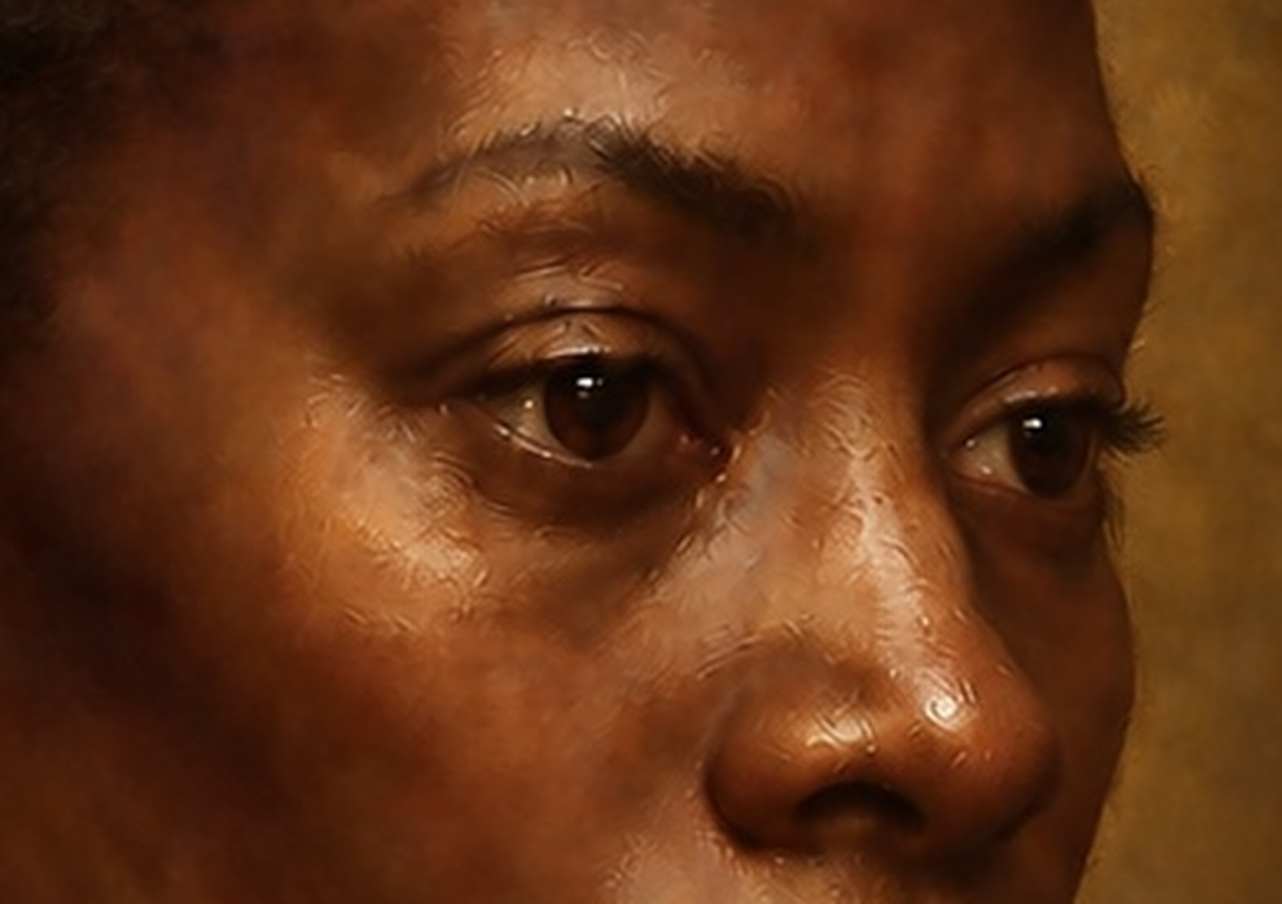
Warmth at the lid margins connected them to surrounding skin. Cool, transparent darkness deepened the upper lid and pupil without producing a flat black mark. The whites remained muted and curved, receiving the same directional illumination as the rest of the head.
Scumbling softened selected transitions around the socket and lower lid. Opaque light was reserved for the smallest reflective points.
The highlight was not used to manufacture life.
It worked because the globe, lids, socket and neighbouring flesh had already created the conditions for reflection.
At close inspection, the eye needed both precision and incompleteness. Some boundaries were firm; others dissolved. The catchlight was exact; the moisture around it was suggested. The viewer's perception completed what the image did not overstate.
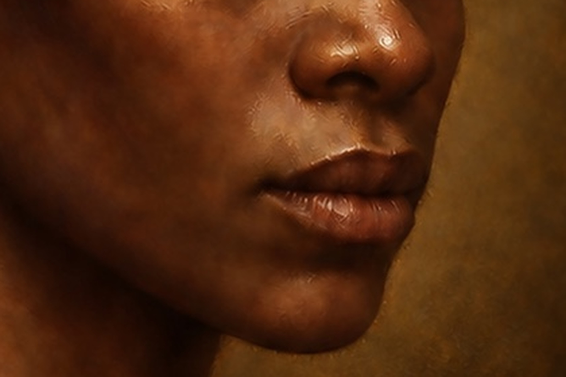
The lips between opacity and translucency
The lips required a different balance.
They contain colour, moisture and soft tissue, but they are not a separate red object attached to the face. Their volume depends upon the turn of the mouth, the compression where the lips meet, the projection of the lower lip and the shadow beneath it.
Transparent red enriched selected passages while allowing the tonal modelling to remain visible. Cooler and darker colour entered the upper lip and corners. A lighter broken passage softened the transition into surrounding flesh. The central separation varied in width, value and sharpness rather than becoming a continuous line.
The final moist highlight was opaque and very small.
If it had been widened, repeated symmetrically or sharpened across the whole mouth, the lips would have become cosmetic and artificial. Its authority depended upon restraint and upon the translucent depth around it.
The mouth became convincing through contrast between a surface event and a deeper field.
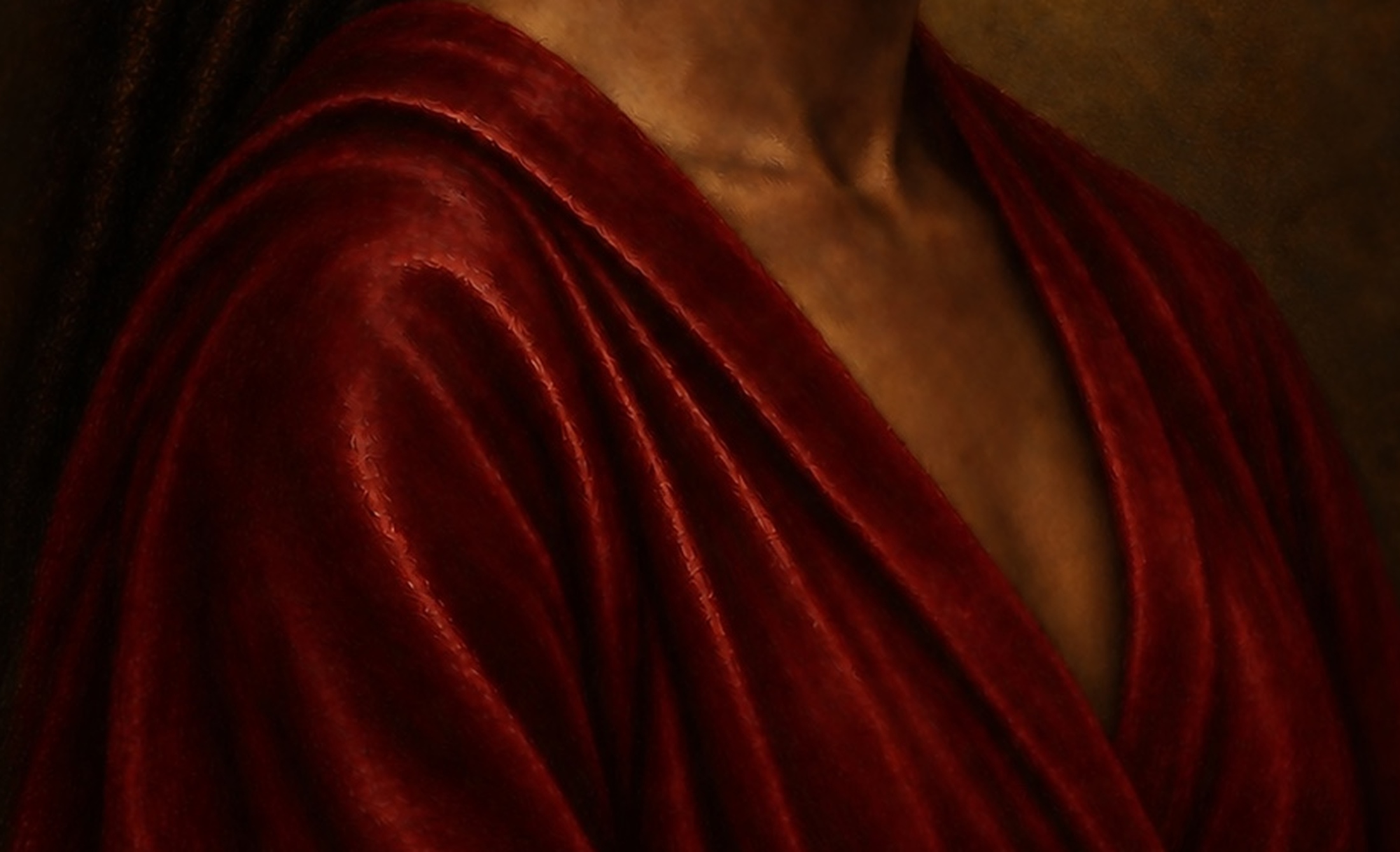
Crimson needs internal depth
The garment offered a larger field in which glazing could be seen operating across folds.
Its first colour had established a muted red body. Later transparent enrichment deepened the crimson in the recesses while leaving the underpainting active. Warm red advanced on selected planes. Cooler, darker red turned away from the light. Brown and violet tendencies prevented the shadows from collapsing into one neutral black.
Scumbling then returned light to raised areas and softened transitions where the cloth needed to feel worn, dense or softly reflective rather than glossy.
The strongest light did not run along every fold.
Some crests caught a narrow accent. Others turned through a broad halftone. Recesses differed according to their depth and orientation. The colour remained related across the garment, but its optical behaviour changed from plane to plane.
This prevented the crimson from reading as a flat saturated shape.
It became a material held in space.
Surface relief must answer to light
Impasto describes heavily built paint whose raised surface catches light and casts minute shadows. In a physical painting, it can make a highlight or jewel visibly project from the picture plane.
The digital master contained no actual thickness.
Any suggestion of impasto therefore had to remain an image of relief rather than a claim of physical relief. Small ridges, broken highlights, directional marks and tiny shadow edges were used to imply a raised paint surface. Raking-light logic helped judge whether those marks agreed with the principal illumination.
This distinction matters because random texture can look persuasive at normal viewing distance while failing under magnification. If every simulated ridge catches light from a different direction, the surface becomes visual noise. If texture is distributed evenly across face, fabric and background, the materials lose their differences. If highlights are too thick everywhere, the portrait acquires a plastic or sculpted skin.
The strongest relief cues were reserved for passages where a painter might plausibly allow paint to stand proud: a tiny highlight on the eye, lip, jewel or illuminated edge of fabric.
Elsewhere, the surface remained quieter.
The illusion of thickness depended upon scarcity.
The background needed layers too
The darkness surrounding the figure appears simple only because it has been disciplined.
A single digital black would have cut the portrait from its atmosphere and created serious problems in print. Fine variations visible on a luminous screen can close when translated to paper. The background therefore retained small differences in temperature, value and implied thickness.
Some passages leaned towards warm earth-black, connecting them to the ground. Others carried cooler blue-black tendencies. Thin areas allowed a suggestion of the prepared surface to remain influential. Soft variations behind the silhouette supported lost edges without creating distracting forms.
Transparent depth and sparse scumbled light prevented the darkness from becoming an empty hole.
This was especially important near the hair, neck and shadowed side of the face. Those forms needed to merge with the background without disappearing entirely. The boundary could be lost, but the head still had to remain complete in the viewer's perception.
Darkness became a material environment rather than a colour code.
Close inspection changes the standard
At normal viewing distance, broad harmony can conceal local failure.
A portrait may appear convincing until the eye, mouth, skin or garment is enlarged. Then repeating pores, synthetic strands, inconsistent brush marks, accidental halos and impossible highlights become visible. Texture that felt painterly at one scale becomes patterned at another.
The glazing and scumbling stage was therefore examined repeatedly at macro scale.
The skin was checked for uniform smoothing, repeated texture and false sharpness. The eyes were compared for alignment, anatomy and reflection. The lips were inspected for symmetry, pasted-on colour and an unbroken central line. The garment was tested for folds that did not agree with its material or light. The boundary between figure and background was searched for halos produced by digital separation.
This inspection did not aim to make every area equally detailed.
It aimed to remove false information.
Where detail was too mechanical, it was interrupted. Where an edge was too perfect, it was varied. Where a glaze created muddy colour, the earlier structure was recovered. Where scumbling became chalky, it was reduced or warmed. Where a highlight lacked a physical cause, it was removed.
Refinement was not the endless addition of detail.
It was the recovery of believable relationships.
Artistic direction inside an AI-assisted process
The artwork was developed through an AI-assisted digital process, but glazing and scumbling could not be delegated to a single instruction.
Words such as luminous, painterly, Old Master, glazed or textured can produce an appearance associated with painting. They do not guarantee a coherent layered structure. A generated image may contain convincing local passages while contradicting itself across the whole.
Artistic direction therefore involved repeated acts of judgement.
The ground, drawing, tonal architecture, colour, transparency, edges, anatomy and surface were assessed as separate but interdependent systems. Outputs were compared against the evolving master. Strong passages were preserved. Seductive but structurally false effects were rejected. Corrections were made at both full-image and microscopic scales.
The role of direction was not merely to choose the most attractive result.
It was to maintain continuity between decisions.
A glaze had to remember the underpainting. A highlight had to remember the light source. A scumble had to remember the form beneath it. Surface detail had to remember the intended physical print.
The intelligence of the process lay in those remembered relationships.
From screen to fine-art print
Optical depth on a screen does not automatically survive on paper.
A display emits light through colour. A print receives ambient light and reflects it from ink, coating, fibre and surface. Transparent-looking shadows can close. Small highlights can lose their brilliance. Subtle colour differences in dark skin and black fabric can compress. Texture can either gain material presence or interfere with fine detail.
The portrait is intended for an A3 fine-art print, with Hahnemühle German Etching as a principal paper under consideration. Its pronounced matte texture and substantial feel can support the work's relationship with historical paper and tactile surface, but it will not reproduce the luminous behaviour of a screen in the same way.
The darkest passages therefore needed separation before printing. The face, hair and background could not depend upon near-black distinctions too small to survive. The eye, lips, skin and jacket were identified as proofing areas because each tests a different requirement: acute detail, moisture, tonal transition and material colour.
A Fuji Pearl photographic surface would create a different encounter—greater apparent luminosity and reflective brilliance, but less of the etching paper's tactile, painterly character. The comparison is not simply between better and worse. It is between two material interpretations of the same digital master.
The digital origin should be translated, not disguised.
The final print does not need to pretend that pigment was physically glazed upon linen. It needs to carry the visual depth, tonal structure and material intelligence of the reconstructed process into a new object with its own surface.
What the simulation cannot reproduce
The digital studio can model the visible consequences of glazing, scumbling, opacity and relief. It cannot recreate their complete physical reality.
No oil film dried between the layers of the digital master. No pigment particles changed the path of light according to their refractive properties. No brush met the resistance of a tacky surface. No impasto acquired weight, smell or vulnerability. No varnish yellowed. No crack formed through incompatible movement between support, ground and paint.
These absences should not be concealed.
They define the actual nature of the work.
The value of the reconstruction lies not in declaring the digital image materially identical to an oil painting, but in using historical process as a demanding framework for seeing. Glazing becomes a question about what can remain visible through change. Scumbling becomes a question about how light can return without erasing darkness. Impasto becomes a question about where the surface must declare itself.
The material history supplies disciplines, not costumes.
Between surface and depth
By the end of this stage, the portrait no longer seemed to be made from one level of colour.
The ground remained faintly present. The drawing continued to hold placement. Tonal underpainting governed the turn of form. Dead colour gave the image a body. Glazes deepened and unified without erasing. Scumbles returned broken light. Opaque accents created moments at which the eye stopped decisively at the surface.
The painting acquired depth because its layers retained different responsibilities.
No single effect produced the result.
It emerged through alternation: warm and cool, opaque and transparent, sharp and soft, covered and revealed, illuminated and withheld.
That alternation is also emotional.
The sitter is present, but not exhausted by visibility. The face emerges from darkness without surrendering all of itself. Light describes the figure while allowing mystery, interiority and authority to remain.
Surface is where the image meets us.
Depth is what the image refuses to give away at once.
ARTWORK AND PROCESS STATEMENT
The paint films were simulated. Their optical responsibilities remained exacting.
Painting Without Wet Paint is a digitally constructed, AI-assisted artwork developed under sustained artistic direction by Jabbi Delahaye. Its later layers simulate selected visual behaviours associated with oil glazing, scumbling, alternating opacity and restrained impasto.
No physical glaze, scumble, oil-bound pigment or raised paint was applied to linen in the creation of the digital master. These terms describe the historical research and visual logic guiding the reconstruction. The final physical print will translate that digital structure through its own paper, ink, surface and reflected light.
FURTHER READING
Transparency, broken light and the painted surface
The National Gallery's technical glossary clarifies the material vocabulary informing this contemporary digital reconstruction.