ARTICLE FIVE · PIGMENT BEHAVIOUR
Colour That Behaves Like Matter
Why recreating a historical palette requires more than selecting historically inspired hues.
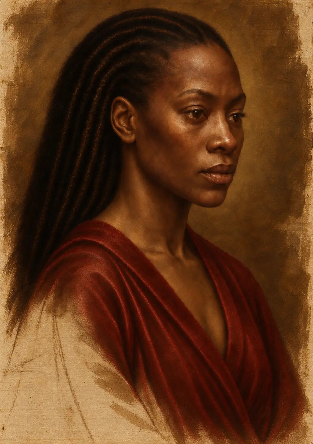
Before the portrait could become luminous, its colour had to acquire weight, temperature and a convincing relationship with the layers beneath it.
In this fifth article accompanying Painting Without Wet Paint, I examine dead colour, historical pigment behaviour and the disciplined construction of flesh, cloth, shadow, red, blue and black inside the digital studio.
Colour entered the portrait only after drawing and tonal underpainting had established its structure.
That sequence mattered. If colour had arrived first, it could have made the image appear finished before the forms were secure. A convincing red, blue or gold can seduce the eye while concealing weak modelling, uncertain anatomy or a light source that does not quite agree with itself. The painting needed to possess volume before it possessed splendour.
Yet restraint did not make the introduction of colour simple.
The difficulty was that colour in an oil painting is never only a hue. It is also a material event. It may cover or reveal. It may sit densely at the surface or allow light to pass through it. It may cool a form without darkening it, warm a shadow without flattening it, scatter light through an opaque body or deepen an earlier layer through transparency.
In the digital studio, none of those effects could be taken for granted. There was no ground pigment, no oil binder and no physical particle suspended in a paint film. Their visible consequences had to be studied, separated and reconstructed.
The aim was not to imitate a list of historical colours. It was to make colour behave as though it belonged to a layered painting.
Colour is not pigment
A colour value on a screen is not the same thing as a pigment suspended in oil.
On a screen, a colour can be selected by numerical coordinates. It can be made lighter, darker, warmer, cooler or more saturated almost instantly. Two passages that share similar digital values may appear closely related even if, in physical painting, they would have been produced from materials with very different properties.
Pigments do not merely name colours. They have bodies.
They differ in opacity, tinting strength, particle size, drying behaviour, stability and refractive character. Some conceal the layer beneath them quickly. Some remain naturally transparent. Some become chalky when mixed with too much white. Some carry enormous chromatic intensity in a thin film. Some settle into quiet earth tones. Some darken, fade or change through chemistry and time.
The National Gallery describes pigment as the finely divided colouring material mixed with a binding medium to make paint. Its account of glaze is equally important: certain pigments form transparent or translucent films which modify another colour without completely obscuring it.
That distinction changes how a painting is built.
A transparent red lake placed over a pale, modelled passage can create a different optical sensation from an opaque mixture adjusted to match its average visible red. In the glaze, light appears to enter the colour and return through what lies beneath. In the opaque mixture, more of the light is returned from the upper surface.
The hue may be comparable. The depth is not.
Dead colour is a structural promise
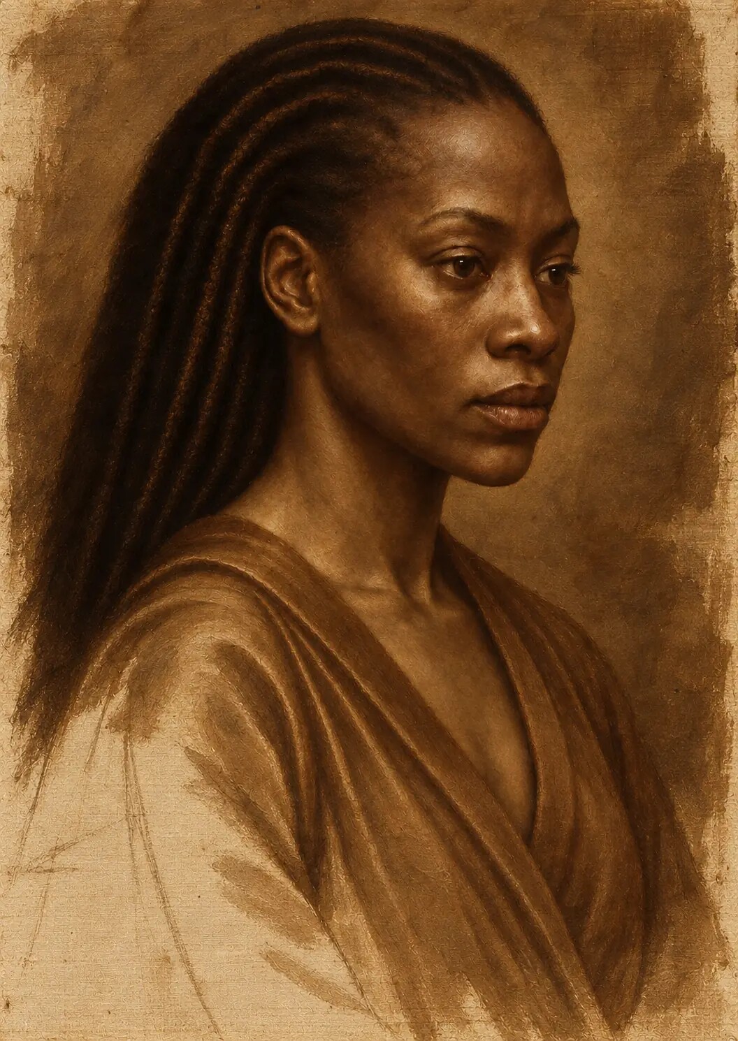
The first colour pass was deliberately restrained.
This stage is often called dead colouring: a term that can sound negative until its purpose is understood. The colour is not dead because it has failed. It is quiet because it is preparing the conditions for later life.
Local colours were introduced without being pushed to their final saturation. Flesh, hair, fabric, ornament and background began to separate, but the brightest highlights and deepest chromatic accents were withheld. The image acquired a colour structure without spending all of its intensity at once.
I treated this layer as a negotiation between the tonal architecture and the final palette.
If it became too bright, later glazing would produce excessive saturation. If it became too dark, transparent upper layers would lose their internal light. If it covered the underpainting completely, the earlier modelling would cease to contribute. If it remained too thin everywhere, the portrait would lack physical authority.
The stage therefore required different degrees of opacity.
The illuminated planes of the face could support denser colour. Selected halftones needed the cooler preparation to remain influential. Shadows were kept open enough to receive transparent depth. The crimson garment acquired its local identity while reserving room for later enrichment. Gold and ornament were placed, but their final flashes of reflected light were delayed.
The unfinished quality of the stage was valuable. It was a promise that later layers would perform genuine work.
[figure:dead-colour]
A palette is a system of behaviours
Historical palettes varied across regions, workshops, artists and periods. There is no single Renaissance recipe that can be applied to every painting, and the digital reconstruction did not claim to reproduce the exact material practice of one named master.
Instead, I built a palette of visual equivalents.
The question was not, “Which digital swatch resembles vermilion?” It was, “How should this red cover, glow, deepen, mix and sit within the light?” The same test was applied to white, earth colour, blue, black and the smaller notes associated with metal, pearl or gemstone.
| Colour family | Visual behaviour | Role in the portrait |
|---|---|---|
| Lead-white-like light | Dense and opaque | Builds illuminated flesh and small highlights without turning light into empty digital white |
| Ochre and earth warmth | Grounded and restrained | Connects flesh, halftone, ground and atmosphere |
| Umber-like shadow | Chromatic darkness | Deepens form while retaining warmer internal variation |
| Vermilion-like red | Warm and assertive | Provides concentrated colour in flesh, cloth and selected accents |
| Lake-like red | Transparent and cumulative | Enriches lips, flesh and crimson passages without erasing earlier modelling |
| Ultramarine/lapis-inspired blue | Deep and precious | Creates reserved cool events rather than indiscriminate saturation |
| Chromatic black | Absorbent but differentiated | Holds depth in hair, background and shadow without becoming an empty digital field |
This table describes the intended visual behaviour of the simulation. It is not a record of physical pigments used in the work.
White as body, not emptiness
Lead white was the principal white pigment of European oil painting for centuries. The National Gallery describes it as an opaque basic lead carbonate that also assists the drying of oil paint.
Its importance to the digital study was visual rather than chemical.
Pure digital white can behave like absence: a blank maximum value with no sense of thickness, warmth or mixture. A lead-white-like passage had to feel denser. It needed to suggest a colour with body—capable of covering what lay beneath, cooling or lightening another pigment and forming the physical-seeming substance of an illuminated plane.
This did not mean turning the skin pale.
The white-like behaviour was used selectively to establish the opacity and lift of light. On the face, it belonged to mixtures rather than sitting as a separate white layer. Its warmth was controlled so that highlights did not become icy, cosmetic or detached from the surrounding flesh. The brightest accents were kept extremely small.
White was therefore not treated as the opposite of colour. It was treated as one of the materials through which colour acquired form.
Earth colours and the gravity of warmth
Ochres and earth colours gave the palette its grounding.
Their role was not to make the painting uniformly brown or artificially old. They provided warm, relatively restrained colour capable of joining flesh, background, hair and cloth without forcing those materials into the same appearance.
Earth warmth could support the cheeks, forehead and neck. Umber-like darkness could strengthen modelling without producing the deadness of neutral black. Small ochre-like notes could connect the warm ground to the later surface, making it seem as though the colour had grown from the preparation rather than been placed above it as a separate digital skin.
These colours were especially important in transition.
Between an illuminated plane and a shadow lies a family of halftones. If these are filled with a simple gradient, the face becomes smooth but empty. Warm and cool earth tendencies allowed those transitions to change character as the form turned. They helped the portrait retain gravity even where no single colour announced itself.
The earth palette carried the quiet work of cohesion.
Red between body and symbol
Red entered the portrait in several different roles.
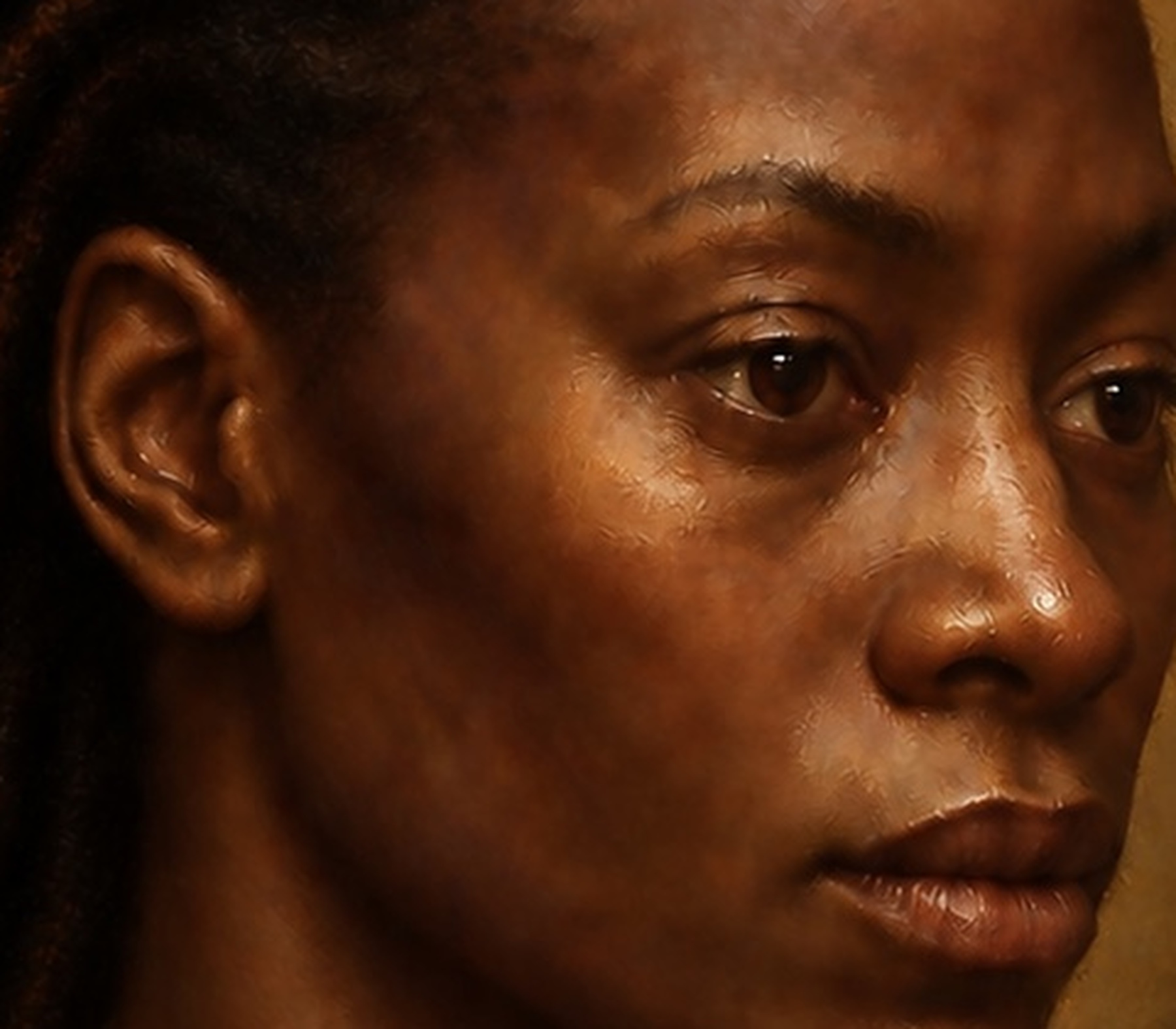
In the flesh, it suggested blood beneath skin, warmth at the cheeks, the compression of the lips and small changes around the nostrils, ears and eyelids. In the garment, it became a larger field of ceremonial colour. In ornament, it could appear as a concentrated jewel-like event.
Those roles could not be solved with one red.
Vermilion has a long history as a brilliant orange-red pigment made from mercury sulphide, whether derived from cinnabar or manufactured. The Metropolitan Museum’s account traces its use across cultures and also demonstrates why material identification depends upon scientific analysis, not appearance alone. The National Gallery’s technical research on the blackening of vermilion is a reminder that historical colour is not chemically fixed.
The digital reconstruction therefore avoided pretending that a sampled red could reproduce a substance and its history.
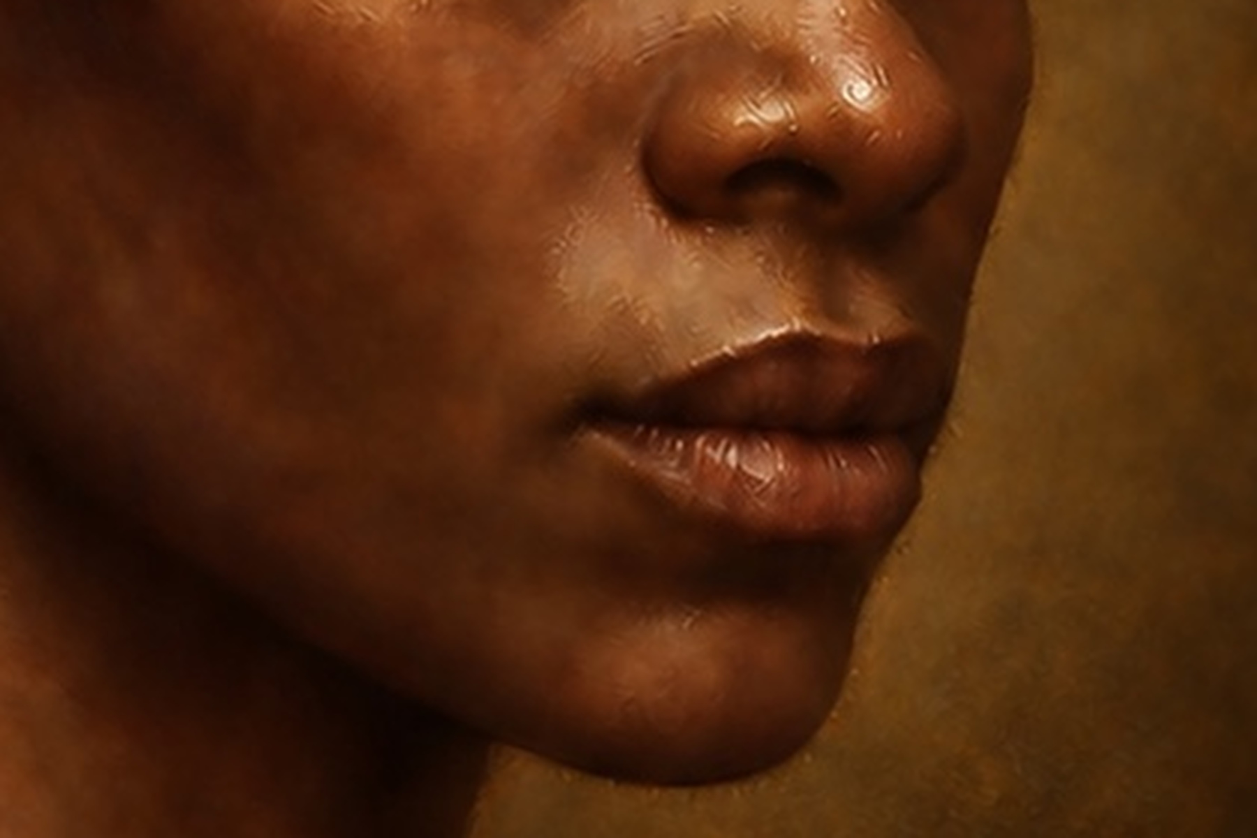
Vermilion-like passages were used as comparatively warm, assertive colour. Lake-like reds were imagined as more transparent and suited to gradual enrichment. In the lips, colour had to remain integrated with anatomy: warmer at selected projecting or blood-rich areas, cooler or darker where the form turned, and softened where the boundary entered surrounding skin.
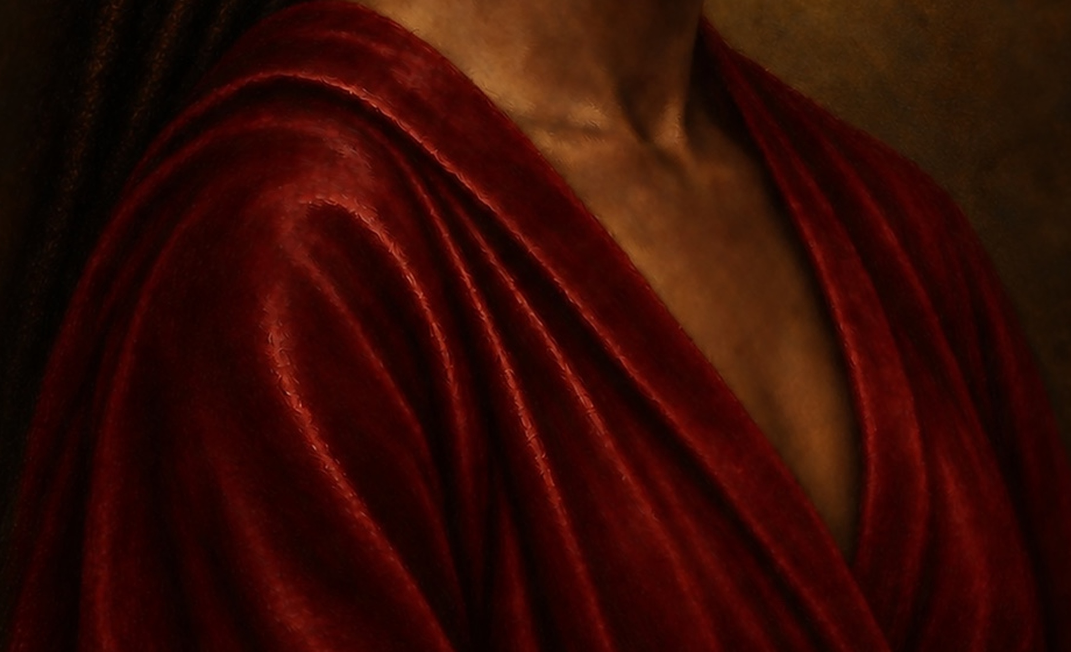
In the drapery, the red needed broader movement. Opaque structure established the folds; transparent enrichment deepened the shadowed crimson without erasing it. Small highlights described the fabric’s relationship to light rather than merely increasing saturation.
Red became convincing when it behaved differently according to the material and form carrying it.
Blue as a precious event
Blue has never been materially neutral.
The National Gallery’s history of blue describes ultramarine made from lapis lazuli, a semi-precious stone whose distance, brilliance and stability made it one of the most celebrated colours available to European painters. Its name—beyond the sea—still carries the memory of movement, scarcity and value.
That history mattered to a practice already interested in lapis, mineral colour and precious surfaces.
But the response was not to saturate every blue passage until it looked expensive. Preciousness depends upon placement. A small, controlled blue can carry more authority than a large area at maximum intensity.
Ultramarine- and lapis-inspired notes were therefore reserved. They entered where they could enrich a shadow, animate an ornament or introduce a cool counterweight to earth, flesh and crimson. Their intensity was moderated by the neighbouring values and by the established light.
The blue needed to feel embedded in the painting, not illuminated from inside by a digital display.
Black must contain a world
Black presented one of the most difficult colour problems.
Digital black is easy to make and easy to misuse. Lowering a value to zero can produce immediate drama on a luminous screen, but it removes the distinctions that make a painted darkness spatially active. Hair, background, shadowed cloth and the far side of a face may all collapse into the same empty field.
The deepest passages of the portrait were therefore built from chromatic darks rather than one neutral black.
Some areas leaned warmer, carrying brown, red or earth undertones. Others were cooler. Some absorbed light almost completely; others returned a faint reflected colour. The background remained quiet, but not vacant. The shadowed side of the face retained compressed variation so that the head stayed complete without competing with the illuminated side.
This was also essential for print.
A screen emits light. A fine-art print reflects it. Dark variations that remain visible on a display can merge on paper, particularly within a textured, matte surface. Building separation into the blacks is therefore part of preparing the work to become physical.
The aim was not to make black less deep. It was to make depth visible within black.
Flesh is a climate of colour
Flesh cannot be reduced to a single sampled complexion.
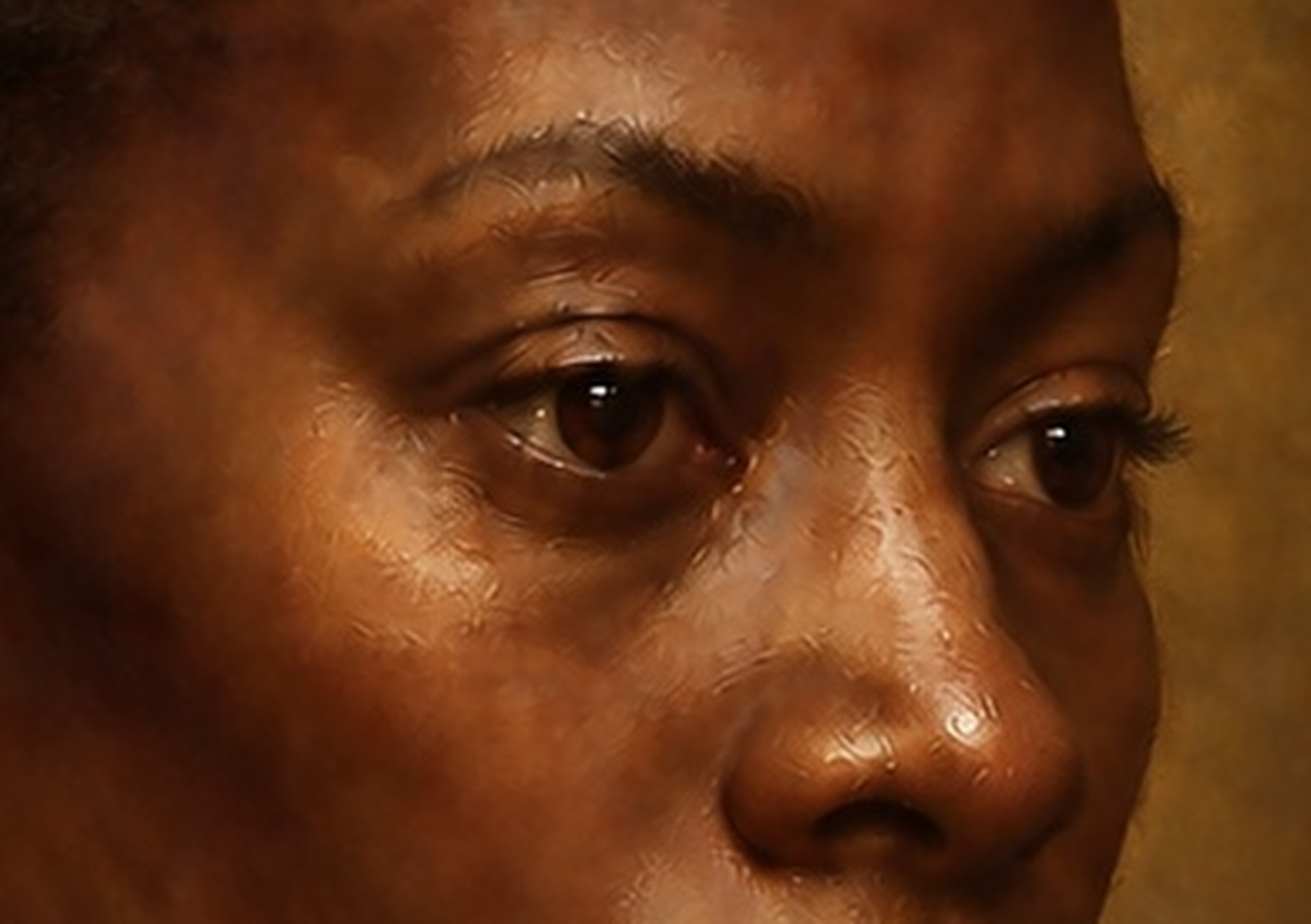
Skin is an optically complicated surface stretched over bone, muscle and soft tissue. Its appearance changes with thickness, blood flow, moisture, hair, oil, reflected colour, surrounding fabric and the direction of light. The forehead, cheek, lips, eyelids, jaw and neck do not carry warmth in the same way.
For darker skin, this complexity must be protected from two opposite failures.
The first is uniform warmth: a single brown or red-orange layer that makes every plane feel the same. The second is lifeless cooling: a grey or green underpainting that remains too pale, too opaque or too dominant and produces an ashen surface.
The portrait was built through temperature relationships.
Cooler undertones remained influential around selected halftones, the jaw, temples and eye sockets. Warmer colour gathered in the cheeks, lips and illuminated passages. Small cooler notes kept the reflected light from becoming simply a weaker version of the main light. Darker accents located the nostrils, eyelids and meeting of the lips without outlining them.
Colour followed form.
A warm passage did not automatically advance unless its value and edge allowed it to. A cool passage did not automatically recede. Each change had to agree with the three-dimensional structure established in the underpainting.
The result was not an inventory of skin colours. It was a climate: a field of subtle changes held together by anatomy and illumination.
Different materials need different colour logic
The portrait contains flesh, hair, fabric, metal, pearl-like and jewel-like details. They occupy the same atmosphere, but they should not return light in the same way.
Flesh required gradual temperature shifts, restrained highlights and soft transitions around turning forms. Hair needed larger dark masses interrupted by selected strands and broken reflected light. Cloth depended on the direction of folds, the density of local colour and the difference between absorbent and reflective passages.
Metal could carry strong contrast across a very small distance. A bright reflection might sit beside a deep dark because the surface redirects its environment sharply. Pearl-like details required softer, more enveloping light. Gemstone references could contain internal colour together with harder external reflections.
If every material received the same smoothness, saturation and highlight, the illusion would collapse.
Material differentiation was therefore achieved not by texture alone but through colour behaviour: how quickly a hue changed, how much of the underlayer remained visible, how sharp the reflection became and whether light appeared to enter the surface or stop upon it.
The precious details were kept subordinate to the face. Their strongest accents supported the path of attention rather than competing for it.
Saturation must be earned
Digital tools make saturation immediately available. Historical-looking colour can therefore fail by becoming too rich too soon.
Jewel-like colour is persuasive when it emerges from restraint. A strong crimson matters because quieter reds surround it. A blue becomes precious because it has not been distributed everywhere. A warm highlight carries life because the adjoining halftones are cooler and less emphatic.
This is why the dead-colour stage remained muted.
Later enrichment needed somewhere to go. Transparent colour could deepen selected passages. Opaque corrections could restore structure. Small high-chroma notes could be introduced where they strengthened the focal hierarchy.
The finished palette was judged as a system rather than colour by colour. When one passage intensified, neighbouring areas were reconsidered. When a red became warmer, the flesh and background changed in relation to it. When a blue note grew stronger, its value and size were tested against the face.
Saturation was not a reward applied at the end. It was a limited resource.
Colour must remain accountable to light
The previous article examined tonal architecture because colour cannot rescue incoherent illumination.
Every chromatic decision in this stage had to remain accountable to the established light source. The lit cheek could become warmer or cooler, but its plane still needed to turn. The shadow could deepen through colour, but it could not become a separate flat shape. The garment could gain crimson intensity, but its highlights still had to describe folds and surface.
This is where colour often exposes digital inconsistency.
One area may be beautifully graded but lit from a different direction. A jewel may carry a studio reflection that does not exist in the eyes. A lip may become glossy while the surrounding illumination suggests a broad, soft source. A dark blue may remain unnaturally saturated in a shadow that should compress it.
The tonal underpainting acted as a governor.
Colour could modify its emotional and material character, but it could not abandon the structure beneath it. When a passage became attractive yet weakened the volume, it was reduced or rebuilt.
The painting was allowed to become colourful only where it could remain believable.
The colour beneath the colour
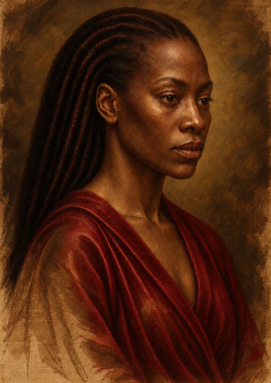
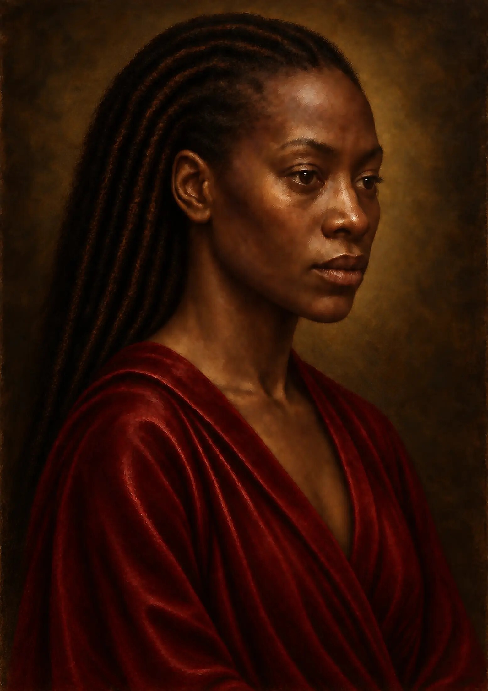
By the end of the stage, the portrait had moved beyond monochrome and beyond dead colour. Flesh, cloth, hair, background and ornament possessed distinct identities. The palette carried warmth, coolness, gravity and selected brilliance.
Yet the final colour was still not located entirely at the surface.
The pale ground remained present as reflected light. The drawing still governed placement. The green-grey and earth-colour underpainting continued to influence flesh and shadow. Restrained early colour supported the richer passages that followed. What appeared as one colour was often the result of several visual layers acting together.
This was the essential lesson.
Colour behaves like matter when it remembers what lies beneath it.
The digital studio could not reproduce the chemistry of lead white, vermilion, red lake, ultramarine, ochre or oil. It could, however, study the visible responsibilities those materials created: opacity and transparency, covering and revealing, density and luminosity, restraint and intensity, surface and depth.
The next stage would make those relationships even more explicit.
Glazing would allow colour to deepen without erasing the earlier structure. Scumbling would return pale, broken light to darker passages. Alternating opacity would decide whether the viewer’s eye stopped at the surface or seemed to travel through it.
Colour had acquired a body. It was now ready to acquire depth.
ARTWORK AND PROCESS STATEMENT
The colour is digital. Its material responsibilities were studied.
Painting Without Wet Paint is a digitally constructed, AI-assisted artwork developed under sustained artistic direction by Jabbi Delahaye. Its colour structure simulates selected visual behaviours associated with layered oil painting: opacity, transparency, temperature, chromatic shadow and the cumulative influence of earlier layers.
No physical lead white, vermilion, red lake, ultramarine, ochre or oil-bound pigment was used to create the digital master. References to those materials describe the historical research and visual logic guiding the simulation, not the literal composition of the artwork.
FURTHER READING
Colour as substance, history and change
Museum glossaries, colour histories and technical research provide the material context behind this contemporary reconstruction.
- Pigments — The National Gallery, London ↗
- Glaze — The National Gallery, London ↗
- Lead white — The National Gallery, London ↗
- A history of blue in art — The National Gallery, London ↗
- A history of red in art — The National Gallery, London ↗
- Journey Through Colour — The National Gallery, London ↗
- The Story of Cinnabar and Vermilion — The Metropolitan Museum of Art ↗
- The Blackening of Vermilion — National Gallery Technical Bulletin ↗