STUDIO PROCESS · COMPANION STUDY
The Ground Remembers
Why a painting begins before the subject appears.
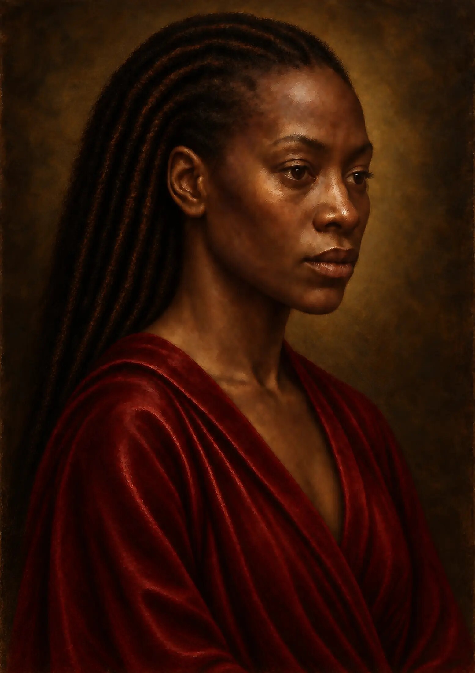
Before a face can emerge from darkness, before colour can acquire depth and before a highlight can appear to rest on the surface of the skin, a painting needs somewhere to begin.
In this second article accompanying Painting Without Wet Paint, I examine how that hidden foundation was digitally reconstructed—and why the layers beneath an image continue to govern everything we see above them.
A finished portrait invites us to begin with the face.
We look towards the eyes, the mouth and the illuminated skin. We notice the direction of the light, the surrounding darkness, the richness of the clothing and the small points of reflection in jewellery or ornament. If the painting has been successful, the figure appears to meet us as a presence rather than as a collection of technical decisions.
Yet the painting did not truly begin with the face.
It began beneath it.
Before the drawing, underpainting, flesh colour, glazing and final varnish, there had to be a believable surface on which all those later events could occur. In a physical Renaissance workshop, that surface might have been a wooden panel or a length of prepared cloth. It would have possessed weight, tension, absorbency, resistance and a particular response to light. It would have been cut, stretched, sealed, coated, scraped, smoothed or left with a deliberate degree of tooth.
In the digital studio, none of those physical actions occurred. There was no wet animal glue, no powdered chalk, no stretched linen and no waiting for a prepared surface to dry. But the visual consequences of those materials still had to be understood.
This distinction became fundamental to the construction of the work.
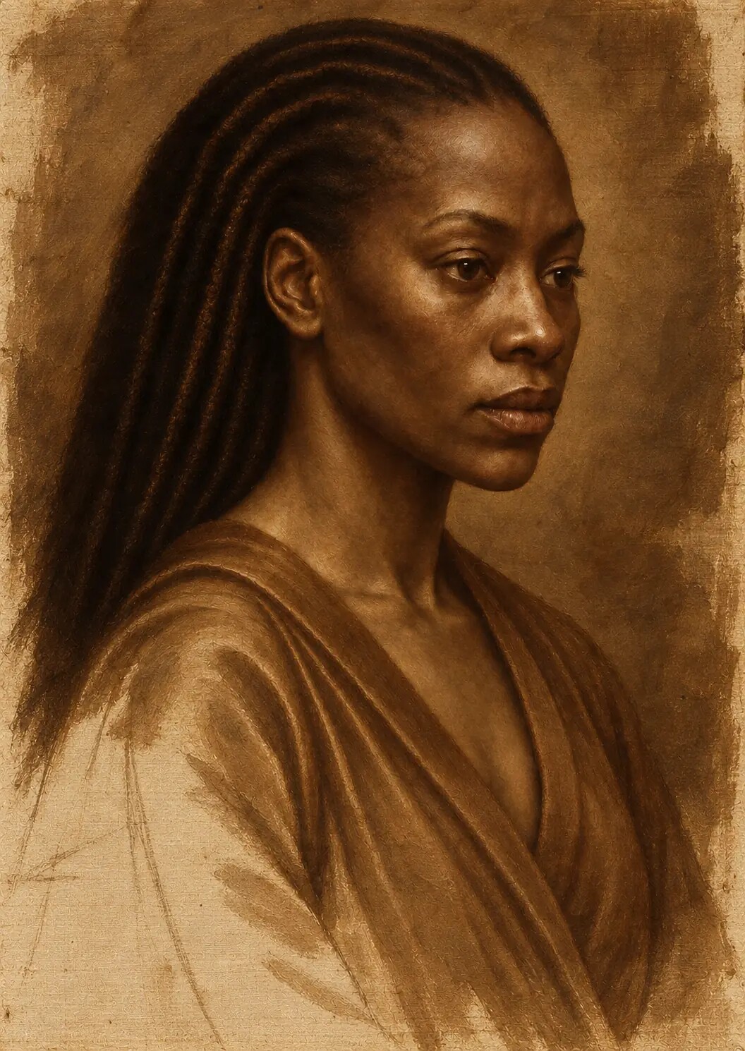
The purpose was not to paste a canvas texture over a completed digital portrait. That would have added a visible pattern without creating a material history. Instead, the image was developed as though the support existed before the subject: as though the drawing had entered its irregular surface, the darker paint had settled into its recesses, the opaque passages had gradually covered its weave and the thinner glazes still allowed something pale and reflective to survive beneath them.
The finished surface needed to contain the memory of its beginning.
That is what I mean when I say the ground remembers.
A surface is never neutral
In everyday language, the surface beneath a painting is often treated as a passive background. It is described as the thing on which the “real” work takes place.
Historically, this was not the case.
The support and its preparation affected how paint moved, how quickly oil was absorbed, how clearly a line could be drawn, how opaque a light passage appeared and how much luminosity could be created through transparent colour. A rough surface invited one kind of mark; a smooth one invited another. A brilliant pale ground produced a different optical environment from a muted red, grey or brown preparation.
The National Gallery defines the support as the material or object on which a painting is executed, noting that panel, canvas and copper each require different forms of preparation. It defines the ground as the preparatory layer placed over that support and emphasises that its colour and tone can affect every chromatic and tonal value above it.
Those definitions may appear technical, but their consequences are deeply visual.
A ground can make a colour seem to advance or withdraw. It can warm flesh from beneath or cool it. It can remain visible between broken strokes. It can influence the degree to which shadows absorb light and highlights return it. Even when it has been almost completely buried, it continues to affect the painting’s overall key.
This means that a painting does not begin on neutral territory.
It begins in negotiation with a material.
There was no single Renaissance surface
It is tempting to speak about “the Renaissance method” as though every workshop followed the same sequence and used the same materials. The historical reality is more varied.
Practices changed between regions, workshops, generations and individual commissions. A Netherlandish panel painting was not prepared in exactly the same way as a large Venetian canvas. An altarpiece intended for a church presented different physical demands from a portrait made for a domestic interior. Materials depended upon availability, cost, climate, scale and local knowledge.
Wooden panels remained enormously important throughout the fifteenth century. Properly constructed and prepared, they offered a firm surface capable of supporting exceptionally controlled drawing and precise paint application. Their traditional grounds were often composed of chalk or gypsum bound with animal glue—what is properly described as traditional gesso.
Canvas became increasingly important in parts of Italy, particularly Venice, where its relative lightness and flexibility made it useful for paintings of substantial scale. It also behaved differently beneath the brush. Its woven structure could remain perceptible through thin preparation and paint, contributing a subtle vibration to the image.
The move from panel to canvas was not a simple technical improvement in which one support replaced an inferior predecessor. Each support possessed advantages and limitations. Each created a different relationship between surface, mark and light.
This matters to the digital reconstruction because the image was not intended to resemble an abstract idea of “old paint”. It needed a more specific material identity.
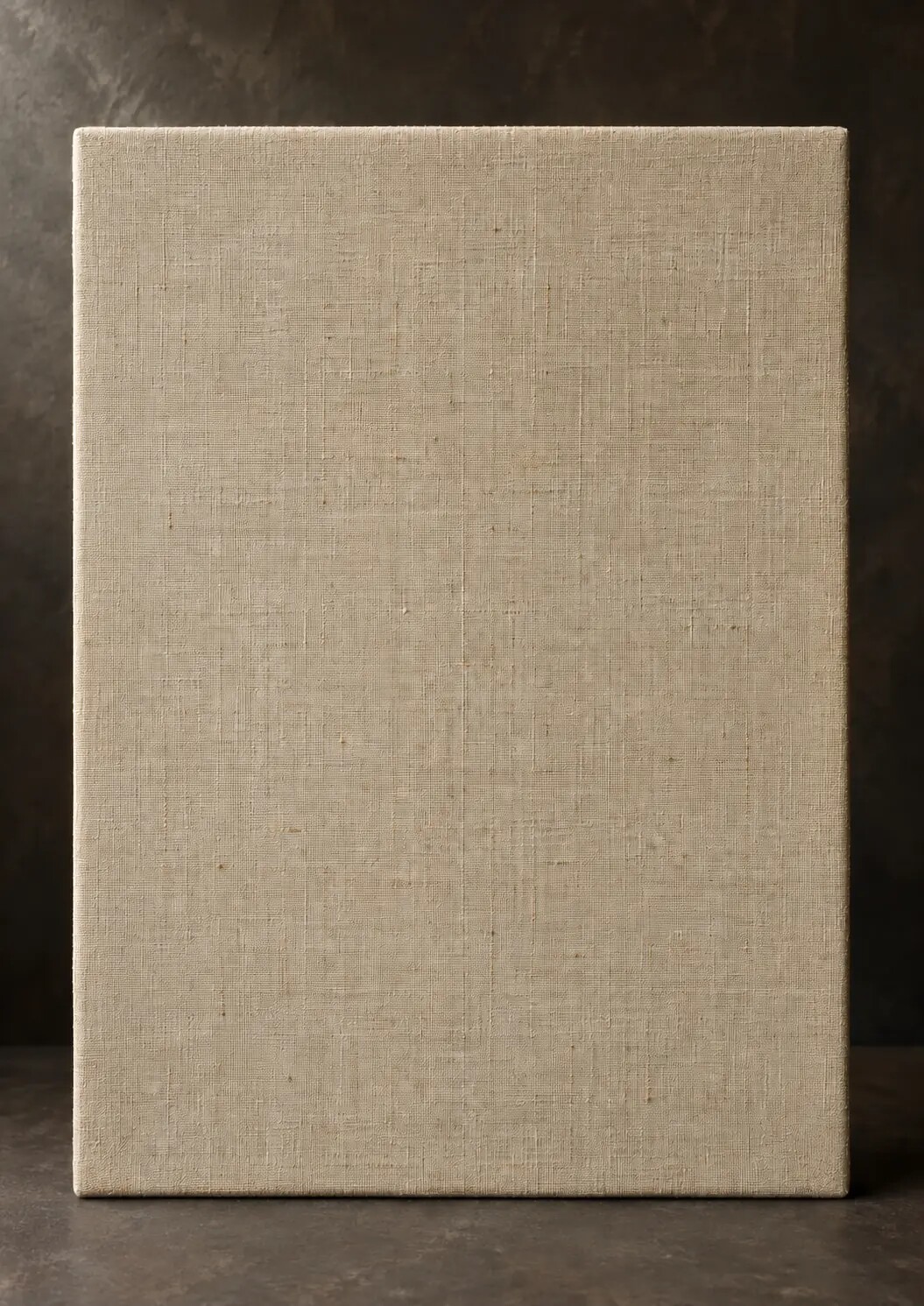
The chosen foundation was imagined as prepared linen: finely woven enough to accommodate close portrait detail, but not so mechanically perfect that it lost the life of a hand-produced cloth. Over that imagined linen sat a visual equivalent of sizing and a pale, slightly warm ground. The preparation was sufficiently smooth for the modelling of the face, while retaining enough tooth to interrupt dry passages and catch light at close range.
This was a historically informed construction rather than a claim to have reproduced one documented workshop formula. It draws from a family of European practices and adapts their visual logic to a contemporary digital work.
That qualification is important. Historical knowledge should increase precision, not encourage false certainty.
Linen as structure
Linen is woven from flax fibres. Like other woven cloth, it is organised through the crossing of warp and weft: one set of threads running lengthwise, the other passing across them.
At a distance, a finely prepared linen support may appear almost smooth. Under magnification, however, it reveals a network of crossings, compressions and small irregular spaces. Individual threads change slightly in thickness. The intervals between them are not mathematically identical. Tension alters the shape of the weave. Preparation fills some recesses more completely than others.
These variations are modest, but they matter.
A computer-generated texture often fails because it is too regular. The repeat may be difficult to notice at first, but the eye eventually senses the mechanical rhythm. One cluster of fibres reappears at fixed intervals. Every raised thread has the same brightness. Every recess has the same darkness. The texture behaves more like wallpaper than cloth.
Real linen does not announce itself so evenly.
Its structure is affected by the material placed over it. A thin wash may settle into the weave and allow the threads to remain visible. A more substantial ground can soften their profile. Several opaque paint passages may conceal them almost completely. Abrasion can reveal them again. Light striking the surface from an oblique angle may emphasise a feature that almost disappears under frontal illumination.
The weave therefore cannot be separated from the history of the layers above it.
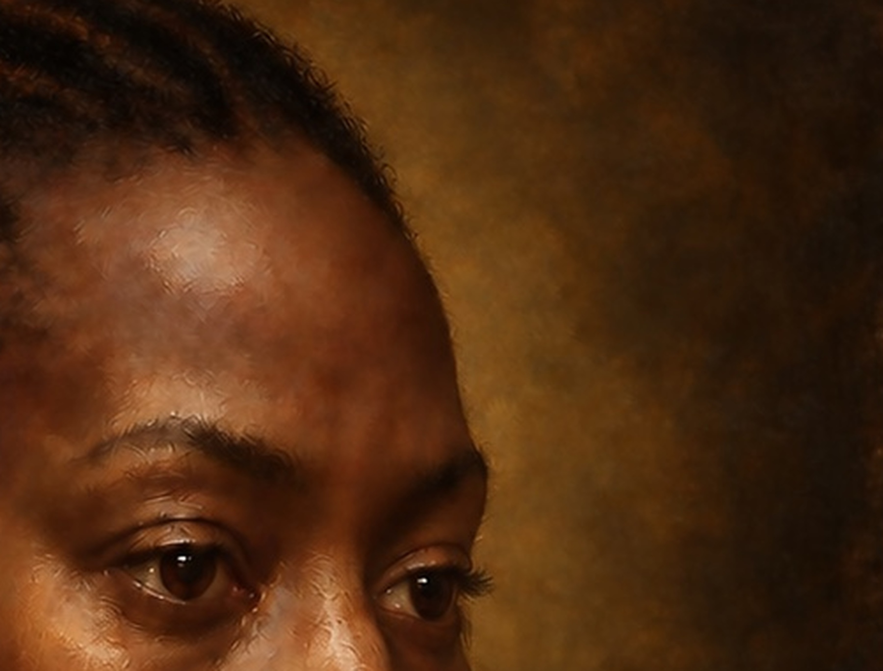
During the construction of the digital painting, I treated the linen as a variable presence. It was more perceptible in thinly painted and quieter areas, particularly where the surrounding darkness did not require heavy apparent paint. It became subdued beneath the face, where multiple stages of modelling implied greater coverage. Around selected highlights and denser passages, the paint appeared to rise above the support rather than simply changing its colour.
This variable visibility was crucial.
If the same weave had remained equally clear across skin, fabric, hair, jewellery and background, the viewer would have recognised it as an overlay. The texture would have belonged to the file rather than to the painting.
Scale is part of credibility
The scale of a simulated weave has to correspond to the imagined size of the physical work.
If the fibres are too large, the surface resembles coarse sacking. Facial features become trapped behind a pattern that would have made delicate historical modelling extremely difficult. If the fibres are too small and too numerous, the texture turns into digital noise. It may create an impression of “detail” while communicating nothing about the supposed material.
Scale becomes especially important when an image is enlarged for printing.
A texture that feels subtle on a laptop screen can become aggressive when printed at exhibition size. Conversely, a convincing weave at full-image scale may disappear from a smaller reproduction. The surface must therefore be assessed in relation to its final dimensions, resolution and expected viewing distance.
I examined the image at several scales:
- As a complete composition.
- At a normal portrait-viewing distance.
- As a close crop of the head and shoulders.
- At macro scale, where the eye, lips, skin and clothing filled the screen.
- At micro scale, where individual textural marks could be compared.
At each enlargement, the question was not simply, “Is there enough texture?”
The more useful questions were:
Does this texture possess a plausible physical size? Does it belong to the support, the ground or the paint? Should it still be visible in this passage? Is it responding to light? Does it follow the form, or is it floating above it?
Magnification is unforgiving. It exposes the difference between material structure and decorative pattern.
What sizing changes
Between raw cloth and the painting ground, historical painters commonly introduced a sizing layer.
The size helped isolate the fibres from the oil-bearing layers placed above them. It stiffened the cloth, altered its absorbency and changed the way subsequent preparation sat on the woven surface. Animal-glue sizes were historically common, although their sensitivity to changes in humidity is now an important conservation concern.
The current digital work contains no physical size. Nevertheless, its visual consequences could be considered.
Raw cloth absorbs and disperses liquid differently from sealed cloth. Paint sinking directly into untreated fibres can appear dry, stained or uneven. A sized and prepared surface allows the paint film to remain more distinctly on top, preserving a clearer relationship between opaque body colour, translucent glaze and reflected light.
To simulate that difference, the virtual linen could not look like cloth onto which a photographic image had simply been printed. The surface needed to suggest a degree of separation between fibre and paint.
This was achieved by controlling three things: edge behaviour, absorption and relief.
Paint boundaries were allowed to remain slightly irregular without dissolving into the imagined threads. Dark passages settled into small depressions, but they did not stain every fibre equally. Lighter and more opaque passages appeared to span the weave, catching illumination across the higher points of the surface.
In other words, the sizing was represented through behaviour rather than through the literal depiction of a transparent coating.
That principle extended throughout the entire project. Many layers in an oil painting cannot be clearly seen as separate objects. Their presence is inferred from what they make possible.
Ground and gesso are not interchangeable terms
The word gesso is often used today to describe almost any white primer sold for painting. Historically and technically, the terminology is more specific.
Traditional gesso usually refers to a preparation made from chalk or gypsum combined with animal glue. It is particularly associated with rigid supports such as wooden panels. Applied in layers and carefully smoothed, it can provide a pale, absorbent surface capable of accepting extremely precise drawing and paint.
Canvas, because it flexes, requires a preparation able to tolerate movement. Historical canvas grounds varied, but oil-bound or emulsion preparations were common. They could contain lead white, chalk, earth pigments or other materials available to the workshop. Grounds were not always white. They might be pale, warm, reddish, grey, brown or constructed in more than one layer.
For this reason, I use ground as the more accurate general term for the simulated preparation in this artwork. Gesso remains useful when discussing the broader visual tradition of pale, prepared surfaces, but the work should not imply that a brittle panel-gesso recipe was literally transferred to flexible linen.
That may sound like a small correction, but terminology shapes the story being told.
A digitally constructed artwork already occupies an unusual position between visual simulation and physical material. Its accompanying language needs to be unusually clear. If no oil pigment was applied, the work should not be labelled simply as an oil painting. If no traditional gesso was physically prepared, it should not be described as though it were present as matter.
The achievement lies in reconstructing the visual behaviour of those processes, not in confusing representation with substance.
The colour of what lies beneath
A ground does not have to remain visibly exposed in order to influence a painting.
Imagine placing a translucent red over a brilliant white surface. Light passes through the coloured layer, encounters the paler foundation and is reflected back towards the viewer. The resulting red may appear luminous and internally lit.
Place a similar translucent colour over a dark brown ground and the effect changes. Less light returns through the layer. The colour appears deeper, quieter and more absorbed.
Neither approach is inherently superior. They serve different visual intentions.
A pale ground can support brilliance, clarity and the optical depth of glazing. A warm ground can unify a composition and prevent unpainted intervals from appearing cold. A reddish preparation may animate flesh and earth colours. Grey can help organise tonal relationships. Brown can establish an immediate atmosphere of shadow.
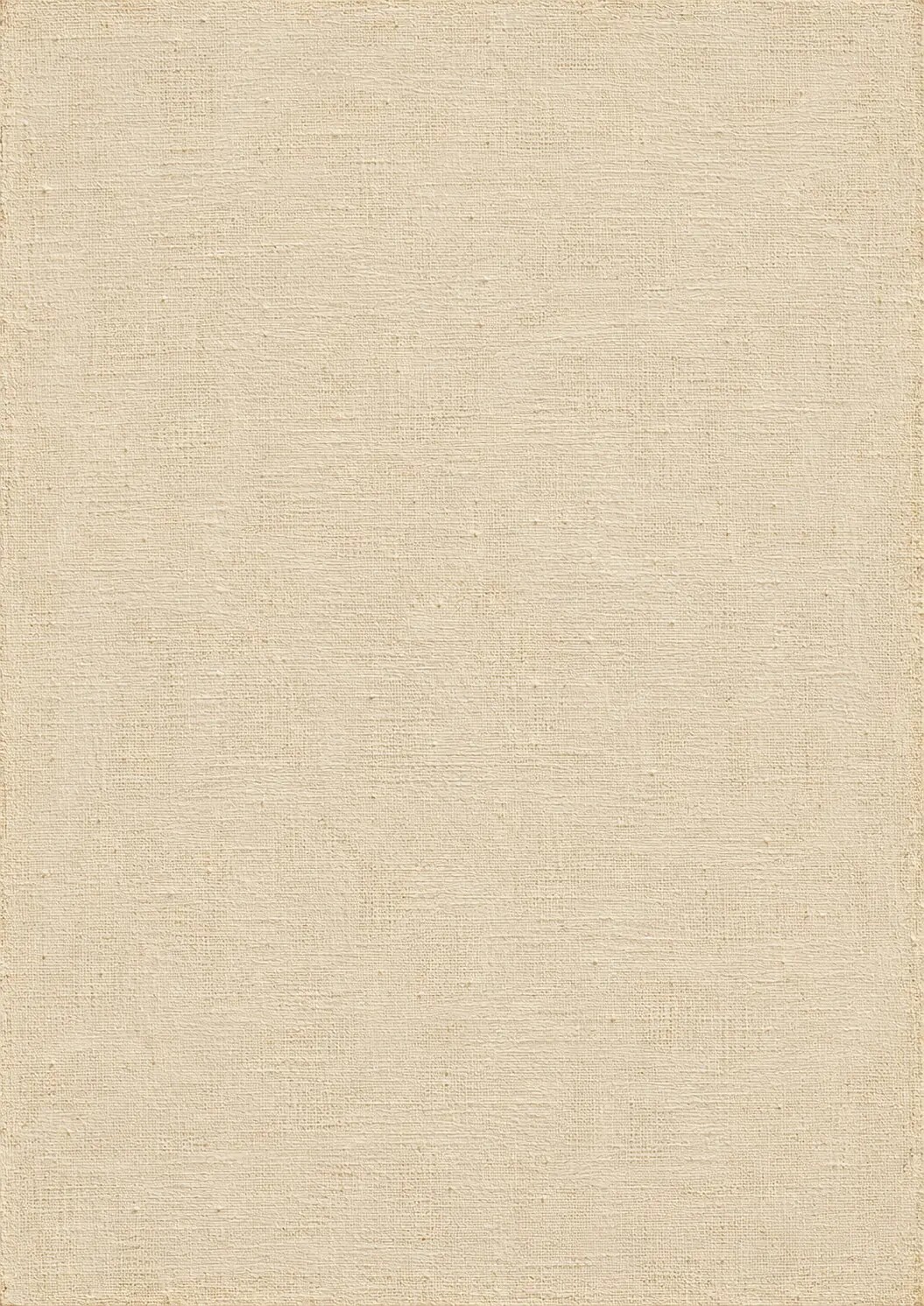
The ground selected for this painting was conceived as pale but not sterile: a warm off-white with slight tonal variation. It needed enough reflectivity to support luminous skin and translucent colour, but it could not resemble a bright digital screen beneath the image.
Pure electronic white would have been too absolute. It would have encouraged brittle highlights and overly clean colour. The preparation required a material softness—a suggestion that light was returning through chalky or mineral matter rather than being emitted by the surface itself.
This became one of the central challenges of translating historical optical ideas into a digital environment.
A screen produces light. A painting in a room reflects it.
The image therefore had to be constructed on an illuminated device while being judged for a future existence under reflected gallery light. The simulated ground became one means of controlling that difference. Its warmth restrained the cold brilliance of the display and gave later highlights somewhere to rise from.
Tooth: the resistance beneath the brush
A prepared painting surface is not defined by colour alone. It also has tooth.
Tooth describes the minute roughness that allows a drawing or paint layer to grip the surface. Too little tooth and a mark may slide without sufficient control. Too much and the texture can break every passage, making subtle transitions difficult.
For a highly resolved portrait, the imagined tooth had to be restrained. The face required smooth modelling, particularly across the forehead, cheeks and transitions around the mouth. Yet complete smoothness would have produced another problem: the skin could begin to resemble polished plastic.
The solution was not to cover the face with pores or aggressive grain. It was to let minute surface resistance interrupt selected passages.
A soft scumble could catch the higher points of the preparation. A translucent shadow could settle more deeply. A small highlight might cross the tooth with a slightly broken edge. A correction could leave a faint ridge or an irregular boundary.
These effects are small. At normal viewing distance, they merge into the general modelling of the face. Under close inspection, they prevent the surface from becoming frictionless.
That resistance gives the viewer a sense that the image was made through contact.
Preparation marks and controlled irregularity
Historical painting surfaces are rarely perfect industrial planes.
Grounds may preserve faint scratches from smoothing, marks from tools, variations in thickness or small areas where the preparation did not settle identically. The edges of a work can contain information about stretching, handling or later alteration. Age introduces further changes, although those belong to a different stage in the object’s history.
When digitally simulating these irregularities, restraint is essential.
A visible scratch is not automatically evidence of authenticity. Nor is a random cluster of dents. Once surface damage becomes a design motif, the painting starts to resemble a theatrical prop.
The irregularities in this work were therefore used as subordinate information. They were introduced where they could plausibly relate to preparation, handling or later paint behaviour. They were not allowed to cross every feature with equal force.
This required repeated removal as well as addition.
Some marks initially looked convincing when viewed alone but became distracting within the full portrait. Others produced an attractive “antique” atmosphere while weakening the anatomy. A scratch crossing a cheek might create surface interest, but if it interrupted the modelling of the face too strongly, it had to be reduced. A visible weave might look impressive in a macro crop but turn into a net stretched over the figure when the full image was restored.
Material credibility depends upon hierarchy. The foundation must be present without constantly demanding attention.
Why a canvas overlay fails
One of the quickest ways to make a digital image look superficially painterly is to place a canvas texture above it and adjust the blending mode. The method can be useful in limited contexts, but it does not reconstruct a painting surface.
A uniform overlay creates several contradictions.
First, it places the weave optically in front of every paint passage. Thick highlights and thin shadows receive the same texture.
Second, the overlay generally responds to the image’s brightness rather than to the imagined thickness of paint. A pale cheek may reveal more texture than a dark background simply because of the blending calculation, not because of a believable material process.
Third, the weave does not interact with the direction of the brushwork. It continues unchanged across skin, velvet, metal and air.
Finally, repeated texture can create false relief. Dark lines are interpreted as recesses and pale lines as raised fibres, even where the lighting of the portrait suggests the opposite.
To avoid these problems, the simulated support was integrated stage by stage.
The linen existed before the underdrawing. The ground partly covered the linen. The drawing entered the ground. The underpainting obscured some marks and preserved others. Opaque colour reduced the visibility of the support, while glazes allowed its influence to continue more subtly. Highlights acquired a different surface character from deep, thin shadows.
The result is not dependent on a single texture layer. It emerges from relationships between layers.
The first real decision is what to conceal
Preparing a surface is an act of both construction and concealment.
The raw support is covered so that painting can begin, but it is not necessarily erased. The preparation modifies the cloth, suppressing some of its qualities and preserving others. The drawing then covers the ground, the underpainting covers parts of the drawing and colour covers the underpainting.
At every stage, information is buried.
This does not mean it ceases to matter.
A line hidden beneath flesh colour may still govern the edge of the jaw. A grey-green underpainting may no longer be separately visible, but it can cool the shadows around the mouth. A pale ground may disappear beneath red glaze while continuing to return light through it.
Painting depends upon this paradox: what is concealed remains active.
The digital environment often encourages the opposite habit. Layers remain available, named and editable. An unwanted stage can be hidden instantly. A decision can be reversed without leaving a trace.
That freedom is powerful, but it can also make the image feel weightless. If every stage is treated as provisional and independent, the surface may never develop the sense that one decision has genuinely acted upon another.
For this project, the layering process had to create consequences. Later passages were judged in relation to what had been established beneath them. Corrections did not merely replace earlier information; where useful, they allowed traces of revision to remain.
The painting needed to look as though it had remembered its own development.
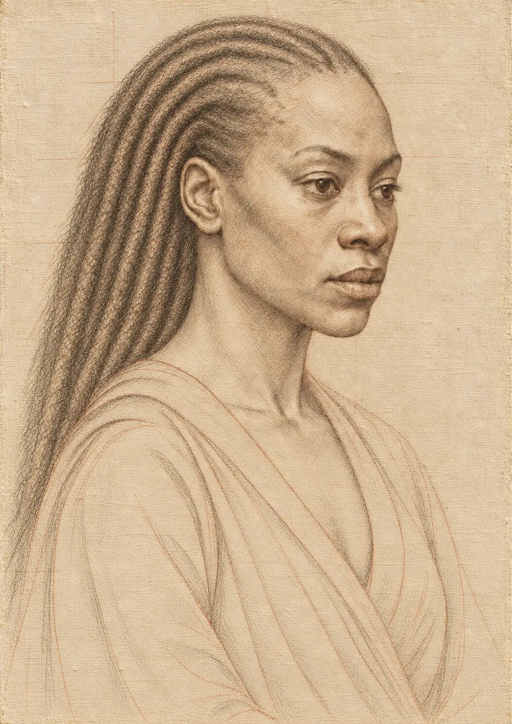
The ground and the drawing
The underdrawing is often discussed as the first visible intellectual structure of a painting. It organises proportion, placement, anatomy and movement. Yet the character of that drawing depends upon the surface receiving it.
A line made on smooth, bright preparation behaves differently from a line made on coarse, absorbent cloth. Charcoal catches the tooth in one way; a brush and diluted pigment move in another. Pressure changes the width and darkness of the mark. Corrections leave ghosts. Erasure may lighten a line without removing it completely.
In the simulated work, the ground had to support an underdrawing that felt worked rather than printed.
The contours were not treated as flawless vector outlines. They varied in pressure and certainty. Some lines were repeated as the form was reconsidered. Others faded beneath later layers. Small remnants remained visible where the paint was thinner, especially near delicate transitions and quieter passages.
These surviving marks help connect the finished image to an earlier state of thought.
They suggest that the figure was searched for.
This is not an attempt to manufacture false spontaneity. It is a recognition that drawing records decisions. The ground gives those decisions somewhere to occur.
From blankness to tonal possibility
Once the support and ground had been established, the image could begin to move away from blankness.
This transition required care because digital black and digital white are unusually absolute. A blank screen can produce a white brighter than most papers, while an unmodulated black can remove information completely.
Historical painting generally operates within a different material range. Even very deep painted shadows may contain pigment variation, surface reflection and traces of underlying preparation. A pale ground is not a source of emitted light. It reflects only the light available to it.
The foundation was therefore used to establish a moderated tonal environment.
Its lightest state was warm and restrained. Its darker irregularities remained subtle. It offered a reflective base without becoming luminous in its own right. The later underpainting could then establish shadows that felt constructed rather than digitally switched off.
This was particularly important in the background.
The darkness surrounding the figure needed to possess depth and temperature. It could not be an empty black field into which the portrait had been inserted. Minute variations in the ground and early tonal layers helped give the darkness a sense of material extension. Some passages appeared absorbent; others retained a faint, low reflection.
The ground allowed the darkness to remain inhabited.
The ethics of a convincing surface
There is a delicate line between material persuasion and material deception.
The artwork is intended to withstand close looking. Its linen, preparation, paint thickness and varnish have been visually simulated with care. But it does not claim that these substances are physically present in the digital master.
That difference should remain explicit.
A viewer may experience the work through a fine-art print. The printed object will possess real paper, real ink, real texture and real reflected light. Those materials may reinforce or modify the simulated painting surface, but they do not turn the work into a historical oil painting.
Nor should restrained ageing effects be used to suggest a false provenance.
The purpose of reconstructing linen and ground is not to create a counterfeit antique object. It is to study and reactivate the visual intelligence contained in historical practice: the knowledge that the appearance of a painting is shaped long before its final surface is reached.
There is no weakness in accurately describing that process.
The work becomes more interesting when its conditions are visible: a contemporary image built with digital and AI-assisted tools, directed through sustained artistic judgement, informed by historical painting and prepared for physical fine-art printing.
Precision protects the integrity of both the historical reference and the contemporary artwork.
AI and the problem of material causality
AI-assisted image generation can produce an immediate approximation of “old canvas”. It can suggest scratches, cracked varnish, rough fibres and painterly texture with remarkable speed.
The problem is not a lack of visible information. The problem is causality.
Why is a particular thread visible? Why does one area appear smoother than another? Has the paint become thin, or has the texture merely been added above it? Does a scratch belong to the ground, the paint or the varnish? Is an irregularity following the surface plane, or is it moving independently of the depicted form?
Generated detail can look plausible without surviving these questions.
The artist’s role is to test the image against material logic.
In this project, AI functioned as one component within a larger digital atelier. It could propose textures and material relationships, but it did not determine which of them were physically convincing. Passages had to be enlarged, compared and either accepted, altered or rebuilt.
The working cycle was repetitive:
A visual problem was defined. A possible surface was produced. The result was inspected at several scales. Repetition, incorrect lighting and implausible texture were identified. The instruction or treatment was refined. The passage was compared with historical references and with the internal logic of the developing image. It was then integrated, reduced or rejected.
This was particularly demanding in the foundation because its effects needed to remain quiet.
A dramatic eye highlight announces its success immediately. A convincing ground often succeeds by not being noticed. It supports everything without presenting itself as the subject.
Foundations and inherited visibility
There is also a wider cultural meaning in beginning with the ground.
The conventional history of European art often directs attention towards celebrated names and finished masterpieces. We encounter the completed surface: the image that has survived, been collected, attributed, conserved and placed under museum lighting.
Less visible are the networks that made those surfaces possible.
Workshops depended upon apprentices, labourers, merchants, miners, textile workers, carpenters, animals, plants, trade routes and accumulated technical knowledge. Linen had to be grown, processed and woven. Pigments travelled across regions and continents. Materials associated with refinement and prestige were entangled with systems of commerce, power and unequal access.
To discuss a Renaissance-inspired process today is therefore not simply to admire individual genius. It is to recognise that every apparently self-contained masterpiece rests upon a material and social ground.
That recognition matters in a contemporary digital practice.
New technologies are also frequently presented as though they produce images from nowhere. The interface hides infrastructure. A prompt appears to lead directly to a result. The labour of building systems, assembling datasets, maintaining networks and making artistic judgements disappears behind the speed of the transaction.
But no image begins from nothing.
Every image has a ground: technical, historical, cultural and material.
The question is whether we are willing to examine it.
The support as metaphor—and its limit
The ground readily becomes a metaphor for memory, inheritance and identity. What lies beneath us influences what becomes visible. Earlier structures remain active even when they are no longer consciously seen.
That metaphor is valuable, but it should not be stretched until the material disappears.
Linen is not only an idea. It has fibres, tension and scale. A painting ground is not merely “history”; it has colour, absorbency and reflectivity. Technical understanding gives the metaphor its weight.
This balance shaped the article and the artwork.
The foundation can evoke ancestry, buried knowledge and cultural memory because it first functions convincingly as a foundation. Its symbolic force grows from material specificity.
The ground remembers because it has been acted upon.
It carries pressure, coverage, revision and time.
Preparing the ground digitally
The simulated foundation was developed through a sequence of related visual decisions rather than as a single effect.
- Establishing the weave — The linen structure was given a restrained irregularity. Warp and weft remained recognisable at macro scale without becoming a rigid grid. Thread thickness and spacing varied slightly, and the pattern avoided obvious repetition.
- Moderating the raw cloth — The untreated weave was softened to suggest the consequences of sealing and preparation. The fibres remained structurally present, but they no longer looked completely exposed.
- Applying the pale ground — A warm, mineral off-white was introduced. It settled into the lower spaces of the weave while allowing selected high points and irregularities to remain perceptible. The preparation was neither perfectly flat nor aggressively rough.
- Creating tooth and preparation marks — Small variations in surface resistance were added: faint scratches, incomplete smoothing and minute differences in density. These marks remained subordinate and were distributed according to plausible preparation rather than visual convenience.
- Testing reflectivity — The ground was assessed beneath later transparent and opaque passages. It needed to return enough light to support glazing without turning every colour bright or enamel-like.
- Controlling visibility — The weave and tooth were reduced beneath denser paint, preserved more clearly in thin passages and allowed to reappear subtly in selected transitions. No single texture setting was applied across the entire image.
This process created the visual conditions required for the underdrawing and tonal underpainting that followed.
What close inspection revealed
The macro-inspection process exposed several kinds of failure.
In some early passages, the weave was too evenly visible. The face appeared to sit behind a transparent sheet of canvas rather than being painted into and over it.
Elsewhere, the texture was too sharp. Individual fibres became more visually assertive than the anatomy. The viewer’s attention shifted from the eyes and mouth to the repeated pattern of the support.
Some areas contained false relief. Highlights in the texture did not correspond to the direction of illumination, making the ground appear embossed by a separate light source.
There were also passages in which surface irregularity became confused with skin texture. The painting needs a relationship between the linen, ground, paint film and depicted flesh, but those are not the same thing. A canvas thread should not be mistaken for a wrinkle. A broken scumble should not turn into a pore pattern. A preparation scratch should not describe the curvature of a lip.
Each category had to be separated and judged.
Close inspection was therefore used to remove information as often as it was used to add it. False detail was softened. Repetition was interrupted. Texture was reduced where it interfered with form. Surface marks that looked attractive in isolation were discarded when they weakened the whole.
The purpose of magnification was not maximal complexity.
It was coherence.
When the foundation should disappear
A convincing ground must accept its own disappearance.
This may be the most important principle in the entire process.
Once the face, fabric and ornament are developed, the viewer should not be continually reminded of the support. The foundation has done its work when it allows the figure to exist with authority.
In strongly illuminated flesh, the linen may be almost completely hidden by successive opaque and semi-opaque passages. In a thin shadow, it may remain detectable as a low irregularity. In a scumbled highlight, the surface tooth may break the paint. In the background, a faint weave may help prevent the darkness from becoming digitally empty.
These differences create hierarchy.
They also create a sense of time. The surface appears to have accumulated rather than being produced simultaneously. Some areas feel worked and reworked; others retain the economy of an earlier state.
Without those variations, every part of the image occupies the same artificial present.
The ground and the physical print
When the digital master is printed, it acquires a new support.
This support is not simulated. It is real paper or canvas with actual fibres, texture, colour and reflectivity. The choice of print surface therefore introduces a second foundation: one that interacts with the foundation already represented inside the image.
This relationship has to be managed carefully.
A heavily textured paper can reinforce the painterly character of the work, but it can also compete with the simulated linen. If the two textures operate at similar scales, they may interfere with each other. A smooth cotton rag can preserve fine facial modelling while allowing the represented paint surface to remain dominant. A warm bamboo-based paper may harmonise with the ground’s colour, but its paper white can alter highlights and flesh tones. A baryta or pearl surface can deepen blacks and sharpen detail, although its sheen may move the work towards a more photographic presence.
There is no universally correct surface.
The choice depends upon which aspect of the artwork should become physically dominant: tactile warmth, tonal depth, fine detail, saturated colour or the tension between contemporary print and historical painting.
Proofing is therefore part of the artwork’s construction.
The ground must be tested again—not only as an image on screen, but as colour reflected from a physical sheet under real light.
What the print cannot reproduce
Even the most carefully prepared fine-art print cannot reproduce every material quality of an oil painting.
It cannot recreate the actual depth of multiple oil films. Simulated impasto does not physically project from the surface unless a specialised raised-print process is used. Pigment particles are not suspended within drying oil. Reflections do not shift in precisely the same way as the viewer moves. There is no real difference in height between a thin glaze and a loaded highlight.
These limits should be acknowledged rather than disguised.
The digital master reconstructs optical relationships: apparent transparency, opacity, surface interruption, absorbed darkness and reflected light. The print translates those relationships into ink on a chosen support.
It becomes its own object.
Its value does not depend upon being mistaken for oil paint. It depends upon the intelligence with which the languages of painting and printing have been brought together.
The patience of beginning
Contemporary image culture rewards immediate impact. The face appears, the colour is intensified, the texture is added and the image is released.
The study of historical painting suggests another rhythm.
Before the spectacle comes preparation. Before detail comes structure. Before colour comes a surface capable of carrying it. The quiet decisions made at the beginning determine what remains possible at the end.
That lesson extends beyond the imitation of any particular historical style.
A ground teaches patience because its success is deferred. It does not need to impress the viewer as an independent image. Its purpose is to establish conditions from which later complexity can grow.
In reconstructing this process digitally, I found that the most persuasive results did not come from adding the greatest number of Old Master signs. They came from asking what each sign depended upon.
A glaze needed something reflective beneath it. A scumble needed tooth. A broken stroke needed a resistant surface. A buried line needed an earlier drawing stage. A worn passage needed paint that could plausibly have become thin. A highlight needed not only brightness but a reason to sit above the surrounding film.
The ground supplied those reasons.
What remains beneath the portrait
When we return to the completed artwork, the foundation is difficult to isolate.
We see the face rather than the pale preparation beneath it. We see darkness rather than the variations that keep that darkness alive. We see a highlight rather than the chain of decisions that allows it to appear luminous.
But the ground has not vanished.
It survives in the temperature of the skin. It survives in the broken edge of a scumble and the depth of a translucent shadow. It survives where an underdrawing remains faintly perceptible and where the background refuses to collapse into featureless black. It survives in the balance between smoothness and resistance.
Most importantly, it survives in the sense that the image possesses a past.
The portrait does not appear to have arrived whole. It appears to have emerged from a sequence of preparations, adjustments, concealments and recoveries.
That sense of emergence is central to the emotional authority of the work.
The image beneath the image
A painting begins before its subject appears.
It begins with the decision to prepare a place for the subject: to choose what will support it, what colour will lie beneath it, how much light will be returned and how much resistance the surface will offer.
In a physical atelier, those decisions are made through cloth, wood, glue, chalk, pigment and labour. In this digital atelier, their visual consequences were reconstructed through research, layering, generation, correction and repeated human judgement.
The two processes are not materially identical. They do, however, share a recognition that the visible image is shaped by structures it eventually conceals.
What lies beneath is not empty.
It carries the memory of the weave, the tone of the preparation, the first uncertainty of the drawing and the earliest division between light and darkness. Every later layer inherits those conditions.
The finished portrait may draw our attention towards the eyes, but its authority begins much further back—inside a pale, irregular surface that the viewer may never consciously notice.
The ground does not ask to be seen.
It asks to be believed.
And when it has been constructed with care, the whole painting remembers it.
ARTWORK AND PROCESS STATEMENT
Clear about the material. Precise about the achievement.
Painting Without Wet Paint is a digitally constructed, AI-assisted artwork developed under sustained artistic direction. No physical oil pigment, linen sizing or traditional gesso was used in the creation of the digital master. The work reconstructs the visual logic and optical consequences of a layered Renaissance-inspired painting process, including simulated linen, ground, underdrawing, tonal underpainting, opaque colour, glazing, scumbling, surface wear and varnish.
The final physical edition is produced as a fine-art print. Its paper, ink and surface are real materials that translate—but do not misrepresent—the simulated paint structure contained within the image.
FURTHER READING
The material language beneath the image
Technical definitions from the National Gallery and Tate distinguish support, ground, gesso and canvas—the terms that give this contemporary reconstruction its historical precision.