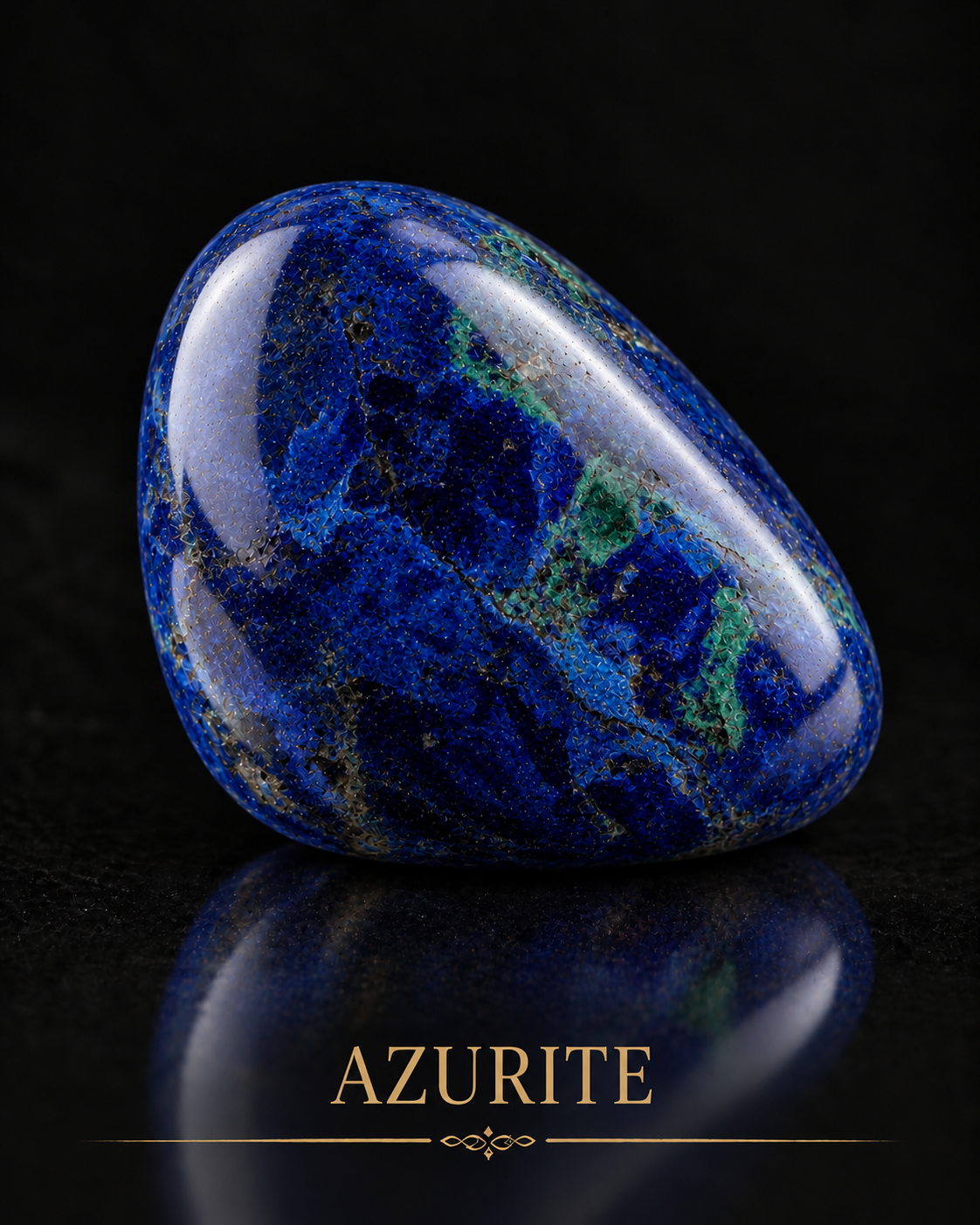
Azurite gives this collection a blue with a different character from Lapis Lazuli. In the generated study, deep mineral blue is interrupted by darker areas and small green passages. Soft reflections describe a polished rounded surface against black. The colour appears concentrated, with the surrounding darkness allowing its variations to remain visible.
Its most direct connection to Renaissance art is the transformation of mineral into pigment. Azurite became a blue in paintings, drawings and manuscripts, entering workshops as a material whose preparation affected its appearance. The enquiry follows that transition through museum research, a specific painting by Titian and modern reconstruction of historical practice.
Blue beside green
Columbia University’s Making and Knowing Project describes azurite as a basic copper carbonate, often occurring alongside green malachite. Its pigment preparation involves grinding and separating unwanted material. The two colours may share a geological setting while needing to be distinguished for a painter’s purposes.
This creates an interesting difference between a stone and a paint. A green passage within a blue polished object may enrich its pattern. In preparing a blue pigment, that same green material may be something to remove. What counts as desirable depends on the intended work.
For an artist, this is a useful question to carry beyond minerals. Does a variation strengthen the piece or obscure what it needs to do? A mark may belong in one composition and become a distraction in another. Material judgement involves reading the particular object rather than applying one rule to every surface.
A worked material with several origins
GIA’s 2017 report on azurite-malachite describes mixtures from Cochapata in Peru, alongside earlier finds in Arizona and another Peruvian locality. Its photographs show blue and green in polished material, sometimes with chrysocolla. The account connects an appearance to a recorded location and mineral association.
That example supports the possibility of a blue-and-green worked stone without assigning the generated study to Peru. There is no physical specimen behind this image to examine. The geological report and the visual simulation serve different purposes: one documents material, while the other explores its appearance.
A source can still inform an artist’s imagination. Rather than copying a specimen’s exact pattern, a study might attend to how the colours meet, how a dark passage changes the blue, or how polish reveals a texture. Such observation can guide the handling of an invented form while leaving the documented specimen’s identity intact.
Renaissance blue as prepared colour
GIA’s historical pigment review describes azurite as a major European blue during the medieval and Renaissance periods. It also records its use beneath ultramarine. The relationship with Lapis Lazuli therefore extends beyond comparing two blue stones: different mineral colours could participate in the construction of a painted passage.
The Making and Knowing Project explains that larger azurite particles produce a deeper blue, while finer grinding makes the colour paler. Its teaching exercise follows sixteenth-century instructions to purify the mineral through levigation and then prepare paint. Particle size becomes part of colour choice.
That offers a practical way to understand historical colour as a process. Blue was not simply selected from a chart. The handling of the mineral changed the result, and the desired appearance guided preparation. The painter’s decision began before the brush touched the support.
Titian: blue in the distance
The National Gallery identifies azurite in the slightly greenish blue of the distant landscape in Titian’s Bacchus and Ariadne. It contrasts this with the intense ultramarine of the sky. Different blues contribute to the painting’s arrangement rather than acting as interchangeable colour names.
The gallery also draws attention to Titian’s use of strongly contrasting colours and the textural qualities of his paint. This gives a contemporary viewer a way into the work through relationships: the force of one colour depends on its neighbour, and a painted surface has its own physical character.
For a portrait, the corresponding question might be where to place a cooler blue. It could sit behind a warm face, appear in a garment or gather in a small ornament. The choice changes the route of attention through the image. A blue detail becomes more effective when its relationship to the subject is considered.
This connection belongs to a documented painting. Azurite’s place in the wider collection is strongest through Renaissance material practice, rather than a claim that every gemstone must share the same Egyptian history. Different studies can develop different parts of the collection’s enquiry.
Evidence inside Florentine panels
National Gallery research on late fifteenth-century Florentine panel paintings identifies shared materials in works by Botticelli, Filippino Lippi and Domenico and Davide Ghirlandaio. Azurite appears among the pigments, alongside natural ultramarine and other colours. The study also examines underdrawing, priming and binding media.
A painting can thus be approached as an arrangement of materials as well as a visible scene. The underdrawing and ground belong to its making even when the final surface conceals them. Technical research restores attention to decisions that the viewer may otherwise overlook.
This is particularly relevant to a digitally simulated Renaissance process. An artist can organise a work through successive stages, allowing each stage to establish conditions for the next. The historical research supplies questions about construction; the digital process supplies its own answers through contemporary means.
The workshop as a place of enquiry
Painter Michael Price’s material studies offer a contemporary perspective on preparing and applying mineral pigments. His published resources include extended discussions of lapis and azurite, together with binding media. They approach historical materials through the experience of working with colour.
These demonstrations can be read alongside museum analysis. The practitioner asks what happens while preparing and painting; the conservator asks what survives within an existing work. Their perspectives meet around a material but begin with different questions.
For studio development, that meeting suggests keeping records of choices. Note why a blue was made lighter, why one texture was retained or why a passage needed another layer. Such observations can make a later revision more deliberate. They also provide a clear account of the artist’s involvement in a process that may use digital tools.
Giving blue a role of its own
Azurite can add a concentrated coolness to the collection’s warmer stones. Its green interruptions make a connection with Malachite, while its pigment history creates a dialogue with Lapis Lazuli. Those relationships invite comparison without making the materials equivalent.
In a new composition, let the blue perform a particular task. It may hold a quiet area beside an active face, deepen a fold or establish distance. A polished stone can give that colour a bounded form; a painted passage can allow it to extend across a wider surface.
The value of this study lies in moving between those scales. A mineral, a pigment grain and a painted landscape each make blue visible differently. Azurite brings them into conversation, offering a material history that can sharpen contemporary decisions about colour, surface and the direction of a viewer’s attention.