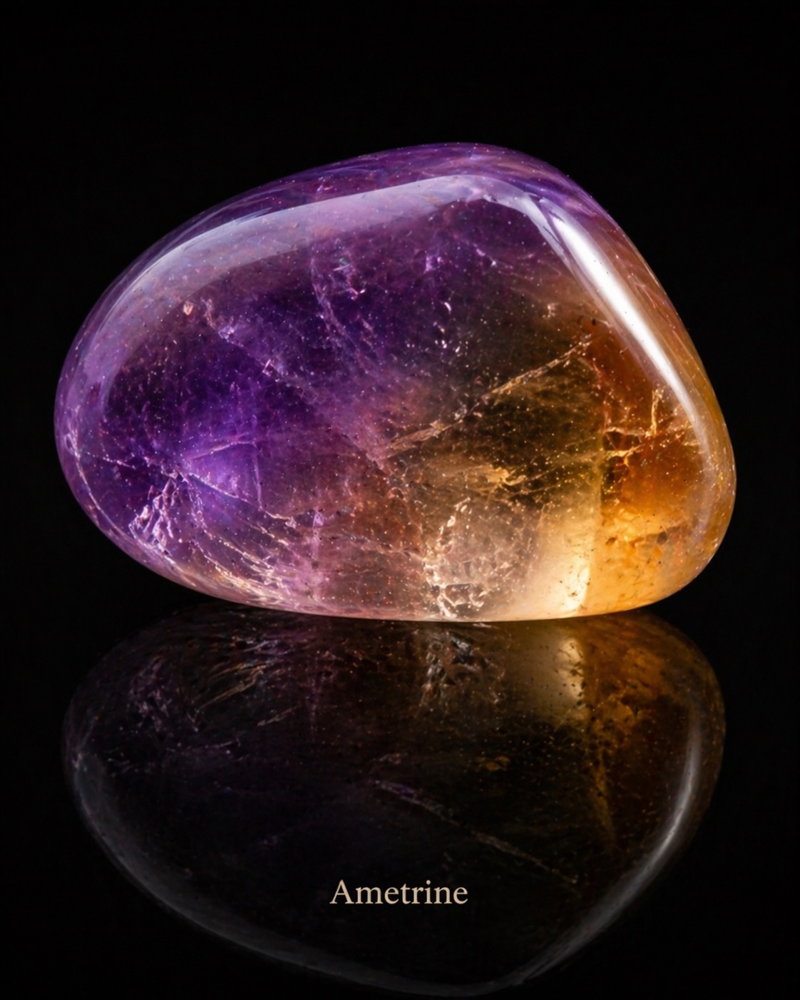
Ametrine begins with a meeting. In the supplied image, purple occupies the left side of a polished form while golden yellow gathers towards the right. Between them, pale passages and fine intersecting lines complicate the transition. A bright reflection follows the rounded upper edge. Beneath the stone, the same colours return in a darker, less legible reflection.
For Jabbi Delahaye’s growing mineral collection, this image offers a different question from the Amethyst study. What happens when contrast belongs inside one form? The colours can be read separately, yet neither explains the whole image. Their relationship invites an artistic exploration of coexistence, change and the spaces where distinct experiences meet.
One mineral, a double colour
Ametrine is quartz displaying the colours associated with amethyst and citrine in the same gem. Its name brings those two names together. GIA describes the characteristic combination as purple or violet-purple alongside yellow to orange. The contrast can be sharply defined in a fashioned gemstone, or appear more mingled through the way the stone has been cut.
This matters for the visual reading. The image presents a continuous outline containing contrasting colour areas. There is no need to imagine two separate stones joined together. At the same time, the photograph alone cannot authenticate a physical specimen or show whether its appearance results from natural growth, treatment, lighting or image production. It serves here as the supplied visual reference for an illustrated study.
Looking at the whole form before naming its parts opens a useful artistic possibility. A viewer may first notice the golden light, then return to the darker purple. Another may experience the purple as the anchor and the yellow as an opening. The image can accommodate both routes. Its centre is a relationship, rather than a single point demanding attention.
Colour zoning and geological evidence
The scientific account deserves greater care than a simple story of two colours appearing by chance. Vasconcelos, Wenk and Rossman’s 1994 study of Bolivia’s Anahí mine combined field observations with experiments. It established that the amethyst-citrine combination in the crystals they investigated was natural, rather than the result of laboratory treatment. The paper discussed unusual geological conditions and the remaining questions surrounding sector colour zoning.
The deposit occurs in a setting of dolomitic limestone and quartz mineralisation associated with a regional fault system. That setting differs from the volcanic cavities discussed in the Amethyst article. Materials sharing a mineral identity can develop in different geological circumstances. One familiar account of quartz growth should not become a universal explanation for every deposit.
For an artist, zoning provides a compositional prompt. A boundary can divide attention while keeping the surrounding form intact. The boundary might be emphatic, softened, interrupted or crossed by another mark. These decisions have consequences for how a viewer moves through an artwork. Geological structure can stimulate those decisions without being reduced to a convenient metaphor for human experience.
Bolivia, with a more precise map
Anahí is the mine most closely associated with ametrine in gem descriptions and films. It is an important Bolivian source, but the often-repeated phrase “the only commercial source” needs qualification. GIA’s own 2016 report describes commercial production from Yuruty, approximately fifty kilometres north of Anahí, following earlier reporting on the deposit.
The Yuruty account records underground workings and samples with differing proportions of purple and yellow. These are dated observations, not a verified statement about the mine’s present production. They nevertheless establish that the sourcing history is broader than a single mine. The locality of the object represented in Jabbi’s supplied image remains unknown.
This small correction has a larger value for an art collection. Research should add specificity as well as atmosphere. A mineral can carry a strong association with a place without every individual example being traced there. An honest caption can hold both facts: a documented geographical history and an image whose physical provenance has not been established.
From a remote deposit to a worked object
Robert Weldon’s 2013 GIA field account follows ametrine from the Anahí mine towards cutting and jewellery production. It describes travel through the Pantanal region, underground extraction, the removal of material in mine carts, washing and sorting. The account brings a sequence of human actions into view where a finished gemstone might otherwise seem to have arrived fully formed.
Such reporting also needs its date attached. Historical worker numbers, production estimates and company arrangements describe the visit and its circumstances. They should not be presented as today’s operating conditions. What remains useful for this study is the documented connection between a mineral deposit, transport, selection and the work that prepares rough material for a cutter.
That chain of attention can change the way an artist uses a gemstone image. The polish becomes one stage in a longer process. A colour boundary has been noticed and preserved by someone; an outline has been chosen. Bringing that awareness into the accompanying text gives a visitor more to consider without making the image carry an invented personal history.
The cutter composes with two colours
GIA explains that rectangular step cuts can make ametrine’s colour division clear, while brilliant, mixed and fantasy cuts can use internal reflections to mingle the colours. The cutter’s choices determine how strongly the contrast is displayed. A piece of rough material therefore contains possibilities rather than one inevitable finished design.
The films below offer two approaches to that decision. A hexagonal design explores the organisation of colour within a more unusual arrangement; a cushion-cut demonstration follows another route through the faceting process. Watching them together makes the relationship between a mineral and its fashioned appearance easier to understand. Shape, orientation and polish become visible decisions.
For Jabbi’s artwork, the equivalent question is how to organise the viewer’s encounter with colour. Purple might supply a surrounding field, while a smaller yellow passage brings intensity. Or the composition might allow the two areas comparable space. Balance does not require identical quantities. It can emerge from differences in brightness, position, edge and the time the eye spends in each area.
Legend, evidence and contemporary meaning
GIA’s history page recounts a legend linking the mine with a Spanish conquistador and a princess named Anahí. It presents the story as legend. The distinction matters: repeating a named princess and a marriage story does not, by itself, establish a documented historical event. A romantic account of discovery should not substitute for evidence about Indigenous histories or colonial relationships.
There is room for storytelling in an art collection, provided its status remains visible. Here, the legend helps show how a gemstone acquires narratives as it travels through culture and commerce. It does not authorise the invention of an ancient ametrine ritual or a universal spiritual symbolism. Any such claim would require its own reliable evidence.
The contemporary interpretations can be offered more openly. Ametrine’s contrasting colours might suggest a meeting of inward reflection and outward energy, or the effort of holding more than one perspective. These are readings proposed through this image. They are not established effects of wearing the stone, and they need not be accepted by every viewer to be useful within the artwork.
A transition with room to breathe
The most interesting part of the supplied image may be the passage between purple and gold. It does not look like a simple graphic division. Fine lines cross it; pale light moves through it; the rounded outline gives both colours a shared enclosure. The image becomes richer when the viewer spends time with that intermediate area.
An artwork could extend this by allowing a similar transition to appear elsewhere. A fabric fold might move from a cooler shadow towards a warmer reflection. An architectural opening might gather the golden tone without repeating the gemstone literally. A small purple passage could connect the object with another part of the composition. These echoes would help the mineral participate in the image’s structure.
The reflection provides a second register of the same relationship. It retains recognisable colour while reducing detail. That could suggest an experience returning as memory, or a visible presence accompanied by something less accessible. These possibilities come from the arrangement of this image. They should remain invitations to look, rather than claims about what the artist must mean.
Material care and continued looking
GIA gives ametrine a Mohs hardness of seven. Scratch resistance does not make it immune to damage: sudden temperature changes can fracture it, and prolonged intense light can fade some colour. Warm soapy water is an appropriate cleaning method for a physical stone; steam and heat should be avoided. Prints and digital displays require care suited to their own materials.
Ametrine gives this collection a way to explore difference within a continuous form. Research connects it with particular deposits and working practices. The supplied image invites a slower encounter with colour, light and an interior that remains partly unresolved. Together, those approaches let the visitor move beyond an attractive object into a more thoughtful relationship with the artwork.