FABERGÉ · CRAFTSMANSHIP · DIGITAL TRIBUTE
A World Within
an Egg
Fabergé, fine craftsmanship and my digital tribute.
Explore the first egg · closed and open views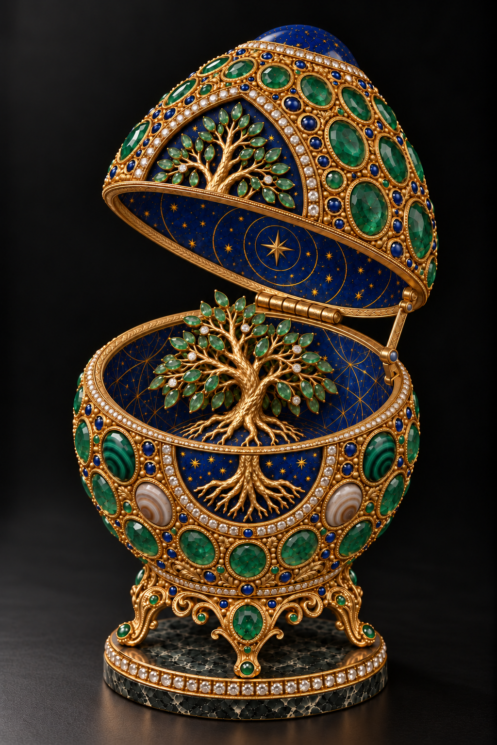
The part of a Fabergé egg that interests me most is the invitation to look again. The first encounter gives us a shape, a colour and the presence of a precious object. A closer encounter reveals how much thought has gone into a border, a setting or the turn of a small piece of gold. Then the egg opens, and the experience changes.
That movement from presence to discovery is the starting point for my first jewelled egg design. I wanted to create an image that carries the richness of fine jewellery while giving that richness a purpose. The closed egg holds a Tree of Life on its surface. Inside, the tree becomes a small sculptural world, surrounded by blue and gold celestial detail.
This is an artist-directed, AI-assisted visual simulation. The gold and gemstones exist within the image; I have not manufactured a jewelled egg. My tribute is to the attention, imagination and skilled labour that make fine jewellery worth looking at closely. Fabergé gives me an exacting reference for that attention.
The magic of something held in reserve
The first Imperial Easter Egg was commissioned in 1885 by Alexander III for his wife, Empress Maria Feodorovna. The V&A describes a white-enamelled gold shell containing a gold yolk and a ruby-eyed hen. The hen originally held further surprises, now missing. What appears simple from the outside contains a carefully organised sequence of discoveries.
That example helps me think about the magic of these objects. Their ingenuity does not depend entirely on covering a surface with jewels. An exterior can hold back information. Opening can become part of the composition, changing what the viewer knows and where their attention rests.
In my design, I want both states to hold their own. The closed view needs an elegant egg silhouette and a clear centre of attention. The open view needs to offer something that earns the act of opening. The miniature tree is the surprise, but it also develops the idea already visible on the shell.
I see the two images as a conversation. One introduces the symbol; the other invites us into its space.
The romance of a small, private world
I want to preserve the romance of the egg as well as its intricacy. An object made to be given carries a relationship within it. Someone chooses it for someone else; its details become part of that exchange. The earliest Imperial commission was an Easter gift, and that act of giving helps me understand the egg's intimate scale.
For me, the romance lies in anticipation: a closed form holding something we have not yet seen, an opening that asks us to slow down, a small tree waiting inside. I want the rich blue to deepen that feeling, as though the shell has protected a little night sky.
The historical objects also belong to the wealth and power of the Russian imperial court. Admiring their workmanship does not require treating that world as an uncomplicated golden age. My interest rests in the imagination and labour of the makers, and in what their attention can teach a contemporary artist.
In my egg, that attention serves a different story. The roots, the living green and the celestial interior create a meeting between earth and sky. I want the image to hold the feeling of something cherished, something opened carefully and returned to because a small detail remains to be discovered.
The people behind the celebrated name
Fabergé's reputation also leads me towards the people who made the work possible. The Royal Collection Trust describes a firm organised into workshops under dedicated workmasters. The V&A distinguishes Carl Fabergé's role from the specialist workshops entrusted with making the objects.
This matters to the tribute I want to make. A finished jewel holds many kinds of judgement: the designer's understanding of proportion, the goldsmith's control of a surface, the setter's treatment of a stone and the care of assembly and finishing. The celebrated name opens the door to a whole working culture.
When I say that I want my image to suggest the work of a master jeweller, I am setting a standard for how closely I look. A branch should join the trunk convincingly. A gemstone should appear securely held. An engraved edge should remain legible. Small decisions should support the whole object.
The physical makers have knowledge gained through working with actual metal and stone. My digital process does not give me that material experience. It gives me a reason to study it, acknowledge it and be precise about what I am representing.
Goldwork that rewards a second look
Gold can quickly dominate an image. Brightness alone can make a surface look rich at first glance, yet leave very little to discover. I wanted this egg's goldwork to carry more information: the texture of the tree, the fine borders around the stones and the engraving along the opening rims.
During refinement, I kept returning to the difference between a polished edge and a quieter recess. The edge catches light. The recess allows a line or a leaf pattern to remain visible. Together they give the metal a sense of depth. When everything shines equally, that depth begins to disappear.
I am also interested in how technical decoration becomes part of an object's character. Fabergé's contemporary account of an egg pendant describes guilloché made by engine turning, followed by enamelling, stone setting and inspection. That account concerns a modern pendant, rather than the production of every historical egg, but it makes the stages of skilled work tangible.
For my simulation, the question is how to make each represented stage feel purposeful. The settings, engraved rims and sculpted roots should suggest decisions made with care. The image needs places where the eye can pause, as well as places where it can move.
The Tree of Life, outside and within
I chose the Tree of Life as the centre of this first design. In this work, I use it to think about growth, connection and continuity. Those are the meanings I am developing through the image, rather than a claim that the symbol has one fixed meaning across cultures.
The roots are important. They make the tree more than a decorative spray of leaves. They give its growth an origin and let the lower part of the composition carry its own weight. On the closed shell, the roots spread across the blue field beneath the gold trunk. Inside, they appear to grip a small lapis-coloured mound.
The miniature tree needed particular attention. Early versions looked too much like a flat emblem. I wanted a sculpture with a rounded, twisting trunk and branches reaching into different depths. Overlapping leaves, darker spaces and small changes of angle helped the tree acquire a stronger presence.
Its scale also matters. A surprise inside an egg should feel as though it belongs there. The tree must leave room for the shell, the interior and the imagined act of closing. The image becomes more convincing when its beauty respects those relationships.
A language of simulated stones
The emerald green remains the dominant colour. It brings the tree's leaves and the jewelled shell into the same visual family. I want variation within that green: some stones lighter, some deeper, with different reflections and suggestions of internal structure.
Lapis lazuli gives the crown and blue areas a different character. In the simulation, its opaque blue and small gold-coloured flecks establish a contrast with the represented transparent gemstones. I use that blue to suggest a sky around the tree, extending the composition towards a larger imagined world.
Four malachite accents bring visible green banding into the shell. Two banded agate accents introduce quieter cream and warm brown layers beside the lower part of the tree. I associate those patterns with growth and accumulated time within this particular work. Their meaning comes through my placement and interpretation.
These choices connect the egg with my Sacred Minerals and Gemstones studies. I want viewers to be able to move from a material represented in an artwork to a closer examination of its appearance, history and uses. A jewel can invite curiosity about the stone as well as admiration for the setting.
What the close-up asked me to change
The macro study became a useful part of the process. At full scale, an elaborate object can conceal weak details through sheer density. A close-up brings those details forward. It asks whether a leaf has a credible mount, whether branches connect and whether roots seem to sit on a surface.
I used that closer view to refine the emerald leaf settings, the bark and the separation between branches, then carried useful changes back into the main open image. The full view remained the reference for proportion. The macro was a refined interpretation, not proof that every small detail stayed identical.
I also checked the closed and open views together. The opening line needed to respect the stones and divide the exterior tree more coherently. Giving the join an engraved gold rim made the relationship between the two states easier to understand.
Some differences in individual stone placement remain. I present these as companion interpretations of one design, rather than exact engineering views. That distinction lets me discuss the work honestly while continuing to improve its visual coherence.
For the website, I am extending that invitation through four closed-view detail studies and four open-view studies. Brief captions identify the crown, tree, patterned stones, base, roots, canopy and mechanism. I want those closer encounters to reinforce the attention to detail that guides the collection.
From the screen towards a physical edition
This is the first design in a planned series of six jewelled eggs, each explored through closed and open views. I want their eventual physical presentation to retain the colour, depth and fine detail that give the images their character.
I am considering Fuji Pearl photographic prints and freestanding, polished acrylic blocks. Those are production intentions, not completed editions. The first paper and block proofs will need to show how the gold highlights, dark blues and fine settings survive the translation from a luminous screen.
The acrylic presentation interests me because of the depth between the viewer and the image. WhiteWall describes its standard block as a photographic print laminated behind a 25-millimetre acrylic surface. The clear material can give the image a strong sense of presence, while the artwork remains a flat print rather than a three-dimensional egg enclosed inside the block.
I intend to keep the collection small and numbered. The final edition size, formats and any artist's proofs will be stated clearly once the physical presentation has been tested. I want the collector to know what they are acquiring and how that object belongs to the series.
The attention I want the work to hold
My admiration for Fabergé begins with the object and leads towards the care behind it. That care is what I want to carry into this visual simulation: a clear form, meaningful material choices and details that remain worth examining after the first impression.
The image is an independent tribute, with no affiliation to the House of Fabergé. Its medium is digital, and its imagined goldsmithing is represented through pixels. I want that distinction to leave room for a serious conversation between historical craftsmanship and contemporary image-making.
When the egg opens, I want the tree to feel like a discovery. When the viewer looks closer, I want a leaf, a root or a small engraved edge to hold their attention for a little longer. That is the quality I am working towards as this first egg becomes the beginning of a wider collection.